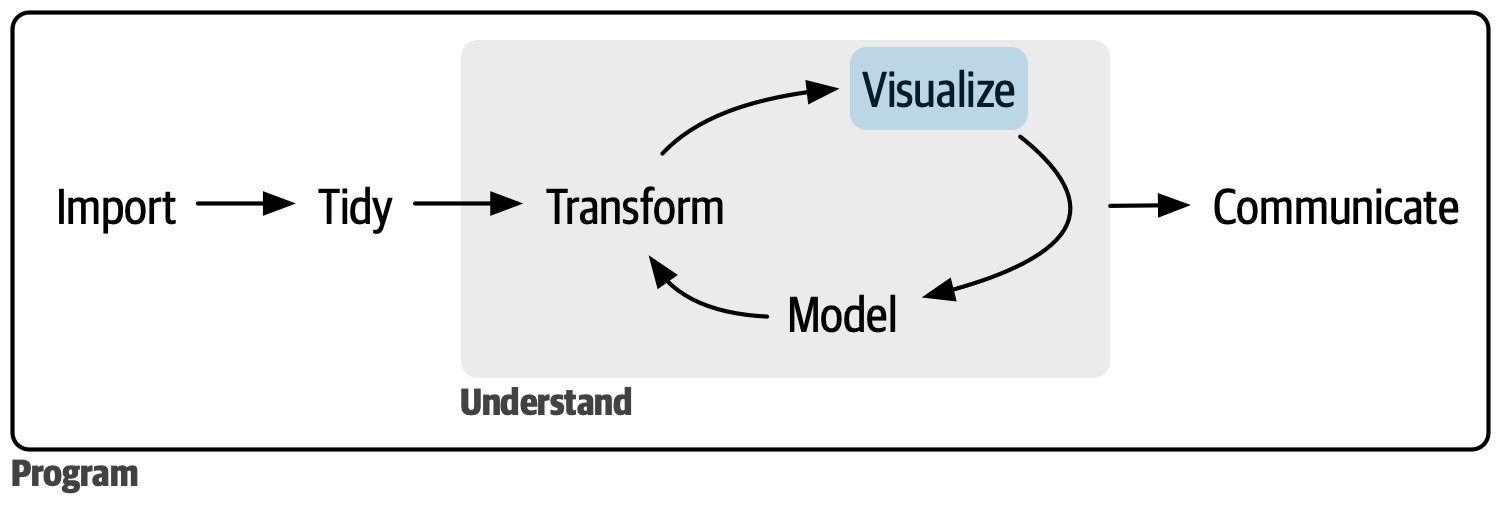
数据可视化通常是数据探索的第一步。
After reading the first part of the book, you understand (at least superficially) the most important tools for doing data science. Now it’s time to start diving into the details. In this part of the book, you’ll learn about visualizing data in further depth.
读完本书的第一部分,你已经(至少表面上)了解了数据科学中最重要的工具。 现在是时候开始深入细节了。 在本书的这一部分,你将更深入地学习数据可视化。
Each chapter addresses one to a few aspects of creating a data visualization.
每一章都会讨论创建数据可视化的一到几个方面。
In 9 Layers you will learn about the layered grammar of graphics.
在 9 Layers 中,你将学习分层图形语法。
In 10 Exploratory data analysis, you’ll combine visualization with your curiosity and skepticism to ask and answer interesting questions about data.
在 10 Exploratory data analysis 中,你将把可视化与你的好奇心和怀疑精神结合起来,对数据提出并回答有趣的问题。
Finally, in 11 Communication you will learn how to take your exploratory graphics, elevate them, and turn them into expository graphics, graphics that help the newcomer to your analysis understand what’s going on as quickly and easily as possible.
最后,在 11 Communication 中,你将学习如何将你的探索性图形进行升华,将它们转变为解释性图形,即能帮助初次接触你分析的人尽可能快速、轻松地理解分析内容的图形。
These three chapters get you started in the world of visualization, but there is much more to learn. The absolute best place to learn more is the ggplot2 book: ggplot2: Elegant graphics for data analysis. It goes into much more depth about the underlying theory, and has many more examples of how to combine the individual pieces to solve practical problems. Another great resource is the ggplot2 extensions gallery https://exts.ggplot2.tidyverse.org/gallery/. This site lists many of the packages that extend ggplot2 with new geoms and scales. It’s a great place to start if you’re trying to do something that seems hard with ggplot2.
这三章为你开启了可视化世界的大门,但还有很多东西需要学习。 学习更多知识的最佳去处是 ggplot2 的书籍:ggplot2: Elegant graphics for data analysis。 它更深入地探讨了底层理论,并提供了更多关于如何组合各个部分来解决实际问题的例子。 另一个很棒的资源是 ggplot2 扩展包的展廊 https://exts.ggplot2.tidyverse.org/gallery/。 这个网站列出了许多用新的几何对象 (geoms) 和标度 (scales) 扩展 ggplot2 的包。 如果你想用 ggplot2 做一些看起来很困难的事情,这是一个很好的起点。