9 Layers
9.1 Introduction
In Chapter 1, you learned much more than just how to make scatterplots, bar charts, and boxplots. You learned a foundation that you can use to make any type of plot with ggplot2.
在 Chapter 1 中,你学到的远不止如何制作散点图、条形图和箱线图。你学到了一个可以用 ggplot2 制作任何类型图表的基础。
In this chapter, you’ll expand on that foundation as you learn about the layered grammar of graphics. We’ll start with a deeper dive into aesthetic mappings, geometric objects, and facets. Then, you will learn about statistical transformations ggplot2 makes under the hood when creating a plot. These transformations are used to calculate new values to plot, such as the heights of bars in a bar plot or medians in a box plot. You will also learn about position adjustments, which modify how geoms are displayed in your plots. Finally, we’ll briefly introduce coordinate systems.
在本章中,你将通过学习分层图形语法来扩展这一基础。我们将从深入探讨美学映射 (aesthetic mappings)、几何对象 (geometric objects) 和分面 (facets) 开始。然后,你将学习 ggplot2 在创建图表时在底层进行的统计变换 (statistical transformations)。这些变换用于计算要绘制的新值,例如条形图中条形的高度或箱线图中的中位数。你还将学习位置调整 (position adjustments),它可以修改几何对象在图表中的显示方式。最后,我们将简要介绍坐标系 (coordinate systems)。
We will not cover every single function and option for each of these layers, but we will walk you through the most important and commonly used functionality provided by ggplot2 as well as introduce you to packages that extend ggplot2.
我们不会涵盖这些图层中的每一个函数和选项,但我们会引导你了解 ggplot2 提供的最重要和最常用的功能,并向你介绍扩展 ggplot2 的包。
9.1.1 Prerequisites
This chapter focuses on ggplot2. To access the datasets, help pages, and functions used in this chapter, load the tidyverse by running this code:
本章重点介绍 ggplot2。要访问本章中使用的数据集、帮助页面和函数,请运行以下代码加载 tidyverse:
9.2 Aesthetic mappings
“The greatest value of a picture is when it forces us to notice what we never expected to see.” — John Tukey
“一图胜千言,尤其是在它迫使我们注意到我们从未预料到的事物时。” — 约翰·图基 (John Tukey)
Remember that the mpg data frame bundled with the ggplot2 package contains 234 observations on 38 car models.
请记住,ggplot2 包中附带的 mpg 数据框包含 234 条关于 38 种车型的观测数据。
mpg
#> # A tibble: 234 × 11
#>   manufacturer model displ  year   cyl trans      drv     cty   hwy fl
#>   <chr>        <chr> <dbl> <int> <int> <chr>      <chr> <int> <int> <chr>
#> 1 audi         a4      1.8  1999     4 auto(l5)   f        18    29 p
#> 2 audi         a4      1.8  1999     4 manual(m5) f        21    29 p
#> 3 audi         a4      2    2008     4 manual(m6) f        20    31 p
#> 4 audi         a4      2    2008     4 auto(av)   f        21    30 p
#> 5 audi         a4      2.8  1999     6 auto(l5)   f        16    26 p
#> 6 audi         a4      2.8  1999     6 manual(m5) f        18    26 p
#> # ℹ 228 more rows
#> # ℹ 1 more variable: class <chr>
Among the variables in mpg are:mpg 数据集中的变量包括:
displ: A car’s engine size, in liters. A numerical variable.displ:汽车的发动机尺寸,单位为升。
这是一个数值变量。hwy: A car’s fuel efficiency on the highway, in miles per gallon (mpg). A car with a low fuel efficiency consumes more fuel than a car with a high fuel efficiency when they travel the same distance. A numerical variable.hwy:汽车在高速公路上的燃油效率,单位为英里/加仑 (mpg)。
当行驶相同距离时,燃油效率低的汽车比燃油效率高的汽车消耗更多的燃料。
这是一个数值变量。class: Type of car. A categorical variable.class:汽车类型。
这是一个分类变量。
Let’s start by visualizing the relationship between displ and hwy for various classes of cars. We can do this with a scatterplot where the numerical variables are mapped to the x and y aesthetics and the categorical variable is mapped to an aesthetic like color or shape.
让我们从可视化不同 class 类型汽车的 displ 和 hwy 之间的关系开始。我们可以通过散点图来实现,其中数值变量映射到 x 和 y 美学属性,而分类变量映射到像 color 或 shape 这样的美学属性。
# Left
ggplot(mpg, aes(x = displ, y = hwy, color = class)) +
  geom_point()

# Right
ggplot(mpg, aes(x = displ, y = hwy, shape = class)) +
  geom_point()
#> Warning: The shape palette can deal with a maximum of 6 discrete values because more
#> than 6 becomes difficult to discriminate
#> ℹ you have requested 7 values. Consider specifying shapes manually if you
#>   need that many of them.
#> Warning: Removed 62 rows containing missing values or values outside the scale range
#> (`geom_point()`).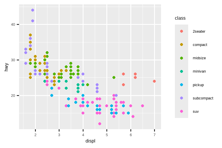
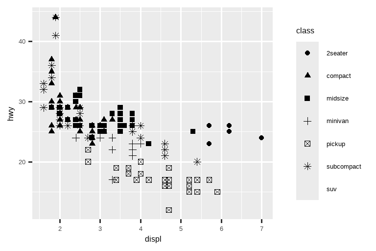
When class is mapped to shape, we get two warnings:
当 class 映射到 shape 时,我们会收到两个警告:
1: The shape palette can deal with a maximum of 6 discrete values because more than 6 becomes difficult to discriminate; you have 7. Consider specifying shapes manually if you must have them.
形状调色板最多只能处理 6 个离散值,因为超过 6 个就很难区分了;而你有 7 个。如果必须使用它们,请考虑手动指定形状。2: Removed 62 rows containing missing values (
geom_point()).
移除了 62 行包含缺失值的数据 (geom_point())。
Since ggplot2 will only use six shapes at a time, by default, additional groups will go unplotted when you use the shape aesthetic. The second warning is related – there are 62 SUVs in the dataset and they’re not plotted.
由于 ggplot2 默认一次只使用六种形状,因此当你使用形状美学时,额外的分组将不会被绘制出来。第二个警告与此相关——数据集中有 62 辆 SUV 没有被绘制。
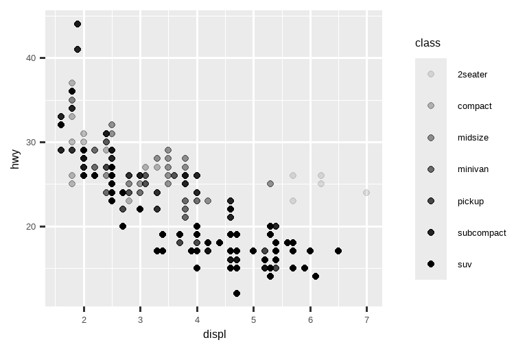
Similarly, we can map class to size or alpha aesthetics as well, which control the size and the transparency of the points, respectively.
同样,我们也可以将 class 映射到 size 或 alpha 美学,它们分别控制点的大小和透明度。
# Left
ggplot(mpg, aes(x = displ, y = hwy, size = class)) +
  geom_point()
#> Warning: Using size for a discrete variable is not advised.

# Right
ggplot(mpg, aes(x = displ, y = hwy, alpha = class)) +
  geom_point()
#> Warning: Using alpha for a discrete variable is not advised.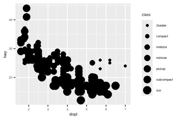
Both of these produce warnings as well:
这两者也都会产生警告:
Using alpha for a discrete variable is not advised. 不建议对离散变量使用 alpha。
Mapping an unordered discrete (categorical) variable (class) to an ordered aesthetic (size or alpha) is generally not a good idea because it implies a ranking that does not in fact exist.
将一个无序的离散(分类)变量(class)映射到一个有序的美学属性(size 或 alpha)通常不是一个好主意,因为它暗示了一个实际上不存在的排序。
Once you map an aesthetic, ggplot2 takes care of the rest. It selects a reasonable scale to use with the aesthetic, and it constructs a legend that explains the mapping between levels and values. For x and y aesthetics, ggplot2 does not create a legend, but it creates an axis line with tick marks and a label. The axis line provides the same information as a legend; it explains the mapping between locations and values.
一旦你映射了一个美学属性,ggplot2 会处理剩下的事情。它会选择一个合理的标度与该美学属性一起使用,并构建一个图例来解释级别和值之间的映射关系。对于 x 和 y 美学属性,ggplot2 不会创建图例,但会创建带有刻度线和标签的坐标轴。坐标轴线提供了与图例相同的信息;它解释了位置和值之间的映射。
You can also set the visual properties of your geom manually as an argument of your geom function (outside of aes()) instead of relying on a variable mapping to determine the appearance. For example, we can make all of the points in our plot blue:
你也可以在几何对象函数中手动设置其视觉属性作为参数(在 aes() 之外),而不是依赖变量映射来决定外观。例如,我们可以将图中的所有点都设置为蓝色:
ggplot(mpg, aes(x = displ, y = hwy)) +
  geom_point(color = "blue")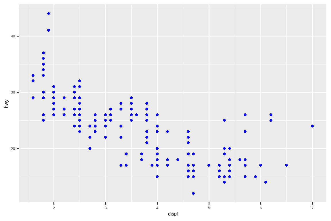
Here, the color doesn’t convey information about a variable, but only changes the appearance of the plot. You’ll need to pick a value that makes sense for that aesthetic:
在这里,颜色并不传达关于变量的信息,而只是改变了图表的外观。你需要为该美学选择一个有意义的值:
The name of a color as a character string, e.g.,
color = "blue"
作为字符串的颜色名称,例如color = "blue"The size of a point in mm, e.g.,
size = 1以毫米为单位的点的大小,例如size = 1The shape of a point as a number, e.g,
shape = 1, as shown in Figure 9.1.
点的形状,以数字表示,例如shape = 1,如 Figure 9.1 所示。
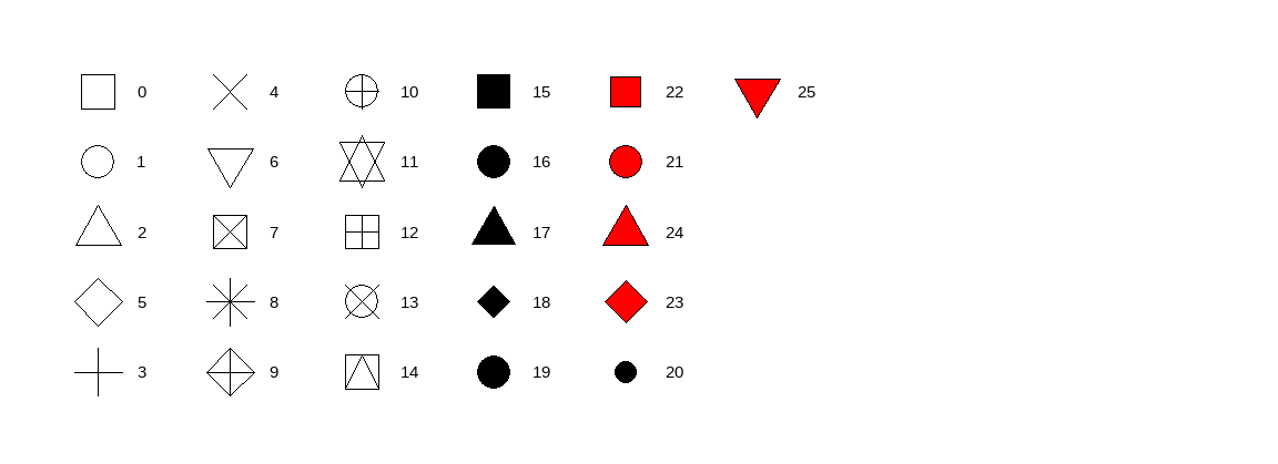
color and fill aesthetics. The hollow shapes (0–14) have a border determined by color; the solid shapes (15–20) are filled with color; the filled shapes (21–25) have a border of color and are filled with fill. Shapes are arranged to keep similar shapes next to each other.R 有 26 种内置形状,用数字标识。有些形状看起来重复了:例如,0、15 和 22 都是正方形。区别在于 color 和 fill 美学的交互作用。空心形状 (0–14) 的边框由 color 决定;实心形状 (15–20) 由 color 填充;填充形状 (21–25) 的边框是 color,填充是 fill。形状的排列是为了让相似的形状彼此相邻。
So far we have discussed aesthetics that we can map or set in a scatterplot, when using a point geom. You can learn more about all possible aesthetic mappings in the aesthetic specifications vignette at https://ggplot2.tidyverse.org/articles/ggplot2-specs.html.
到目前为止,我们已经讨论了在使用点几何对象时,可以在散点图中映射或设置的美学。你可以在美学规范小品文 https://ggplot2.tidyverse.org/articles/ggplot2-specs.html 中了解更多关于所有可能的美学映射。
The specific aesthetics you can use for a plot depend on the geom you use to represent the data. In the next section we dive deeper into geoms.
你可以用于绘图的特定美学取决于你用来表示数据的几何对象。在下一节中,我们将更深入地探讨几何对象。
9.2.1 Exercises
Create a scatterplot of
hwyvs.displwhere the points are pink filled in triangles.-
Why did the following code not result in a plot with blue points?
ggplot(mpg) +
  geom_point(aes(x = displ, y = hwy, color = "blue"))
What does the
strokeaesthetic do? What shapes does it work with? (Hint: use?geom_point)What happens if you map an aesthetic to something other than a variable name, like
aes(color = displ < 5)? Note, you’ll also need to specify x and y.
9.3 Geometric objects
How are these two plots similar?
这两幅图有何相似之处?
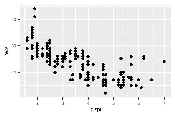
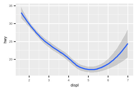
Both plots contain the same x variable, the same y variable, and both describe the same data. But the plots are not identical. Each plot uses a different geometric object, geom, to represent the data. The plot on the left uses the point geom, and the plot on the right uses the smooth geom, a smooth line fitted to the data.
两张图都包含相同的 x 变量,相同的 y 变量,并且都描述了相同的数据。但这两张图并不完全相同。每张图都使用不同的几何对象(geom)来表示数据。左边的图使用了点几何对象(point geom),右边的图使用了平滑几何对象(smooth geom),即一条拟合数据的平滑曲线。
To change the geom in your plot, change the geom function that you add to ggplot(). For instance, to make the plots above, you can use the following code:
要更改绘图中的几何对象,请更改添加到 ggplot() 的几何函数。例如,要制作上面的图,您可以使用以下代码:
# Left
ggplot(mpg, aes(x = displ, y = hwy)) +
  geom_point()

# Right
ggplot(mpg, aes(x = displ, y = hwy)) +
  geom_smooth()
#> `geom_smooth()` using method = 'loess' and formula = 'y ~ x'
Every geom function in ggplot2 takes a mapping argument, either defined locally in the geom layer or globally in the ggplot() layer. However, not every aesthetic works with every geom. You could set the shape of a point, but you couldn’t set the “shape” of a line. If you try, ggplot2 will silently ignore that aesthetic mapping. On the other hand, you could set the linetype of a line. geom_smooth() will draw a different line, with a different linetype, for each unique value of the variable that you map to linetype.
ggplot2 中的每个几何函数都接受一个 mapping 参数,该参数可以在几何层中局部定义,也可以在 ggplot() 层中全局定义。然而,并非每个美学都适用于每个几何对象。你可以设置点的形状,但不能设置线的“形状”。如果你尝试这样做,ggplot2 会默默地忽略该美学映射。另一方面,你可以设置线的线型。geom_smooth() 会为映射到线型的变量的每个唯一值绘制一条不同的线,并具有不同的线型。
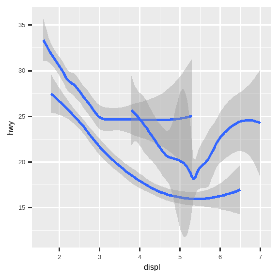
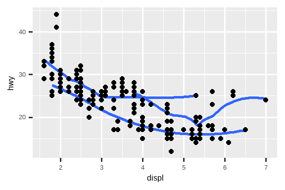
# Left
ggplot(mpg, aes(x = displ, y = hwy, shape = drv)) +
  geom_smooth()

# Right
ggplot(mpg, aes(x = displ, y = hwy, linetype = drv)) +
  geom_smooth()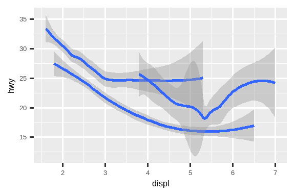
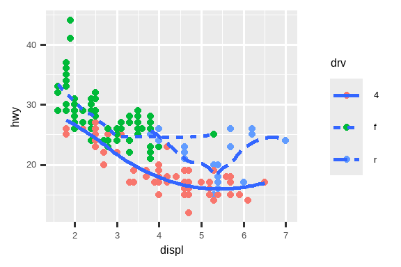
Here, geom_smooth() separates the cars into three lines based on their drv value, which describes a car’s drive train. One line describes all of the points that have a 4 value, one line describes all of the points that have an f value, and one line describes all of the points that have an r value. Here, 4 stands for four-wheel drive, f for front-wheel drive, and r for rear-wheel drive.
在这里,geom_smooth() 根据汽车的 drv 值(描述汽车的驱动系统)将汽车分为三条线。一条线描述所有 drv 值为 4 的点,一条线描述所有值为 f 的点,另一条线描述所有值为 r 的点。这里,4 代表四轮驱动 (four-wheel drive),f 代表前轮驱动 (front-wheel drive),r 代表后轮驱动 (rear-wheel drive)。
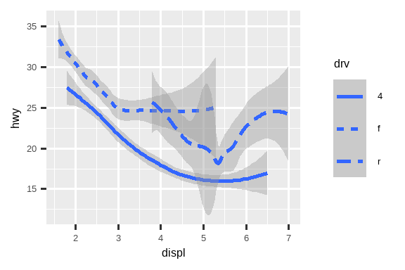
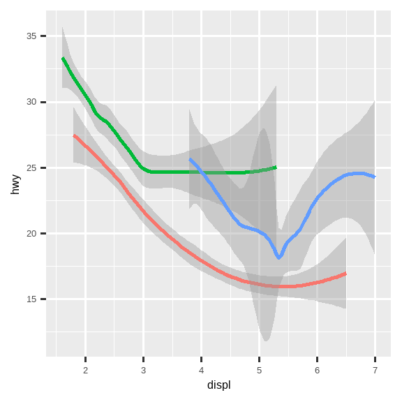
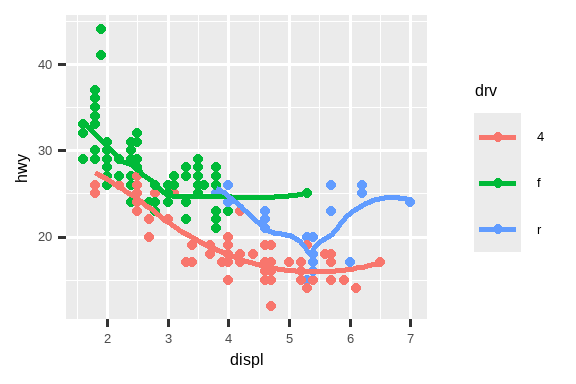
If this sounds strange, we can make it clearer by overlaying the lines on top of the raw data and then coloring everything according to drv.
如果这听起来有些奇怪,我们可以通过将线条叠加在原始数据之上,然后根据 drv 对所有内容进行着色,使其更加清晰。
ggplot(mpg, aes(x = displ, y = hwy, color = drv)) +
  geom_point() +
  geom_smooth(aes(linetype = drv))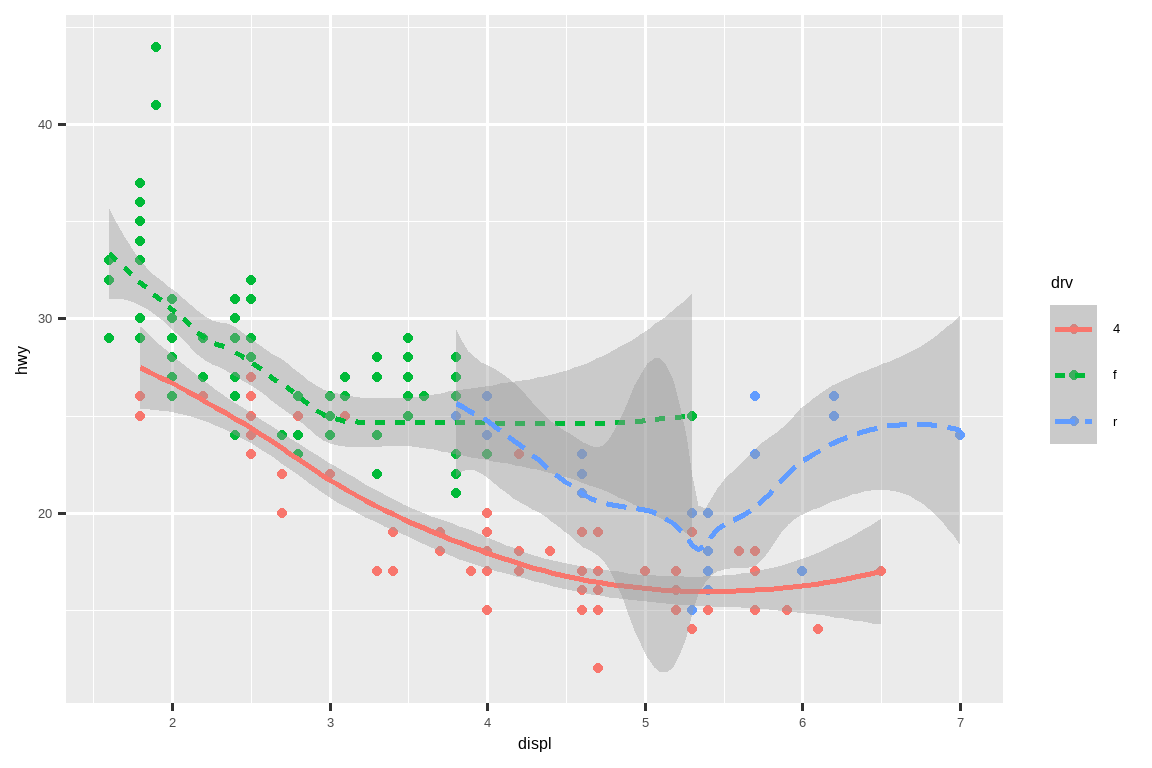
Notice that this plot contains two geoms in the same graph.
注意,此图在同一张图表中包含了两种几何对象。
Many geoms, like geom_smooth(), use a single geometric object to display multiple rows of data. For these geoms, you can set the group aesthetic to a categorical variable to draw multiple objects. ggplot2 will draw a separate object for each unique value of the grouping variable. In practice, ggplot2 will automatically group the data for these geoms whenever you map an aesthetic to a discrete variable (as in the linetype example). It is convenient to rely on this feature because the group aesthetic by itself does not add a legend or distinguishing features to the geoms.
许多几何对象(geoms),如 geom_smooth(),使用单个几何对象来显示多行数据。对于这些几何对象,您可以将 group 美学设置为分类变量以绘制多个对象。ggplot2 将为分组变量的每个唯一值绘制一个单独的对象。在实践中,只要您将美学映射到离散变量(如 linetype 示例中),ggplot2 就会自动为这些几何对象分组数据。依赖此功能很方便,因为 group 美学本身不会为几何对象添加图例或区分特征。
# Left
ggplot(mpg, aes(x = displ, y = hwy)) +
  geom_smooth()

# Middle
ggplot(mpg, aes(x = displ, y = hwy)) +
  geom_smooth(aes(group = drv))

# Right
ggplot(mpg, aes(x = displ, y = hwy)) +
  geom_smooth(aes(color = drv), show.legend = FALSE)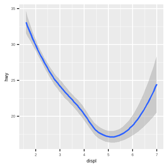
If you place mappings in a geom function, ggplot2 will treat them as local mappings for the layer. It will use these mappings to extend or overwrite the global mappings for that layer only. This makes it possible to display different aesthetics in different layers.
如果你将映射放置在 geom 函数中,ggplot2 会将它们视为该图层的局部映射。它将使用这些映射来扩展或覆盖仅该图层的全局映射。这使得在不同图层中显示不同的美学成为可能。
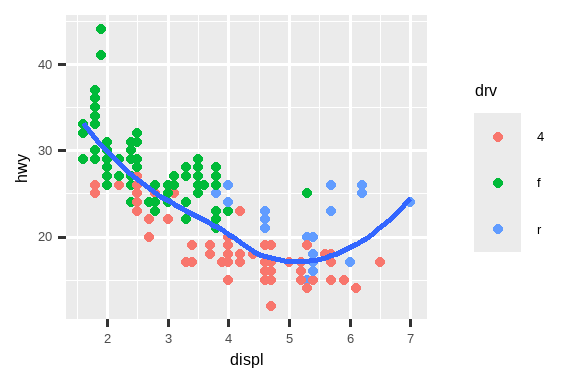
ggplot(mpg, aes(x = displ, y = hwy)) +
  geom_point(aes(color = class)) +
  geom_smooth()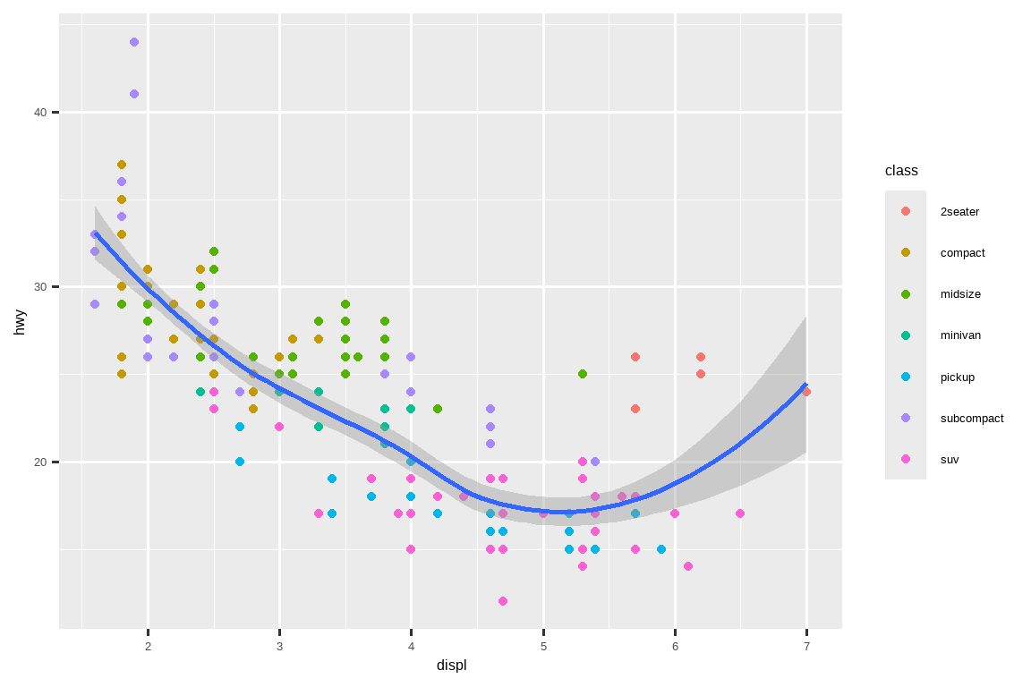
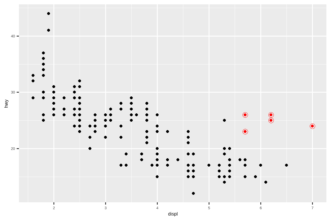
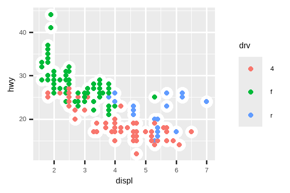
You can use the same idea to specify different data for each layer. Here, we use red points as well as open circles to highlight two-seater cars. The local data argument in geom_point() overrides the global data argument in ggplot() for that layer only.
您可以使用相同的思路为每个图层指定不同的 data。在这里,我们使用红点和空心圆来突出显示双座汽车。geom_point() 中的局部数据参数仅覆盖 ggplot() 中该图层的全局数据参数。
ggplot(mpg, aes(x = displ, y = hwy)) +
  geom_point() +
  geom_point(
    data = mpg |> filter(class == "2seater"),
    color = "red"
  ) +
  geom_point(
    data = mpg |> filter(class == "2seater"),
    shape = "circle open", size = 3, color = "red"
  )
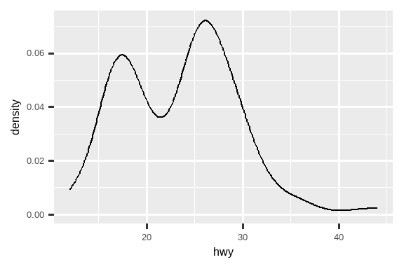
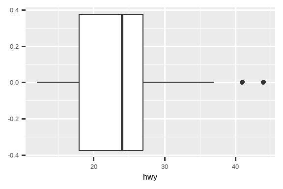
Geoms are the fundamental building blocks of ggplot2. You can completely transform the look of your plot by changing its geom, and different geoms can reveal different features of your data. For example, the histogram and density plot below reveal that the distribution of highway mileage is bimodal and right skewed while the boxplot reveals two potential outliers.
Geoms 是 ggplot2 的基本构建块。您可以通过更改其 geom 来完全改变绘图的外观,不同的 geoms 可以揭示您数据的不同特征。例如,下面的直方图和密度图显示高速公路里程的分布是双峰和右偏的,而箱线图则揭示了两个潜在的异常值。
# Left
ggplot(mpg, aes(x = hwy)) +
  geom_histogram(binwidth = 2)

# Middle
ggplot(mpg, aes(x = hwy)) +
  geom_density()

# Right
ggplot(mpg, aes(x = hwy)) +
  geom_boxplot()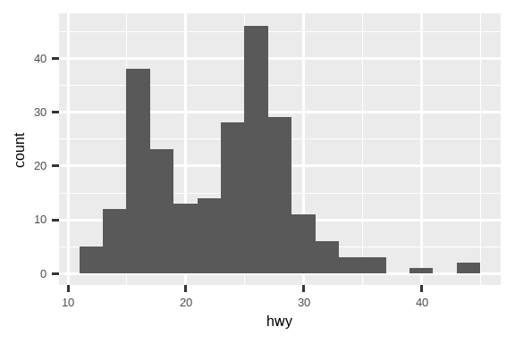
ggplot2 provides more than 40 geoms but these don’t cover all possible plots one could make. If you need a different geom, we recommend looking into extension packages first to see if someone else has already implemented it (see https://exts.ggplot2.tidyverse.org/gallery/ for a sampling). For example, the ggridges package (https://wilkelab.org/ggridges) is useful for making ridgeline plots, which can be useful for visualizing the density of a numerical variable for different levels of a categorical variable. In the following plot not only did we use a new geom (geom_density_ridges()), but we have also mapped the same variable to multiple aesthetics (drv to y, fill, and color) as well as set an aesthetic (alpha = 0.5) to make the density curves transparent.
ggplot2 提供了 40 多种几何对象,但这些并不能涵盖所有可能制作的图表。如果您需要一种不同的几何对象,我们建议首先查看扩展包,看是否有人已经实现了它(参见 https://exts.ggplot2.tidyverse.org/gallery/ 以获取示例)。例如,ggridges 包(https://wilkelab.org/ggridges)对于制作山脊线图非常有用,这对于可视化一个数值变量在不同分类变量水平下的密度非常有用。在下面的图表中,我们不仅使用了一个新的几何对象(geom_density_ridges()),还将同一个变量映射到了多个美学属性(将 drv 映射到 y、fill 和 color),并且设置了一个美学属性(alpha = 0.5)来使密度曲线透明。
library(ggridges)

ggplot(mpg, aes(x = hwy, y = drv, fill = drv, color = drv)) +
  geom_density_ridges(alpha = 0.5, show.legend = FALSE)
#> Picking joint bandwidth of 1.28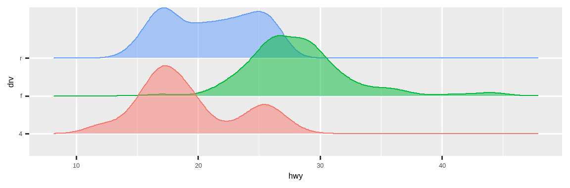
The best place to get a comprehensive overview of all of the geoms ggplot2 offers, as well as all functions in the package, is the reference page: https://ggplot2.tidyverse.org/reference. To learn more about any single geom, use the help (e.g., ?geom_smooth).
要全面了解 ggplot2 提供的所有几何对象以及包中的所有函数,最好的地方是参考页面:https://ggplot2.tidyverse.org/reference。要了解任何单个几何对象,请使用帮助(例如,?geom_smooth)。
9.3.1 Exercises
What geom would you use to draw a line chart? A boxplot? A histogram? An area chart?
-
Earlier in this chapter we used
show.legendwithout explaining it:ggplot(mpg, aes(x = displ, y = hwy)) + geom_smooth(aes(color = drv), show.legend = FALSE)What does
show.legend = FALSEdo here? What happens if you remove it? Why do you think we used it earlier? What does the
seargument togeom_smooth()do?-
Recreate the R code necessary to generate the following graphs. Note that wherever a categorical variable is used in the plot, it’s
drv.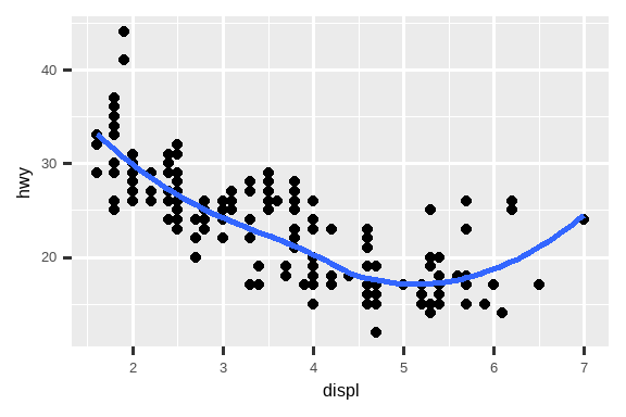
9.4 Facets
In Chapter 1 you learned about faceting with facet_wrap(), which splits a plot into subplots that each display one subset of the data based on a categorical variable.
在 Chapter 1 中,你学习了使用 facet_wrap() 进行分面,该函数根据一个分类变量将图表分割成多个子图,每个子图显示数据的一个子集。
ggplot(mpg, aes(x = displ, y = hwy)) +
  geom_point() +
  facet_wrap(~cyl)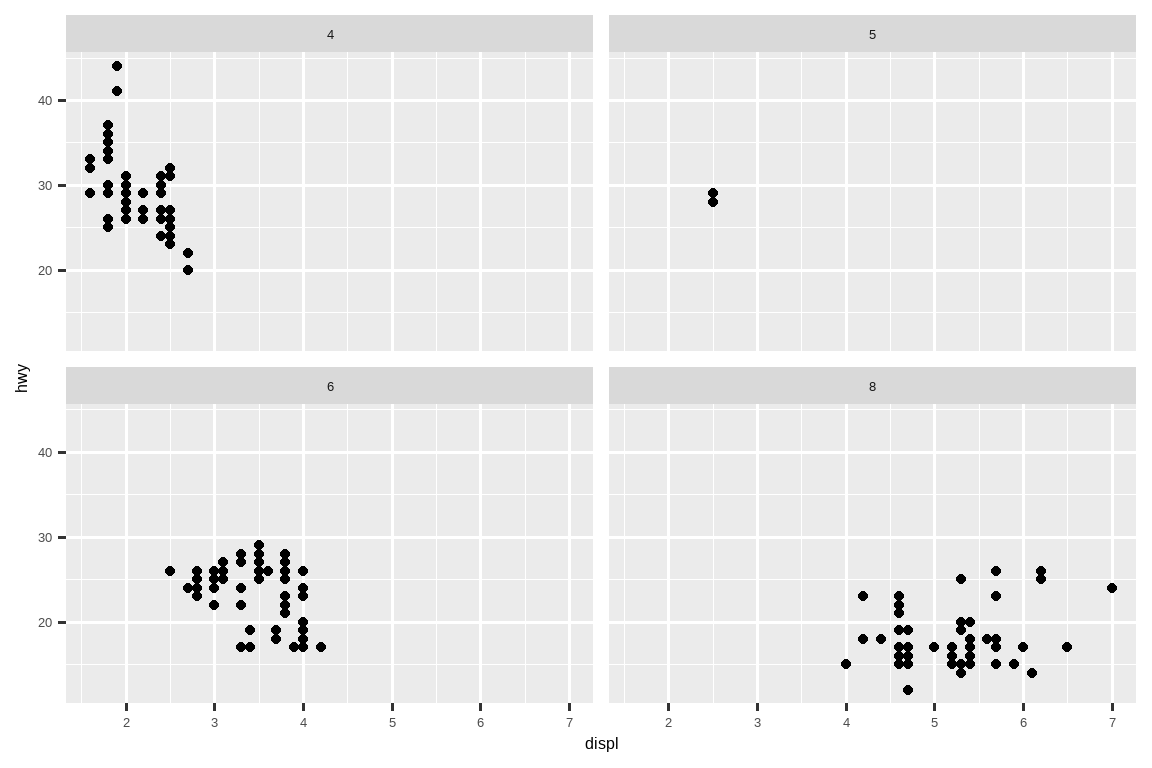
To facet your plot with the combination of two variables, switch from facet_wrap() to facet_grid(). The first argument of facet_grid() is also a formula, but now it’s a double sided formula: rows ~ cols.
要使用两个变量的组合对图表进行分面,请从 facet_wrap() 切换到 facet_grid()。facet_grid() 的第一个参数也是一个公式,但现在它是一个双边公式:rows ~ cols。
ggplot(mpg, aes(x = displ, y = hwy)) +
  geom_point() +
  facet_grid(drv ~ cyl)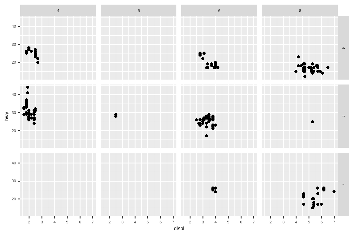
By default each of the facets share the same scale and range for x and y axes. This is useful when you want to compare data across facets but it can be limiting when you want to visualize the relationship within each facet better. Setting the scales argument in a faceting function to "free_x" will allow for different scales of x-axis across columns, "free_y" will allow for different scales on y-axis across rows, and "free" will allow both.
默认情况下,每个分面共享相同的 x 轴和 y 轴刻度及范围。当您想在不同分面之间比较数据时,这很有用,但当您想更好地可视化每个分面内部的关系时,这可能会有限制。在分面函数中将 scales 参数设置为 "free_x" 将允许跨列使用不同的 x 轴刻度,"free_y" 将允许跨行使用不同的 y 轴刻度,而 "free" 将同时允许两者。
ggplot(mpg, aes(x = displ, y = hwy)) +
  geom_point() +
  facet_grid(drv ~ cyl, scales = "free")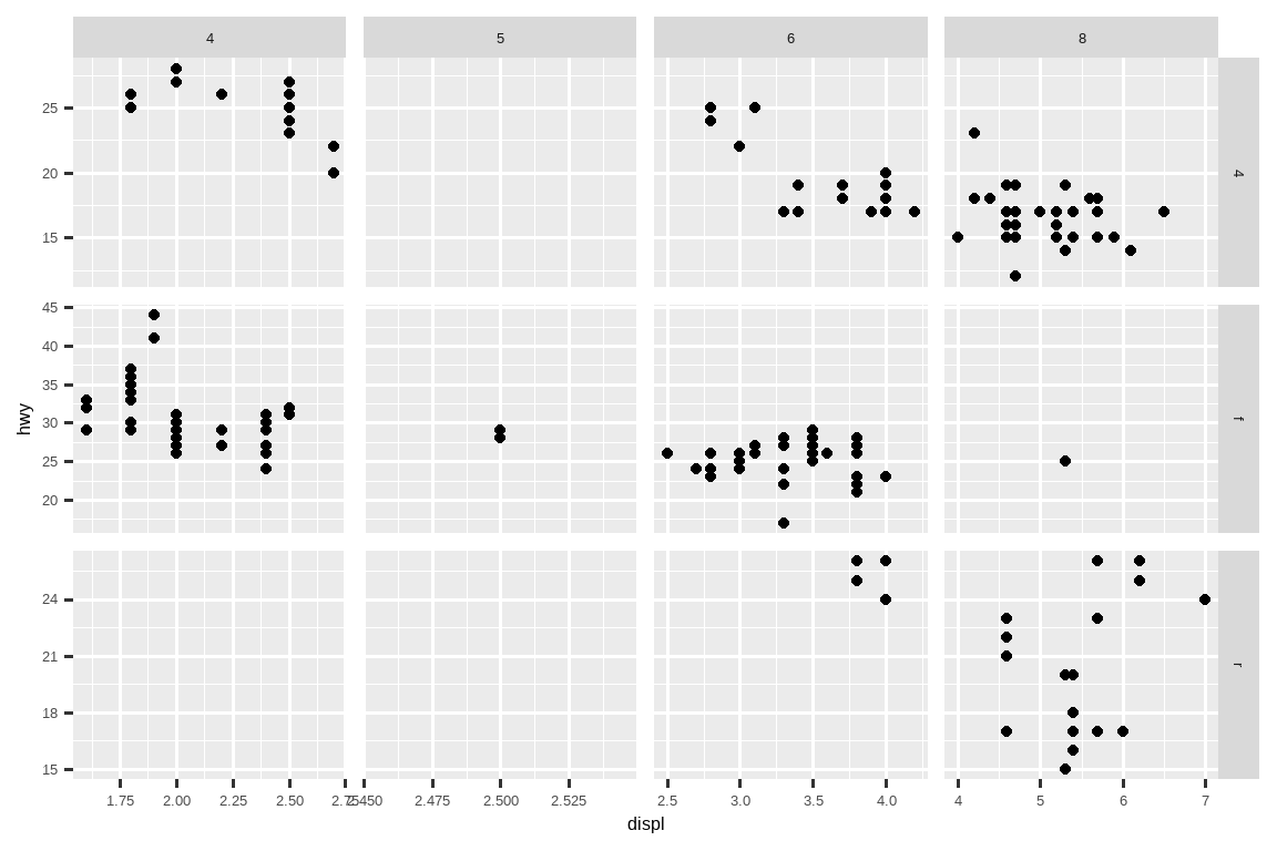
9.4.1 Exercises
What happens if you facet on a continuous variable?
-
What do the empty cells in the plot above with
facet_grid(drv ~ cyl)mean? Run the following code. How do they relate to the resulting plot?ggplot(mpg) + geom_point(aes(x = drv, y = cyl)) -
What plots does the following code make? What does
.do?ggplot(mpg) + geom_point(aes(x = displ, y = hwy)) + facet_grid(drv ~ .) ggplot(mpg) + geom_point(aes(x = displ, y = hwy)) + facet_grid(. ~ cyl) -
Take the first faceted plot in this section:
ggplot(mpg) +
  geom_point(aes(x = displ, y = hwy)) +
  facet_wrap(~ cyl, nrow = 2)
What are the advantages to using faceting instead of the color aesthetic? What are the disadvantages? How might the balance change if you had a larger dataset?
Read
?facet_wrap. What doesnrowdo? What doesncoldo? What other options control the layout of the individual panels? Why doesn’tfacet_grid()havenrowandncolarguments?-
Which of the following plots makes it easier to compare engine size (
displ) across cars with different drive trains? What does this say about when to place a faceting variable across rows or columns?ggplot(mpg, aes(x = displ)) + geom_histogram() + facet_grid(drv ~ .) ggplot(mpg, aes(x = displ)) + geom_histogram() + facet_grid(. ~ drv) -
Recreate the following plot using
facet_wrap()instead offacet_grid(). How do the positions of the facet labels change?ggplot(mpg) + geom_point(aes(x = displ, y = hwy)) + facet_grid(drv ~ .)
9.5 Statistical transformations
Consider a basic bar chart, drawn with geom_bar() or geom_col(). The following chart displays the total number of diamonds in the diamonds dataset, grouped by cut. The diamonds dataset is in the ggplot2 package and contains information on ~54,000 diamonds, including the price, carat, color, clarity, and cut of each diamond. The chart shows that more diamonds are available with high quality cuts than with low quality cuts.
考虑一个用 geom_bar() 或 geom_col() 绘制的基本条形图。下图显示了 diamonds 数据集中按 cut 分组的钻石总数。diamonds 数据集位于 ggplot2 包中,包含约 54,000 颗钻石的信息,包括每颗钻石的 price、carat、color、clarity 和 cut。该图表显示,高质量切工的钻石比低质量切工的钻石更多。

On the x-axis, the chart displays cut, a variable from diamonds. On the y-axis, it displays count, but count is not a variable in diamonds! Where does count come from? Many graphs, like scatterplots, plot the raw values of your dataset. Other graphs, like bar charts, calculate new values to plot:
在 x 轴上,图表显示 cut,这是 diamonds 数据集中的一个变量。在 y 轴上,它显示计数 (count),但计数并不是 diamonds 数据集中的变量!计数从何而来?许多图表,如散点图,会绘制数据集的原始值。而其他图表,如条形图,则会计算新的值来进行绘制:
Bar charts, histograms, and frequency polygons bin your data and then plot bin counts, the number of points that fall in each bin.
条形图、直方图和频率多边形将您的数据分箱,然后绘制每个箱中的计数,即落入每个箱中的点的数量。Smoothers fit a model to your data and then plot predictions from the model.
平滑器 (Smoothers) 会对你的数据拟合一个模型,然后绘制出模型的预测值。Boxplots compute the five-number summary of the distribution and then display that summary as a specially formatted box.
箱线图计算分布的五数概括(five-number summary),然后将该概括显示为特殊格式的箱形。
The algorithm used to calculate new values for a graph is called a stat, short for statistical transformation. Figure 9.2 shows how this process works with geom_bar().
用于为图形计算新值的算法称为 stat,即统计变换 (statistical transformation) 的缩写。Figure 9.2 展示了此过程如何与 geom_bar() 一起工作。
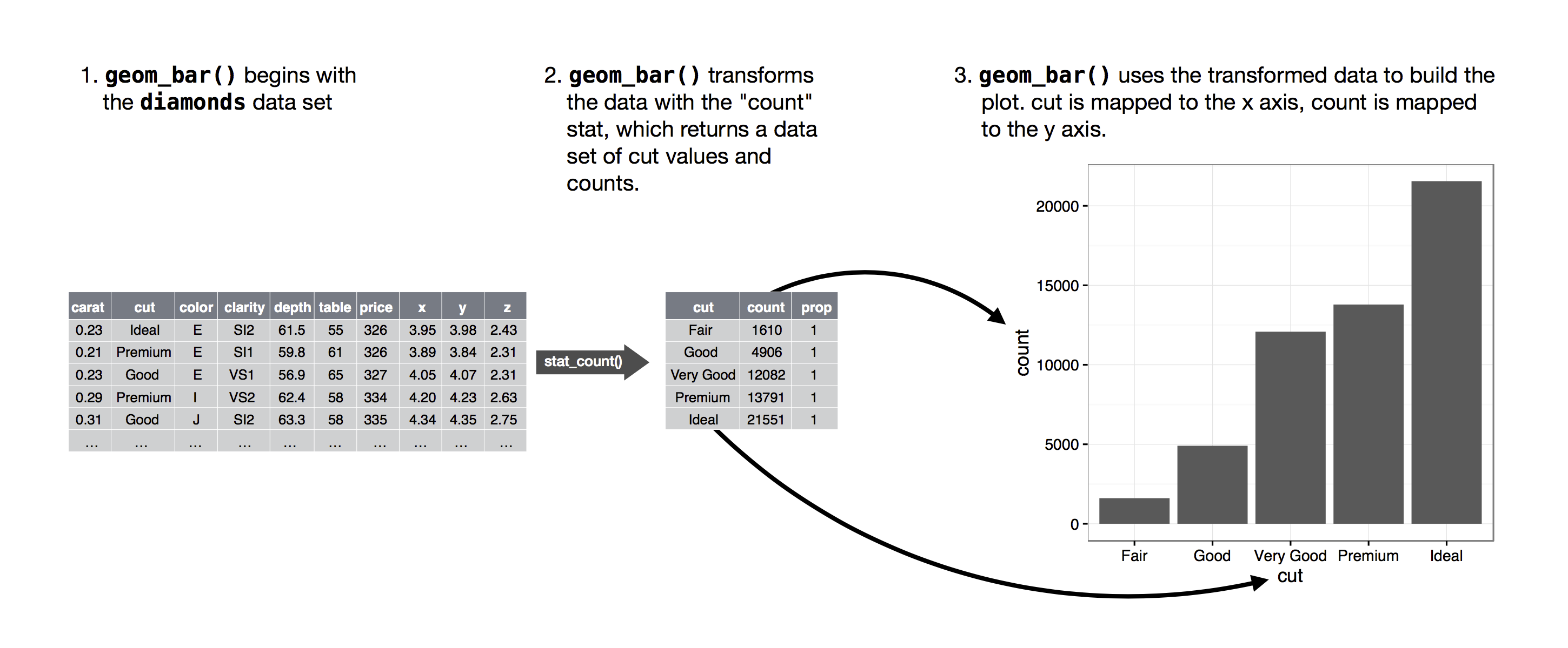
在创建条形图时,我们首先从原始数据开始,然后对其进行聚合以计算每个条形中的观测数量,最后将这些计算出的变量映射到绘图美学上。
You can learn which stat a geom uses by inspecting the default value for the stat argument. For example, ?geom_bar shows that the default value for stat is “count”, which means that geom_bar() uses stat_count(). stat_count() is documented on the same page as geom_bar(). If you scroll down, the section called “Computed variables” explains that it computes two new variables: count and prop.
你可以通过检查 stat 参数的默认值来了解一个几何对象(geom)使用了哪个统计变换(stat)。例如,?geom_bar 显示 stat 的默认值是 “count”,这意味着 geom_bar() 使用了 stat_count()。stat_count() 和 geom_bar() 在同一个帮助页面上有文档说明。如果你向下滚动,名为“计算变量”的部分会解释它计算了两个新变量:count 和 prop。
Every geom has a default stat; and every stat has a default geom. This means that you can typically use geoms without worrying about the underlying statistical transformation. However, there are three reasons why you might need to use a stat explicitly:
每个 geom 都有一个默认的 stat;每个 stat 也有一个默认的 geom。这意味着你通常可以使用 geom 而不必担心底层的统计转换。然而,有三个原因可能让你需要明确地使用 stat:
-
You might want to override the default stat. In the code below, we change the stat of
geom_bar()from count (the default) to identity. This lets us map the height of the bars to the raw values of a y variable.
你可能想要覆盖默认的统计变换。在下面的代码中,我们将geom_bar()的统计变换从 count(默认值)更改为 identity。这使我们可以将条形的高度映射到 y 变量的原始值。 -
You might want to override the default mapping from transformed variables to aesthetics. For example, you might want to display a bar chart of proportions, rather than counts:
你可能想要覆盖从转换后变量到美学的默认映射。例如,你可能想显示一个比例条形图,而不是计数条形图:ggplot(diamonds, aes(x = cut, y = after_stat(prop), group = 1)) + geom_bar()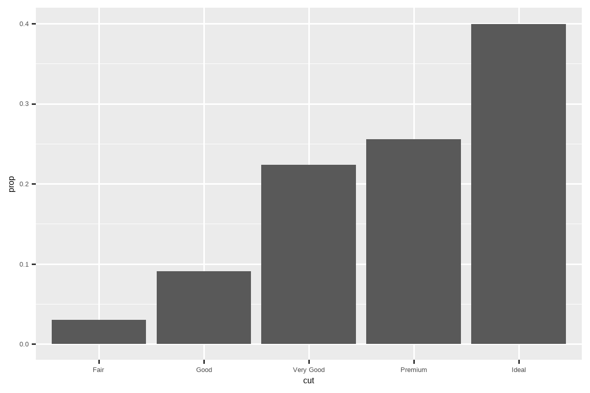
To find the possible variables that can be computed by the stat, look for the section titled “computed variables” in the help for
geom_bar().
要查找可由统计变换计算的可能变量,请在geom_bar()的帮助文档中查找标题为“计算变量”的部分。 -
You might want to draw greater attention to the statistical transformation in your code. For example, you might use
stat_summary(), which summarizes the y values for each unique x value, to draw attention to the summary that you’re computing:
你可能想在代码中更加突出统计变换。例如,你可以使用stat_summary(),它为每个唯一的 x 值汇总 y 值,以突出你正在计算的摘要:ggplot(diamonds) + stat_summary( aes(x = cut, y = depth), fun.min = min, fun.max = max, fun = median )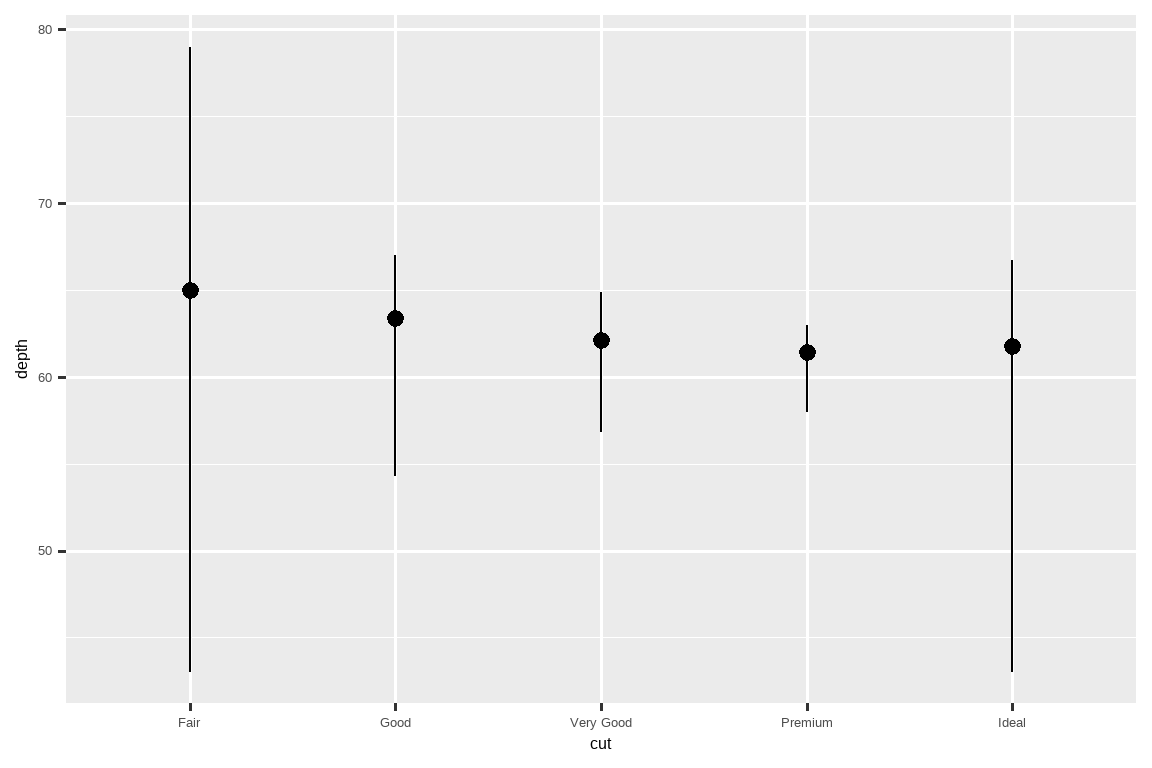

ggplot2 provides more than 20 stats for you to use. Each stat is a function, so you can get help in the usual way, e.g., ?stat_bin.
ggplot2 提供了超过 20 种统计变换供您使用。每种统计变换都是一个函数,因此您可以通过常规方式获取帮助,例如 ?stat_bin。
9.5.1 Exercises
What is the default geom associated with
stat_summary()? How could you rewrite the previous plot to use that geom function instead of the stat function?What does
geom_col()do? How is it different fromgeom_bar()?Most geoms and stats come in pairs that are almost always used in concert. Make a list of all the pairs. What do they have in common? (Hint: Read through the documentation.)
What variables does
stat_smooth()compute? What arguments control its behavior?-
In our proportion bar chart, we needed to set
group = 1. Why? In other words, what is the problem with these two graphs?ggplot(diamonds, aes(x = cut, y = after_stat(prop))) + geom_bar() ggplot(diamonds, aes(x = cut, fill = color, y = after_stat(prop))) + geom_bar()
9.6 Position adjustments
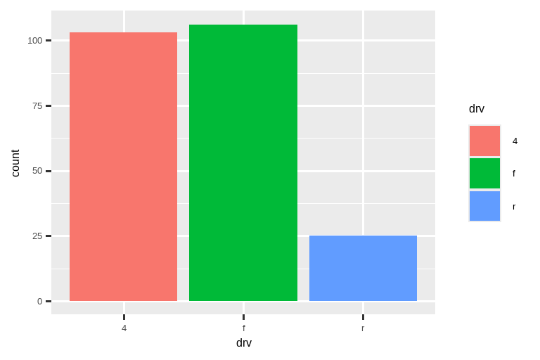
There’s one more piece of magic associated with bar charts. You can color a bar chart using either the color aesthetic, or, more usefully, the fill aesthetic:
条形图还有一个神奇之处。你可以使用 color 美学,或者更有用的 fill 美学来为条形图上色:
# Left
ggplot(mpg, aes(x = drv, color = drv)) +
  geom_bar()

# Right
ggplot(mpg, aes(x = drv, fill = drv)) +
  geom_bar()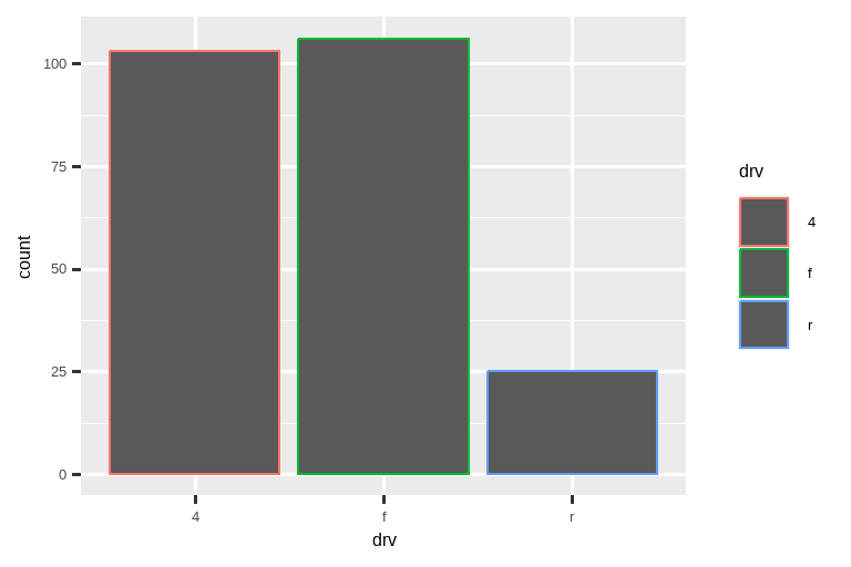
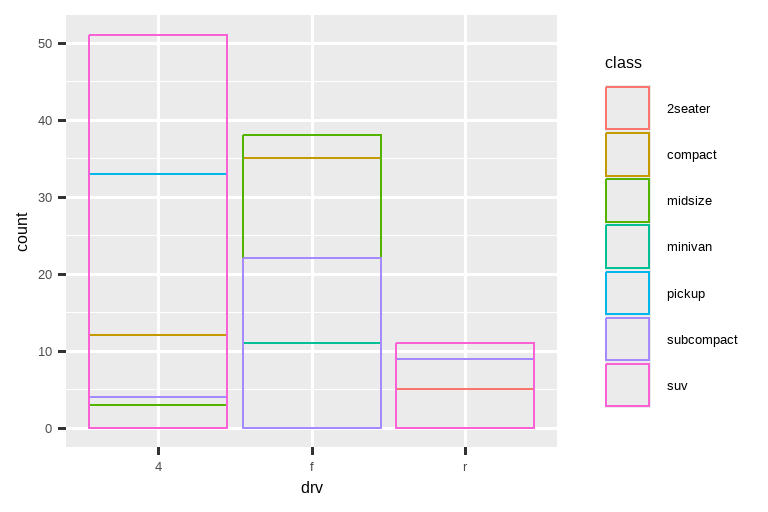
Note what happens if you map the fill aesthetic to another variable, like class: the bars are automatically stacked. Each colored rectangle represents a combination of drv and class.
请注意,如果将填充美学映射到另一个变量(如 class),会发生什么:条形会自动堆叠。每个彩色矩形代表 drv 和 class 的组合。
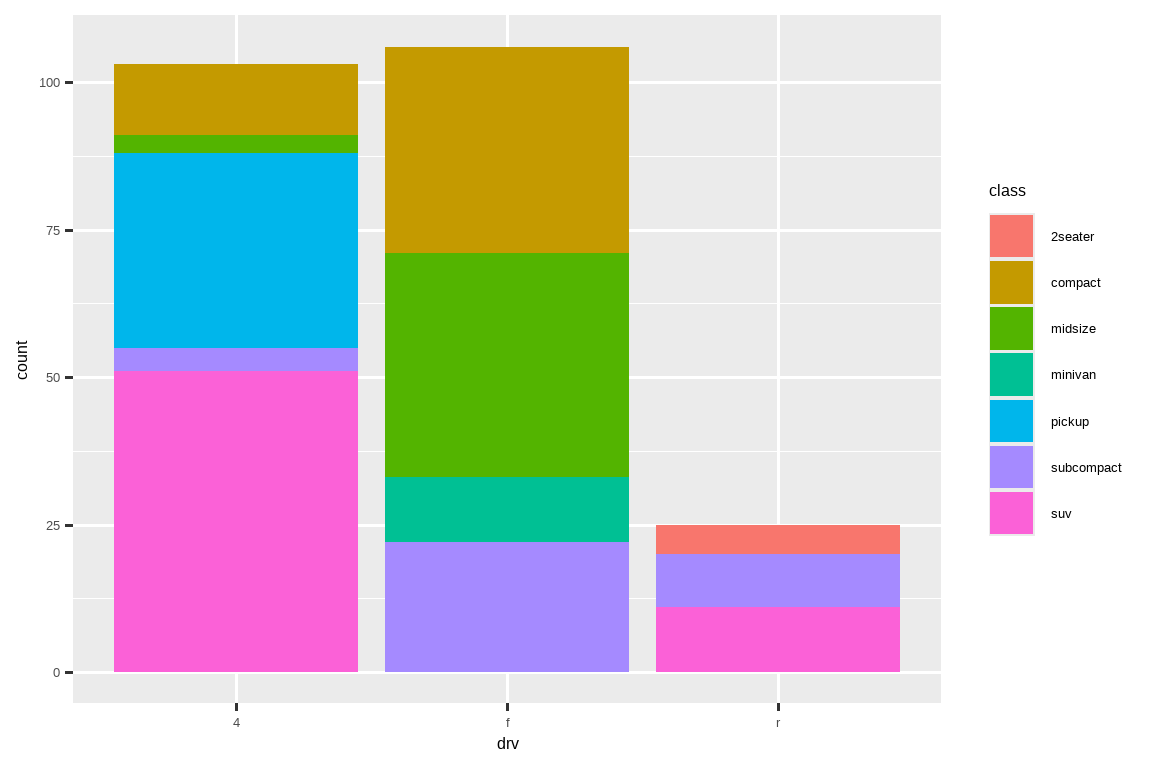
The stacking is performed automatically using the position adjustment specified by the position argument. If you don’t want a stacked bar chart, you can use one of three other options: "identity", "dodge" or "fill".
堆叠是通过 position 参数指定的 位置调整 (position adjustment) 自动执行的。如果你不想要堆叠条形图,可以使用其他三个选项之一:"identity"、"dodge" 或 "fill"。
-
position = "identity"will place each object exactly where it falls in the context of the graph. This is not very useful for bars, because it overlaps them. To see that overlapping we either need to make the bars slightly transparent by settingalphato a small value, or completely transparent by settingfill = NA.# Left ggplot(mpg, aes(x = drv, fill = class)) + geom_bar(alpha = 1/5, position = "identity") # Right ggplot(mpg, aes(x = drv, color = class)) + geom_bar(fill = NA, position = "identity")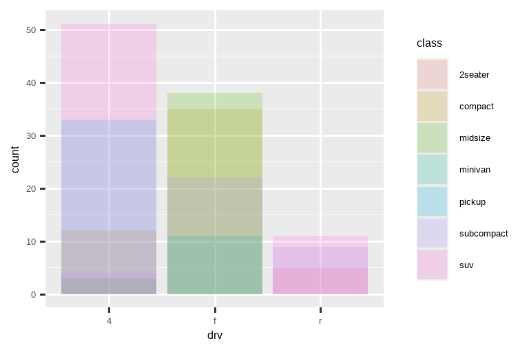
-
position = "identity"会将每个对象精确地放置在它在图表上下文中的位置。对于条形图来说,这不太有用,因为它会使它们重叠。为了看到这种重叠,我们需要通过将alpha设置为一个较小的值来使条形图略微透明,或者通过设置fill = NA来使其完全透明。The identity position adjustment is more useful for 2d geoms, like points, where it is the default.
identity位置调整对于二维几何对象(如点)更有用,它是默认设置。 position = "fill"works like stacking, but makes each set of stacked bars the same height. This makes it easier to compare proportions across groups.position = "fill"的作用类似于堆叠,但会使每组堆叠的条形图具有相同的高度。这使得跨组比较比例变得更加容易。-
position = "dodge"places overlapping objects directly beside one another. This makes it easier to compare individual values.# Left ggplot(mpg, aes(x = drv, fill = class)) + geom_bar(position = "fill") # Right ggplot(mpg, aes(x = drv, fill = class)) + geom_bar(position = "dodge")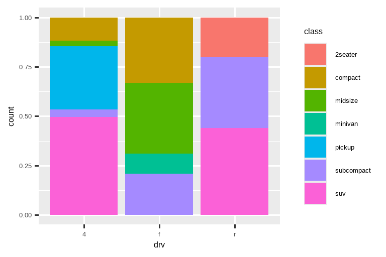
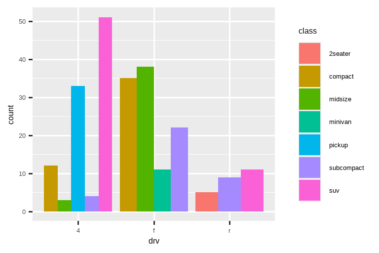
position = "dodge"将重叠的对象直接并排放置。这使得比较单个值变得更容易。
There’s one other type of adjustment that’s not useful for bar charts, but can be very useful for scatterplots. Recall our first scatterplot. Did you notice that the plot displays only 126 points, even though there are 234 observations in the dataset?
还有一种调整对条形图没什么用,但对散点图却非常有用。回想一下我们的第一个散点图。你有没有注意到,尽管数据集中有 234 个观测值,但该图只显示了 126 个点?
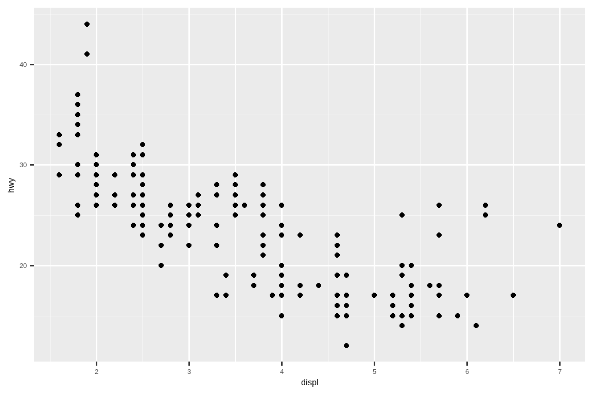
The underlying values of hwy and displ are rounded so the points appear on a grid and many points overlap each other. This problem is known as overplotting. This arrangement makes it difficult to see the distribution of the data. Are the data points spread equally throughout the graph, or is there one special combination of hwy and displ that contains 109 values?hwy 和 displ 的基础值是四舍五入的,所以点出现在一个网格上,许多点相互重叠。这个问题被称为 过绘 (overplotting)。这种排列方式使得很难看出数据的分布情况。数据点是均匀地分布在整个图表中,还是存在一个包含 109 个值的特殊 hwy 和 displ 组合?
You can avoid this gridding by setting the position adjustment to “jitter”. position = "jitter" adds a small amount of random noise to each point. This spreads the points out because no two points are likely to receive the same amount of random noise.
您可以通过将位置调整设置为“jitter”来避免这种网格化。position = "jitter" 会为每个点添加少量随机噪声。这会将点散开,因为不太可能有两点会接收到相同量的随机噪声。
ggplot(mpg, aes(x = displ, y = hwy)) +
  geom_point(position = "jitter")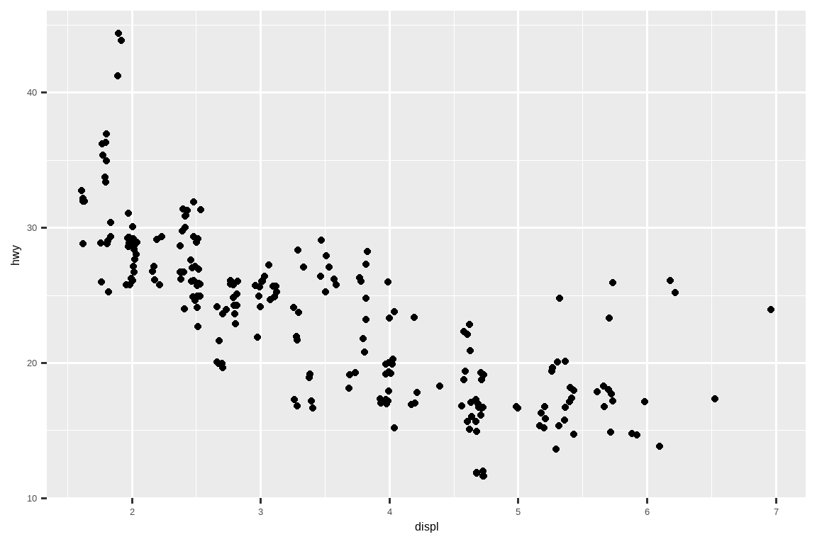
Adding randomness seems like a strange way to improve your plot, but while it makes your graph less accurate at small scales, it makes your graph more revealing at large scales. Because this is such a useful operation, ggplot2 comes with a shorthand for geom_point(position = "jitter"): geom_jitter().
增加随机性似乎是一种奇怪的改善图表的方式,但虽然它在小尺度上使你的图表不那么精确,但在大尺度上却使你的图表更具揭示性。因为这是一个非常有用的操作,ggplot2 为 geom_point(position = "jitter") 提供了一个简写:geom_jitter()。
To learn more about a position adjustment, look up the help page associated with each adjustment: ?position_dodge, ?position_fill, ?position_identity, ?position_jitter, and ?position_stack.
要了解有关位置调整的更多信息,请查阅与每个调整相关的帮助页面:?position_dodge、?position_fill、?position_identity、?position_jitter 和 ?position_stack。
9.6.1 Exercises
-
What is the problem with the following plot? How could you improve it?
ggplot(mpg, aes(x = cty, y = hwy)) + geom_point() -
What, if anything, is the difference between the two plots? Why?
ggplot(mpg, aes(x = displ, y = hwy)) +
  geom_point()
ggplot(mpg, aes(x = displ, y = hwy)) +
  geom_point(position = "identity")
What parameters to
geom_jitter()control the amount of jittering?Compare and contrast
geom_jitter()withgeom_count().What’s the default position adjustment for
geom_boxplot()? Create a visualization of thempgdataset that demonstrates it.
9.7 Coordinate systems
Coordinate systems are probably the most complicated part of ggplot2. The default coordinate system is the Cartesian coordinate system where the x and y positions act independently to determine the location of each point. There are two other coordinate systems that are occasionally helpful.
坐标系可能是 ggplot2 中最复杂的部分。默认的坐标系是笛卡尔坐标系,其中 x 和 y 的位置独立地决定每个点的位置。还有另外两个偶尔有用的坐标系。
-
coord_quickmap()sets the aspect ratio correctly for geographic maps. This is very important if you’re plotting spatial data with ggplot2. We don’t have the space to discuss maps in this book, but you can learn more in the Maps chapter of ggplot2: Elegant graphics for data analysis.nz <- map_data("nz") ggplot(nz, aes(x = long, y = lat, group = group)) + geom_polygon(fill = "white", color = "black") ggplot(nz, aes(x = long, y = lat, group = group)) + geom_polygon(fill = "white", color = "black") + coord_quickmap()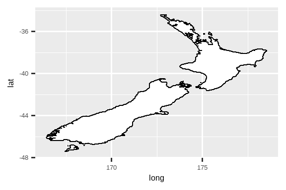
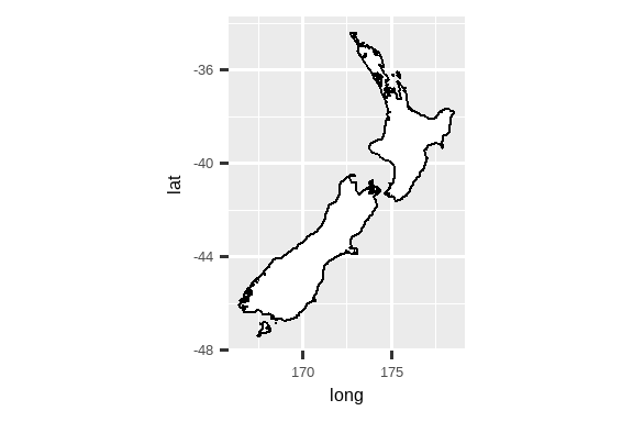
coord_quickmap()为地理地图正确设置长宽比。如果您正在使用 ggplot2 绘制空间数据,这一点非常重要。我们在这本书中没有篇幅讨论地图,但您可以在 ggplot2: Elegant graphics for data analysis 的地图章节中了解更多信息。-
coord_polar()uses polar coordinates. Polar coordinates reveal an interesting connection between a bar chart and a Coxcomb chart.bar <- ggplot(data = diamonds) + geom_bar( mapping = aes(x = clarity, fill = clarity), show.legend = FALSE, width = 1 ) + theme(aspect.ratio = 1) bar + coord_flip() bar + coord_polar()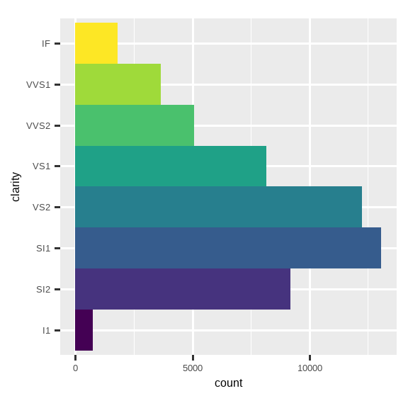
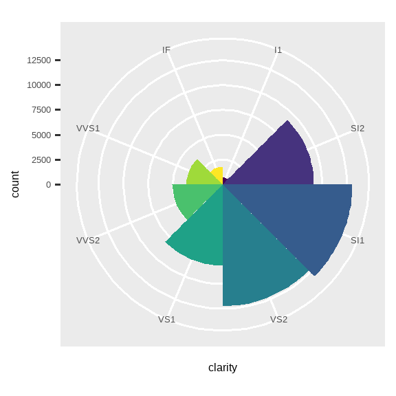
coord_polar()使用极坐标。极坐标揭示了条形图和南丁格尔玫瑰图 (Coxcomb chart) 之间一个有趣的联系。
9.7.1 Exercises
Turn a stacked bar chart into a pie chart using
coord_polar().What’s the difference between
coord_quickmap()andcoord_map()?-
What does the following plot tell you about the relationship between city and highway mpg? Why is
coord_fixed()important? What doesgeom_abline()do?ggplot(data = mpg, mapping = aes(x = cty, y = hwy)) + geom_point() + geom_abline() + coord_fixed()
9.8 The layered grammar of graphics
We can expand on the graphing template you learned in Section 1.3 by adding position adjustments, stats, coordinate systems, and faceting:
我们可以通过添加位置调整、统计变换、坐标系和分面,来扩展您在 Section 1.3 中学到的绘图模板:
ggplot(data = <DATA>) +
  <GEOM_FUNCTION>(
     mapping = aes(<MAPPINGS>),
     stat = <STAT>,
     position = <POSITION>
  ) +
  <COORDINATE_FUNCTION> +
  <FACET_FUNCTION>
Our new template takes seven parameters, the bracketed words that appear in the template. In practice, you rarely need to supply all seven parameters to make a graph because ggplot2 will provide useful defaults for everything except the data, the mappings, and the geom function.
我们的新模板有七个参数,即模板中出现的方括号内的词。在实践中,您很少需要提供所有七个参数来制作图表,因为 ggplot2 会为除了数据、映射和几何函数之外的所有内容提供有用的默认值。
The seven parameters in the template compose the grammar of graphics, a formal system for building plots. The grammar of graphics is based on the insight that you can uniquely describe any plot as a combination of a dataset, a geom, a set of mappings, a stat, a position adjustment, a coordinate system, a faceting scheme, and a theme.
模板中的七个参数构成了图形语法,这是一个用于构建绘图的正式系统。图形语法基于这样一个洞见:你可以将任何绘图唯一地描述为一个数据集、一个几何对象、一组映射、一个统计变换、一个位置调整、一个坐标系、一个分面方案和一个主题的组合。
To see how this works, consider how you could build a basic plot from scratch: you could start with a dataset and then transform it into the information that you want to display (with a stat). Next, you could choose a geometric object to represent each observation in the transformed data. You could then use the aesthetic properties of the geoms to represent variables in the data. You would map the values of each variable to the levels of an aesthetic. These steps are illustrated in Figure 9.3. You’d then select a coordinate system to place the geoms into, using the location of the objects (which is itself an aesthetic property) to display the values of the x and y variables.
为了理解这是如何工作的,可以考虑如何从头开始构建一个基本图表:你可以从一个数据集开始,然后(通过一个统计变换 stat)将其转换为你想要显示的信息。接下来,你可以选择一个几何对象来表示转换后数据中的每个观测值。然后,你可以使用几何对象的美学属性来表示数据中的变量。你会将每个变量的值映射到美学的一个层次上。这些步骤在 Figure 9.3 中有所说明。然后,你会选择一个坐标系来放置这些几何对象,利用对象的位置(其本身也是一个美学属性)来显示 x 和 y 变量的值。
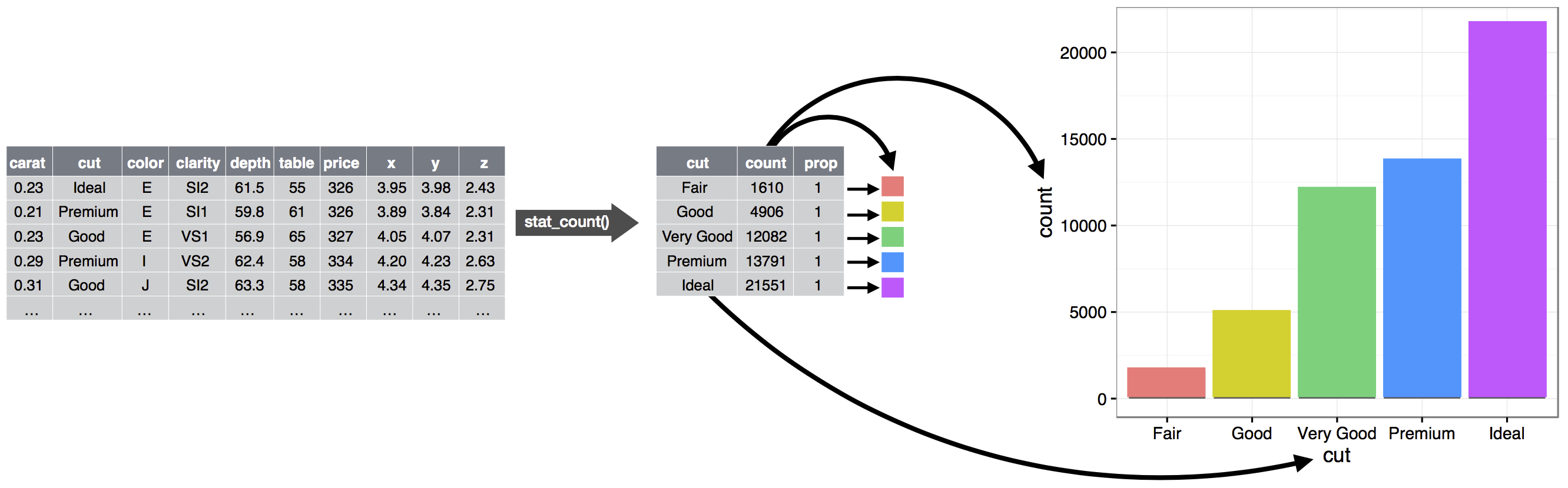
从原始数据到频率表,再到条形图的步骤,其中条形的高度代表频率。
At this point, you would have a complete graph, but you could further adjust the positions of the geoms within the coordinate system (a position adjustment) or split the graph into subplots (faceting). You could also extend the plot by adding one or more additional layers, where each additional layer uses a dataset, a geom, a set of mappings, a stat, and a position adjustment.
至此,你将得到一个完整的图形,但你可以进一步调整坐标系内几何对象的位置(位置调整),或将图形分割成子图(分面)。你还可以通过添加一个或多个附加图层来扩展该图,其中每个附加图层都使用一个数据集、一个几何对象、一组映射、一个统计变换和一个位置调整。
You could use this method to build any plot that you imagine. In other words, you can use the code template that you’ve learned in this chapter to build hundreds of thousands of unique plots.
你可以用这种方法构建你所能想象的任何图表。换句话说,你可以使用本章学到的代码模板来构建成千上万个独特的图表。
If you’d like to learn more about the theoretical underpinnings of ggplot2, you might enjoy reading “The Layered Grammar of Graphics”, the scientific paper that describes the theory of ggplot2 in detail.
如果你想深入了解 ggplot2 的理论基础,你可能会喜欢阅读《分层图形语法》,这篇科学论文详细描述了 ggplot2 的理论。
9.9 Summary
In this chapter you learned about the layered grammar of graphics starting with aesthetics and geometries to build a simple plot, facets for splitting the plot into subsets, statistics for understanding how geoms are calculated, position adjustments for controlling the fine details of position when geoms might otherwise overlap, and coordinate systems which allow you to fundamentally change what x and y mean. One layer we have not yet touched on is theme, which we will introduce in Section 11.5.
在本章中,你学习了分层图形语法,从美学和几何学开始构建一个简单的图,用分面将图分割成子集,用统计来理解几何对象的计算方式,用位置调整来控制几何对象可能重叠时的位置细节,以及用坐标系来从根本上改变 x 和 y 的含义。我们尚未涉及的一个图层是主题,我们将在 Section 11.5 中介绍它。
Two very useful resources for getting an overview of the complete ggplot2 functionality are the ggplot2 cheatsheet (which you can find at https://posit.co/resources/cheatsheets) and the ggplot2 package website (https://ggplot2.tidyverse.org).
要想全面了解 ggplot2 的功能,有两个非常有用的资源:ggplot2 速查表(你可以在 https://posit.co/resources/cheatsheets 找到)和 ggplot2 包的网站(https://ggplot2.tidyverse.org)。
An important lesson you should take from this chapter is that when you feel the need for a geom that is not provided by ggplot2, it’s always a good idea to look into whether someone else has already solved your problem by creating a ggplot2 extension package that offers that geom.
你应该从本章中学到的一个重要教训是,当你觉得需要一个 ggplot2 未提供的几何对象时,最好先去看看是否已经有人通过创建提供该几何对象的 ggplot2 扩展包解决了你的问题。