16 Factors
16.1 Introduction
Factors are used for categorical variables, variables that have a fixed and known set of possible values.
因子 (factor) 用于处理分类变量 (categorical variable),即取值范围是固定的、已知的有限集合的变量。
They are also useful when you want to display character vectors in a non-alphabetical order.
当你想要以非字母顺序显示字符向量时,因子也很有用。
We’ll start by motivating why factors are needed for data analysis1 and how you can create them with factor().
我们将首先阐述为何数据分析需要因子1,以及如何使用 factor() 函数创建它们。
We’ll then introduce you to the gss_cat dataset which contains a bunch of categorical variables to experiment with.
接着,我们将向你介绍 gss_cat 数据集,其中包含许多分类变量可供你进行实验。
You’ll then use that dataset to practice modifying the order and values of factors, before we finish up with a discussion of ordered factors.
然后,你将使用该数据集练习修改因子的顺序和值,最后我们将讨论有序因子 (ordered factor)。
16.1.1 Prerequisites
Base R provides some basic tools for creating and manipulating factors.
基础 R 提供了一些用于创建和操作因子的基本工具。
We’ll supplement these with the forcats package, which is part of the core tidyverse.
我们将使用 forcats 包作为补充,它是核心 tidyverse 的一部分。
It provides tools for dealing with categorical variables (and it’s an anagram of factors!) using a wide range of helpers for working with factors.
它提供了一系列处理分类 ( categorical ) 变量的工具 ( forcats 是 factors 的变位词!),包含了大量用于处理因子的辅助函数。
16.2 Factor basics
Imagine that you have a variable that records month:
想象一下,你有一个记录月份的变量:
x1 <- c("Dec", "Apr", "Jan", "Mar")Using a string to record this variable has two problems:
使用字符串来记录此变量存在两个问题:
-
There are only twelve possible months, and there’s nothing saving you from typos:
只有十二个可能的月份,但没有任何机制可以防止你输入错误:x2 <- c("Dec", "Apr", "Jam", "Mar") -
It doesn’t sort in a useful way:
它的排序方式没什么用:sort(x1) #> [1] "Apr" "Dec" "Jan" "Mar"
You can fix both of these problems with a factor.
你可以用因子来解决这两个问题。
To create a factor you must start by creating a list of the valid levels:
要创建一个因子,你必须首先创建一个有效水平 (levels) 的列表:
month_levels <- c(
  "Jan", "Feb", "Mar", "Apr", "May", "Jun",
  "Jul", "Aug", "Sep", "Oct", "Nov", "Dec"
)
Now you can create a factor:
现在你可以创建一个因子:
And any values not in the level will be silently converted to NA:
任何不在水平中的值都将被静默地转换为 NA:
y2 <- factor(x2, levels = month_levels)
y2
#> [1] Dec  Apr  <NA> Mar
#> Levels: Jan Feb Mar Apr May Jun Jul Aug Sep Oct Nov Dec
This seems risky, so you might want to use forcats::fct() instead:
这看起来有风险,所以你可能想改用 forcats::fct():
y2 <- fct(x2, levels = month_levels)
#> Error in `fct()`:
#> ! All values of `x` must appear in `levels` or `na`
#> ℹ Missing level: "Jam"
If you omit the levels, they’ll be taken from the data in alphabetical order:
如果你省略了水平 (levels),它们将按字母顺序从数据中提取:
factor(x1)
#> [1] Dec Apr Jan Mar
#> Levels: Apr Dec Jan Mar
Sorting alphabetically is slightly risky because not every computer will sort strings in the same way.
按字母顺序排序有点风险,因为并非每台计算机都以相同的方式对字符串进行排序。
So forcats::fct() orders by first appearance:
因此,forcats::fct() 会按照首次出现的顺序进行排序:
fct(x1)
#> [1] Dec Apr Jan Mar
#> Levels: Dec Apr Jan Mar
If you ever need to access the set of valid levels directly, you can do so with levels():
如果你需要直接访问有效的水平集合,可以使用 levels() 函数:
levels(y2)
#>  [1] "Jan" "Feb" "Mar" "Apr" "May" "Jun" "Jul" "Aug" "Sep" "Oct" "Nov" "Dec"
You can also create a factor when reading your data with readr with col_factor():
你也可以在使用 readr 读取数据时,通过 col_factor() 来创建因子:
csv <- "
month,value
Jan,12
Feb,56
Mar,12"

df <- read_csv(csv, col_types = cols(month = col_factor(month_levels)))
df$month
#> [1] Jan Feb Mar
#> Levels: Jan Feb Mar Apr May Jun Jul Aug Sep Oct Nov Dec16.4 Modifying factor order
It’s often useful to change the order of the factor levels in a visualization.
在可视化中,更改因子水平的顺序通常很有用。
For example, imagine you want to explore the average number of hours spent watching TV per day across religions:
例如,假设你想探究不同宗教每天看电视的平均小时数:
relig_summary <- gss_cat |>
  group_by(relig) |>
  summarize(
    tvhours = mean(tvhours, na.rm = TRUE),
    n = n()
  )

ggplot(relig_summary, aes(x = tvhours, y = relig)) +
  geom_point()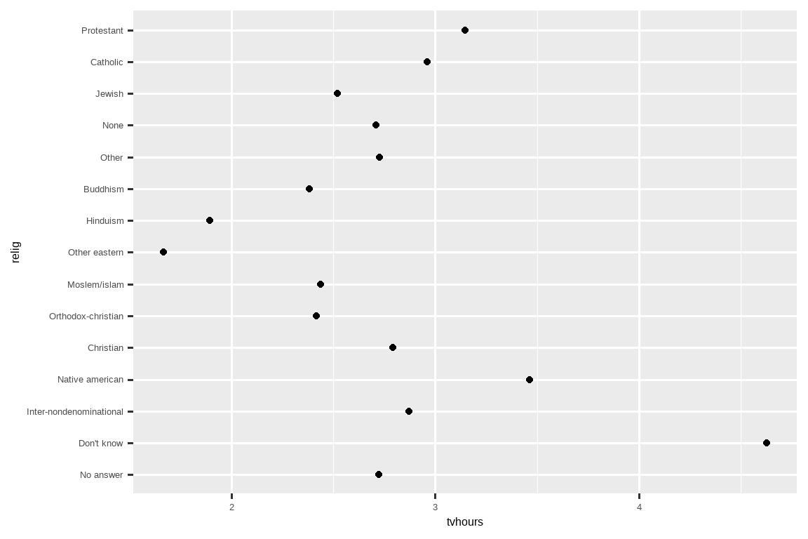
It is hard to read this plot because there’s no overall pattern.
这张图很难解读,因为没有明显的整体模式。
We can improve it by reordering the levels of relig using fct_reorder().
我们可以通过使用 fct_reorder() 重新排序 relig 的水平来改进它。
fct_reorder() takes three arguments:fct_reorder() 接受三个参数:
.f, the factor whose levels you want to modify.
.f, 你想要修改其水平的因子。.x, a numeric vector that you want to use to reorder the levels.
.x, 一个你想要用来重新排序水平的数值向量。Optionally,
.fun, a function that’s used if there are multiple values of.xfor each value of.f. The default value ismedian.
可选的 .fun, 一个函数,当 .f 的每个值对应多个 .x 值时使用。默认值为median。
ggplot(relig_summary, aes(x = tvhours, y = fct_reorder(relig, tvhours))) +
  geom_point()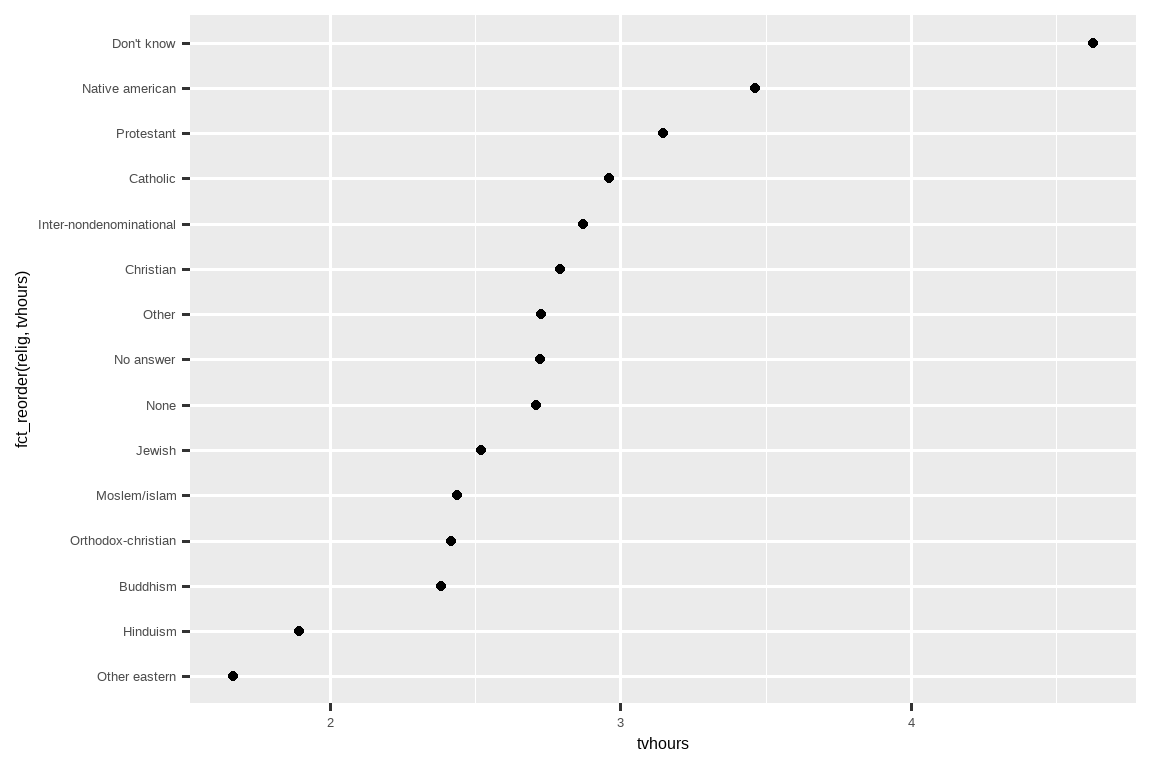
Reordering religion makes it much easier to see that people in the “Don’t know” category watch much more TV, and Hinduism & Other Eastern religions watch much less.
对宗教进行重新排序后,我们可以更容易地看出,“Don’t know” 类别的人看电视的时间要多得多,而印度教 (Hinduism) 和其他东方宗教 (Other Eastern religions) 的人看电视的时间则少得多。
As you start making more complicated transformations, we recommend moving them out of aes() and into a separate mutate() step.
当你开始进行更复杂的转换时,我们建议将它们从 aes() 中移出,放到一个单独的 mutate() 步骤中。
For example, you could rewrite the plot above as:
例如,你可以将上面的图重写为:
relig_summary |>
  mutate(
    relig = fct_reorder(relig, tvhours)
  ) |>
  ggplot(aes(x = tvhours, y = relig)) +
  geom_point()
What if we create a similar plot looking at how average age varies across reported income level?
如果我们创建一个类似的图,来观察平均年龄在不同报告收入水平上的变化情况,会怎么样?
rincome_summary <- gss_cat |>
  group_by(rincome) |>
  summarize(
    age = mean(age, na.rm = TRUE),
    n = n()
  )

ggplot(rincome_summary, aes(x = age, y = fct_reorder(rincome, age))) +
  geom_point()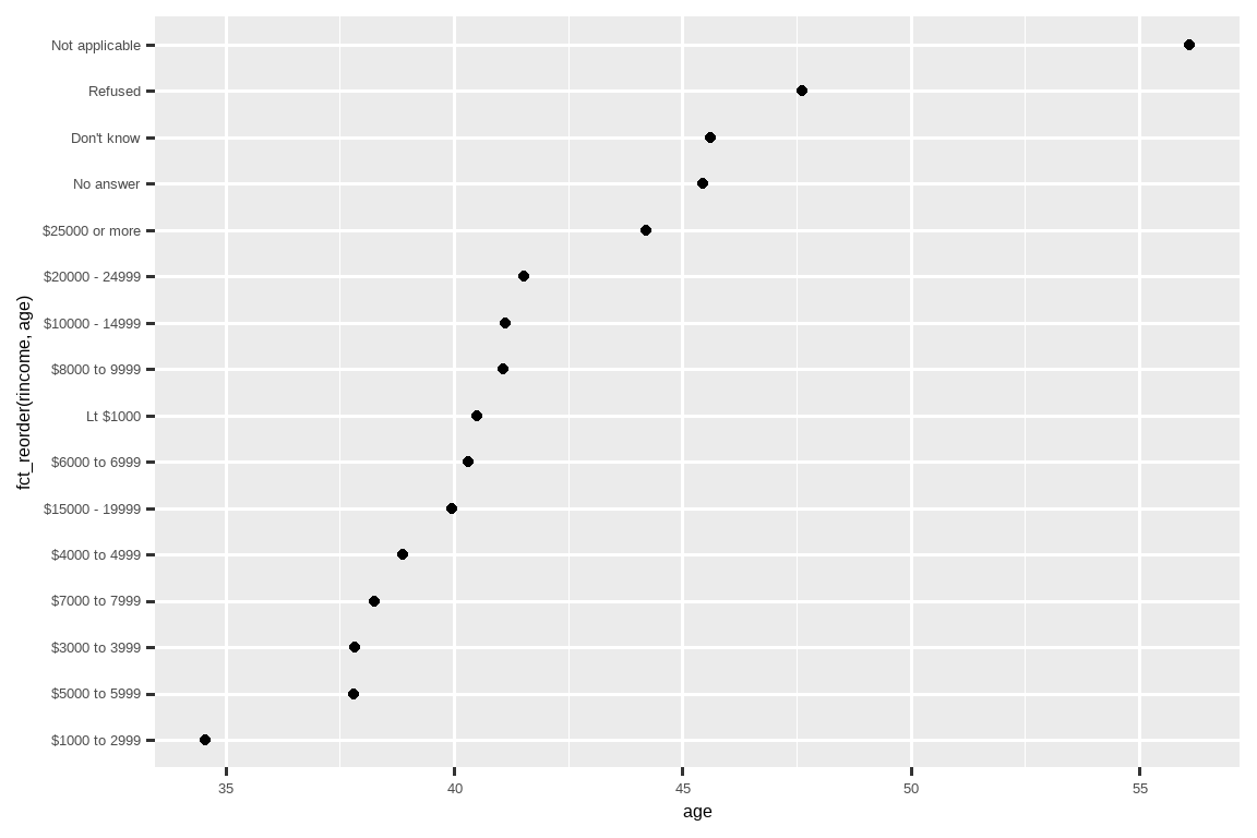
Here, arbitrarily reordering the levels isn’t a good idea!
在这里,任意地重新排序水平不是一个好主意!
That’s because rincome already has a principled order that we shouldn’t mess with.
这是因为 rincome 已经有了一个我们不应该打乱的原则性顺序。
Reserve fct_reorder() for factors whose levels are arbitrarily ordered.
请将 fct_reorder() 用于那些水平是任意排序的因子。
However, it does make sense to pull “Not applicable” to the front with the other special levels.
然而,将 “Not applicable” 和其他特殊水平一起移到最前面是合理的。
You can use fct_relevel().
你可以使用 fct_relevel()。
It takes a factor, .f, and then any number of levels that you want to move to the front of the line.
它接受一个因子 .f,以及任意数量你想要移动到最前面的水平。
ggplot(rincome_summary, aes(x = age, y = fct_relevel(rincome, "Not applicable"))) +
  geom_point()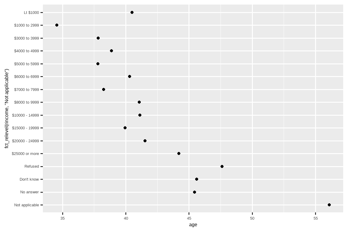
Why do you think the average age for “Not applicable” is so high?
你认为 “Not applicable” 的平均年龄为什么这么高?
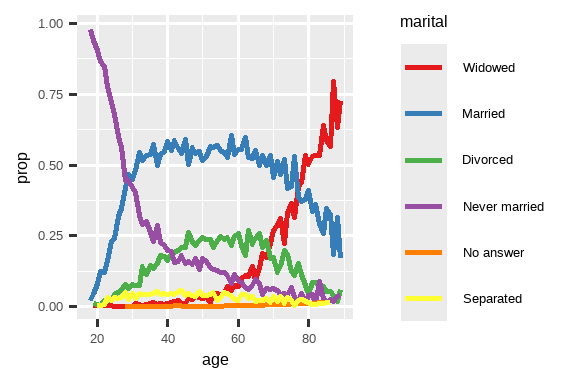
Another type of reordering is useful when you are coloring the lines on a plot.
当你在图上为线条着色时,另一种重排序也很有用。
fct_reorder2(.f, .x, .y) reorders the factor .f by the .y values associated with the largest .x values.fct_reorder2(.f, .x, .y) 会根据与最大 .x 值相关联的 .y 值来对因子 .f 进行重排序。
This makes the plot easier to read because the colors of the line at the far right of the plot will line up with the legend.
这使得图更容易阅读,因为图最右侧的线条颜色将与图例对齐。
by_age <- gss_cat |>
  filter(!is.na(age)) |>
  count(age, marital) |>
  group_by(age) |>
  mutate(
    prop = n / sum(n)
  )

ggplot(by_age, aes(x = age, y = prop, color = marital)) +
  geom_line(linewidth = 1) +
  scale_color_brewer(palette = "Set1")

ggplot(by_age, aes(x = age, y = prop, color = fct_reorder2(marital, age, prop))) +
  geom_line(linewidth = 1) +
  scale_color_brewer(palette = "Set1") +
  labs(color = "marital")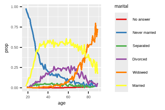
Finally, for bar plots, you can use fct_infreq() to order levels in decreasing frequency: this is the simplest type of reordering because it doesn’t need any extra variables.
最后,对于条形图,你可以使用 fct_infreq() 按频率递减的顺序排列水平:这是最简单的重排序类型,因为它不需要任何额外的变量。
Combine it with fct_rev() if you want them in increasing frequency so that in the bar plot largest values are on the right, not the left.
如果你希望它们按频率递增的顺序排列,以便在条形图中最大的值在右边而不是左边,可以将其与 fct_rev() 结合使用。
gss_cat |>
  mutate(marital = marital |> fct_infreq() |> fct_rev()) |>
  ggplot(aes(x = marital)) +
  geom_bar()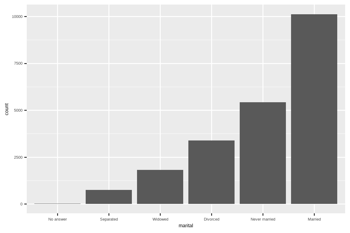
16.4.1 Exercises
There are some suspiciously high numbers in
tvhours. Is the mean a good summary?For each factor in
gss_catidentify whether the order of the levels is arbitrary or principled.Why did moving “Not applicable” to the front of the levels move it to the bottom of the plot?
16.5 Modifying factor levels
More powerful than changing the orders of the levels is changing their values.
比更改水平顺序更强大的是更改它们的值。
This allows you to clarify labels for publication, and collapse levels for high-level displays.
这可以让你为出版物澄清标签,并为高层次的展示折叠水平。
The most general and powerful tool is fct_recode().
最通用和最强大的工具是 fct_recode()。
It allows you to recode, or change, the value of each level.
它允许你重新编码 (recode),或更改每个水平的值。
For example, take the partyid variable from the gss_cat data frame:
例如,以 gss_cat 数据框中的 partyid 变量为例:
gss_cat |> count(partyid)
#> # A tibble: 10 × 2
#>   partyid                n
#>   <fct>              <int>
#> 1 No answer            154
#> 2 Don't know             1
#> 3 Other party          393
#> 4 Strong republican   2314
#> 5 Not str republican  3032
#> 6 Ind,near rep        1791
#> # ℹ 4 more rows
The levels are terse and inconsistent.
这些水平既简洁又不一致。
Let’s tweak them to be longer and use a parallel construction.
让我们调整它们,使其更长并使用并列结构。
Like most rename and recoding functions in the tidyverse, the new values go on the left and the old values go on the right:
像 tidyverse 中大多数重命名和重新编码的函数一样,新值在左边,旧值在右边:
gss_cat |>
  mutate(
    partyid = fct_recode(partyid,
      "Republican, strong"    = "Strong republican",
      "Republican, weak"      = "Not str republican",
      "Independent, near rep" = "Ind,near rep",
      "Independent, near dem" = "Ind,near dem",
      "Democrat, weak"        = "Not str democrat",
      "Democrat, strong"      = "Strong democrat"
    )
  ) |>
  count(partyid)
#> # A tibble: 10 × 2
#>   partyid                   n
#>   <fct>                 <int>
#> 1 No answer               154
#> 2 Don't know                1
#> 3 Other party             393
#> 4 Republican, strong     2314
#> 5 Republican, weak       3032
#> 6 Independent, near rep  1791
#> # ℹ 4 more rows
fct_recode() will leave the levels that aren’t explicitly mentioned as is, and will warn you if you accidentally refer to a level that doesn’t exist.fct_recode() 会保持未明确提及的水平不变,并且如果你意外引用了一个不存在的水平,它会发出警告。
To combine groups, you can assign multiple old levels to the same new level:
要合并组,你可以将多个旧水平分配给同一个新水平:
gss_cat |>
  mutate(
    partyid = fct_recode(partyid,
      "Republican, strong"    = "Strong republican",
      "Republican, weak"      = "Not str republican",
      "Independent, near rep" = "Ind,near rep",
      "Independent, near dem" = "Ind,near dem",
      "Democrat, weak"        = "Not str democrat",
      "Democrat, strong"      = "Strong democrat",
      "Other"                 = "No answer",
      "Other"                 = "Don't know",
      "Other"                 = "Other party"
    )
  )
Use this technique with care: if you group together categories that are truly different you will end up with misleading results.
请谨慎使用此技术:如果将真正不同的类别组合在一起,你将得到误导性的结果。
If you want to collapse a lot of levels, fct_collapse() is a useful variant of fct_recode().
如果你想折叠许多水平,fct_collapse() 是 fct_recode() 的一个有用变体。
For each new variable, you can provide a vector of old levels:
对于每个新变量,你可以提供一个旧水平的向量:
gss_cat |>
  mutate(
    partyid = fct_collapse(partyid,
      "other" = c("No answer", "Don't know", "Other party"),
      "rep" = c("Strong republican", "Not str republican"),
      "ind" = c("Ind,near rep", "Independent", "Ind,near dem"),
      "dem" = c("Not str democrat", "Strong democrat")
    )
  ) |>
  count(partyid)
#> # A tibble: 4 × 2
#>   partyid     n
#>   <fct>   <int>
#> 1 other     548
#> 2 rep      5346
#> 3 ind      8409
#> 4 dem      7180
Sometimes you just want to lump together the small groups to make a plot or table simpler.
有时你只是想把小的组合并在一起,使图表或表格更简单。
That’s the job of the fct_lump_*() family of functions.
这是 fct_lump_*() 系列函数的工作。
fct_lump_lowfreq() is a simple starting point that progressively lumps the smallest groups categories into “Other”, always keeping “Other” as the smallest category.fct_lump_lowfreq() 是一个简单的起点,它会逐步将最小的组类别合并到 “Other” 中,并始终保持 “Other” 是最小的类别。
gss_cat |>
  mutate(relig = fct_lump_lowfreq(relig)) |>
  count(relig)
#> # A tibble: 2 × 2
#>   relig          n
#>   <fct>      <int>
#> 1 Protestant 10846
#> 2 Other      10637
In this case it’s not very helpful: it is true that the majority of Americans in this survey are Protestant, but we’d probably like to see some more details!
在这种情况下,它不是很有用:确实,这项调查中的大多数美国人是新教徒 (Protestant),但我们可能想看到更多细节!
Instead, we can use the fct_lump_n() to specify that we want exactly 10 groups:
相反,我们可以使用 fct_lump_n() 来指定我们想要正好 10 个组:
gss_cat |>
  mutate(relig = fct_lump_n(relig, n = 10)) |>
  count(relig, sort = TRUE)
#> # A tibble: 10 × 2
#>   relig          n
#>   <fct>      <int>
#> 1 Protestant 10846
#> 2 Catholic    5124
#> 3 None        3523
#> 4 Christian    689
#> 5 Other        458
#> 6 Jewish       388
#> # ℹ 4 more rows
Read the documentation to learn about fct_lump_min() and fct_lump_prop() which are useful in other cases.
阅读文档以了解 fct_lump_min() 和 fct_lump_prop(),它们在其他情况下也很有用。
16.5.1 Exercises
How have the proportions of people identifying as Democrat, Republican, and Independent changed over time?
How could you collapse
rincomeinto a small set of categories?Notice there are 9 groups (excluding other) in the
fct_lumpexample above. Why not 10? (Hint: type?fct_lump, and find the default for the argumentother_levelis “Other”.)
16.6 Ordered factors
Before we continue, it’s important to briefly mention a special type of factor: ordered factors.
在继续之前,有必要简要提及一种特殊的因子:有序因子 (ordered factor)。
Created with the ordered() function, ordered factors imply a strict ordering between levels, but don’t specify anything about the magnitude of the differences between the levels.
有序因子是使用 ordered() 函数创建的,它意味着水平之间存在严格的排序,但没有指定水平之间差异的大小。
You use ordered factors when you know there the levels are ranked, but there’s no precise numerical ranking.
当你知道水平有排名但没有精确的数值排名时,就可以使用有序因子。
You can identify an ordered factor when its printed because it uses < symbols between the factor levels:
你可以通过打印输出来识别有序因子,因为它在因子水平之间使用了 < 符号:
In both base R and the tidyverse, ordered factors behave very similarly to regular factors.
在基础 R 和 tidyverse 中,有序因子的行为与常规因子非常相似。
There are only two places where you might notice different behavior:
只有在两个地方你可能会注意到不同的行为:
If you map an ordered factor to color or fill in ggplot2, it will default to
scale_color_viridis()/scale_fill_viridis(), a color scale that implies a ranking.
如果你在 ggplot2 中将有序因子映射到颜色或填充,它将默认为scale_color_viridis()/scale_fill_viridis(),这是一个暗示排名的色阶。If you use an ordered predictor in a linear model, it will use “polynomial contrasts”. These are mildly useful, but you are unlikely to have heard of them unless you have a PhD in Statistics, and even then you probably don’t routinely interpret them. If you want to learn more, we recommend
vignette("contrasts", package = "faux")by Lisa DeBruine.
如果你在线性模型中使用有序预测变量,它将使用“多项式对比” (polynomial contrasts)。这些有些用处,但除非你拥有统计学博士学位,否则你不太可能听说过它们,即使那样,你可能也不会常规地解释它们。如果你想了解更多,我们推荐 Lisa DeBruine 的vignette("contrasts", package = "faux")。
For the purposes of this book, correctly distinguishing between regular and ordered factors is not particularly important.
就本书而言,正确区分常规因子和有序因子并非特别重要。
More broadly, however, certain fields (particularly the social sciences) do use ordered factors extensively.
然而,在更广泛的范围内,某些领域(特别是社会科学)确实广泛使用有序因子。
In these contexts, it’s important to correctly identify them so that other analysis packages can offer the appropriate behavior.
在这些情况下,正确识别它们非常重要,以便其他分析包可以提供适当的行为。
16.7 Summary
This chapter introduced you to the handy forcats package for working with factors, introducing you to the most commonly used functions.
本章向你介绍了用于处理因子的便捷 forcats 包,并介绍了最常用的函数。
forcats contains a wide range of other helpers that we didn’t have space to discuss here, so whenever you’re facing a factor analysis challenge that you haven’t encountered before, I highly recommend skimming the reference index to see if there’s a canned function that can help solve your problem.
forcats 包含许多我们在此没有篇幅讨论的其他辅助函数,因此,当你遇到以前从未见过的因子分析挑战时,我强烈建议你浏览参考索引,看看是否有现成的函数可以帮助你解决问题。
If you want to learn more about factors after reading this chapter, we recommend reading Amelia McNamara and Nicholas Horton’s paper, Wrangling categorical data in R.
如果你在阅读本章后想了解更多关于因子的知识,我们建议阅读 Amelia McNamara 和 Nicholas Horton 的论文,Wrangling categorical data in R。
This paper lays out some of the history discussed in stringsAsFactors: An unauthorized biography and stringsAsFactors = <sigh>, and compares the tidy approaches to categorical data outlined in this book with base R methods.
该论文阐述了 stringsAsFactors: An unauthorized biography 和 stringsAsFactors = <sigh> 中讨论的一些历史,并比较了本书中概述的处理分类数据的整洁方法与基础 R 的方法。
An early version of the paper helped motivate and scope the forcats package; thanks Amelia & Nick!
该论文的早期版本帮助激发并确定了 forcats 包的范围;感谢 Amelia 和 Nick!
In the next chapter we’ll switch gears to start learning about dates and times in R.
在下一章中,我们将转换主题,开始学习 R 中的日期和时间。
Dates and times seem deceptively simple, but as you’ll soon see, the more you learn about them, the more complex they seem to get!
日期和时间看起来似乎很简单,但你很快就会发现,你对它们了解得越多,它们似乎就越复杂!
They’re also really important for modelling.↩︎