library(tidyverse)
#> ── Attaching core tidyverse packages ───────────────────── tidyverse 2.0.0 ──
#> ✔ dplyr     1.1.4     ✔ readr     2.1.5
#> ✔ forcats   1.0.0     ✔ stringr   1.5.1
#> ✔ ggplot2   3.5.2     ✔ tibble    3.3.0
#> ✔ lubridate 1.9.4     ✔ tidyr     1.3.1
#> ✔ purrr     1.0.4
#> ── Conflicts ─────────────────────────────────────── tidyverse_conflicts() ──
#> ✖ dplyr::filter() masks stats::filter()
#> ✖ dplyr::lag()    masks stats::lag()
#> ℹ Use the conflicted package (<http://conflicted.r-lib.org/>) to force all conflicts to become errors1 Data visualization
1.1 Introduction
“The simple graph has brought more information to the data analyst’s mind than any other device.” — John Tukey
“简单的图形给数据分析师带来的信息比任何其他设备都多。” — 约翰·图基 (John Tukey)
R has several systems for making graphs, but ggplot2 is one of the most elegant and most versatile. ggplot2 implements the grammar of graphics, a coherent system for describing and building graphs. With ggplot2, you can do more and faster by learning one system and applying it in many places.
R 有多个用于制作图形的系统,但 ggplot2 是其中最优雅、功能最全面的之一。ggplot2 实现了图形语法 (grammar of graphics),这是一个用于描述和构建图形的连贯系统。通过学习 ggplot2,你可以在许多地方应用这一系统,从而更快、更好地完成工作。
This chapter will teach you how to visualize your data using ggplot2. We will start by creating a simple scatterplot and use that to introduce aesthetic mappings and geometric objects – the fundamental building blocks of ggplot2. We will then walk you through visualizing distributions of single variables as well as visualizing relationships between two or more variables. We’ll finish off with saving your plots and troubleshooting tips.
本章将教你如何使用 ggplot2 来可视化你的数据。我们将从创建一个简单的散点图开始,并以此介绍美学映射 (aesthetic mappings) 和几何对象 (geometric objects)——它们是 ggplot2 的基本构建模块。然后,我们将引导你学习如何可视化单个变量的分布以及两个或多个变量之间的关系。最后,我们会介绍如何保存你的图形以及一些故障排除技巧。
1.1.1 Prerequisites
This chapter focuses on ggplot2, one of the core packages in the tidyverse. To access the datasets, help pages, and functions used in this chapter, load the tidyverse by running:
本章重点介绍 ggplot2,它是 tidyverse 中的核心包之一。要访问本章中使用的数据集、帮助页面和函数,请通过运行以下代码加载 tidyverse:
That one line of code loads the core tidyverse; the packages that you will use in almost every data analysis. It also tells you which functions from the tidyverse conflict with functions in base R (or from other packages you might have loaded)1.
这一行代码加载了 tidyverse 的核心包;这些包几乎在每次数据分析中都会用到。它还会告诉你 tidyverse 中的哪些函数与基础 R(或其他你可能已加载的包)中的函数存在冲突1。
If you run this code and get the error message there is no package called 'tidyverse', you’ll need to first install it, then run library() once again.
如果你运行此代码并收到错误消息 there is no package called 'tidyverse',你需要先安装它,然后再运行一次 library()。
install.packages("tidyverse")
library(tidyverse)
You only need to install a package once, but you need to load it every time you start a new session.
你只需要安装一个包一次,但每次开始新会话时都需要加载它。
In addition to tidyverse, we will also use the palmerpenguins package, which includes the penguins dataset containing body measurements for penguins on three islands in the Palmer Archipelago, and the ggthemes package, which offers a colorblind safe color palette.
除了 tidyverse,我们还将使用 palmerpenguins 包,其中包含了 penguins 数据集,该数据集包含帕默群岛三个岛屿上企鹅的身体测量数据;我们还会用到 ggthemes 包,它提供了一个色盲安全的调色板。
library(palmerpenguins)
#>
#> Attaching package: 'palmerpenguins'
#> The following objects are masked from 'package:datasets':
#>
#>     penguins, penguins_raw
library(ggthemes)
1.2 First steps
Do penguins with longer flippers weigh more or less than penguins with shorter flippers? You probably already have an answer, but try to make your answer precise. What does the relationship between flipper length and body mass look like? Is it positive? Negative? Linear? Nonlinear? Does the relationship vary by the species of the penguin? How about by the island where the penguin lives? Let’s create visualizations that we can use to answer these questions.
鳍状肢较长的企鹅比鳍状肢较短的企鹅重还是轻?你可能已经有了答案,但请尝试让你的答案更精确。鳍状肢长度和体重之间的关系是怎样的?是正相关?负相关?线性的?非线性的?这种关系是否因企鹅的种类而异?又是否因企鹅居住的岛屿而异?让我们创建可视化图表来回答这些问题。
1.2.1 The penguins data frame
You can test your answers to those questions with the penguins data frame found in palmerpenguins (a.k.a. palmerpenguins::penguins). A data frame is a rectangular collection of variables (in the columns) and observations (in the rows). penguins contains 344 observations collected and made available by Dr. Kristen Gorman and the Palmer Station, Antarctica LTER2.
你可以使用 palmerpenguins 包中的 penguins 数据框(也写作 palmerpenguins::penguins)来检验你对这些问题的回答。数据框是一个矩形集合,包含变量(在列中)和观测值(在行中)。penguins 数据集包含了 344 条观测数据,由 Kristen Gorman 博士和南极帕默站长期生态研究项目(LTER)收集并提供2。
To make the discussion easier, let’s define some terms:
为了让讨论更容易,我们来定义一些术语:
- A variable is a quantity, quality, or property that you can measure.
变量 (variable) 是你可以测量的数量、质量或属性。
- A value is the state of a variable when you measure it. The value of a variable may change from measurement to measurement.
值 (value) 是你在测量时一个变量的状态。一个变量的值可能在不同次测量中发生变化。
- An observation is a set of measurements made under similar conditions (you usually make all of the measurements in an observation at the same time and on the same object). An observation will contain several values, each associated with a different variable. We’ll sometimes refer to an observation as a data point.
观测 (observation) 是在相似条件下进行的一组测量(通常你会在同一时间对同一对象进行一次观测中的所有测量)。一次观测会包含几个值,每个值都与一个不同的变量相关联。我们有时也将一次观测称为一个数据点。
- Tabular data is a set of values, each associated with a variable and an observation. Tabular data is tidy if each value is placed in its own “cell”, each variable in its own column, and each observation in its own row.
表格数据 (Tabular data) 是一组值,每个值都与一个变量和一次观测相关联。如果每个值都放在自己的“单元格”中,每个变量在自己的列中,每个观测在自己的行中,那么这个表格数据就是整洁的。
In this context, a variable refers to an attribute of all the penguins, and an observation refers to all the attributes of a single penguin.
在此背景下,一个变量指的是所有企鹅的一个属性,而一个观测指的是单只企鹅的所有属性。
Type the name of the data frame in the console and R will print a preview of its contents. Note that it says tibble on top of this preview. In the tidyverse, we use special data frames called tibbles that you will learn more about soon.
在控制台中输入数据框的名称,R 将会打印其内容的预览。注意,在这个预览的顶部显示了 tibble。在 tidyverse 中,我们使用一种特殊的数据框,称为 tibbles,你很快就会学到更多关于它的知识。
penguins
#> # A tibble: 344 × 8
#>   species island    bill_length_mm bill_depth_mm flipper_length_mm
#>   <fct>   <fct>              <dbl>         <dbl>             <int>
#> 1 Adelie  Torgersen           39.1          18.7               181
#> 2 Adelie  Torgersen           39.5          17.4               186
#> 3 Adelie  Torgersen           40.3          18                 195
#> 4 Adelie  Torgersen           NA            NA                  NA
#> 5 Adelie  Torgersen           36.7          19.3               193
#> 6 Adelie  Torgersen           39.3          20.6               190
#> # ℹ 338 more rows
#> # ℹ 3 more variables: body_mass_g <int>, sex <fct>, year <int>
This data frame contains 8 columns. For an alternative view, where you can see all variables and the first few observations of each variable, use glimpse(). Or, if you’re in RStudio, run View(penguins) to open an interactive data viewer.
该数据框包含 8 列。若要查看另一种视图,即可以看到所有变量以及每个变量的前几个观测值,请使用 glimpse()。或者,如果你在 RStudio 中,运行 View(penguins) 可以打开一个交互式数据查看器。
glimpse(penguins)
#> Rows: 344
#> Columns: 8
#> $ species           <fct> Adelie, Adelie, Adelie, Adelie, Adelie, Adelie, A…
#> $ island            <fct> Torgersen, Torgersen, Torgersen, Torgersen, Torge…
#> $ bill_length_mm    <dbl> 39.1, 39.5, 40.3, NA, 36.7, 39.3, 38.9, 39.2, 34.…
#> $ bill_depth_mm     <dbl> 18.7, 17.4, 18.0, NA, 19.3, 20.6, 17.8, 19.6, 18.…
#> $ flipper_length_mm <int> 181, 186, 195, NA, 193, 190, 181, 195, 193, 190, …
#> $ body_mass_g       <int> 3750, 3800, 3250, NA, 3450, 3650, 3625, 4675, 347…
#> $ sex               <fct> male, female, female, NA, female, male, female, m…
#> $ year              <int> 2007, 2007, 2007, 2007, 2007, 2007, 2007, 2007, 2…
Among the variables in penguins are:penguins 数据框中的变量包括:
species: a penguin’s species (Adelie, Chinstrap, or Gentoo).species: 企鹅的种类(阿德利、帽带或金图)。flipper_length_mm: length of a penguin’s flipper, in millimeters.flipper_length_mm: 企鹅鳍状肢的长度,单位为毫米。body_mass_g: body mass of a penguin, in grams.body_mass_g: 企鹅的体重,单位为克。
To learn more about penguins, open its help page by running ?penguins.
要了解更多关于 penguins 的信息,运行 ?penguins 来打开它的帮助页面。
1.2.2 Ultimate goal
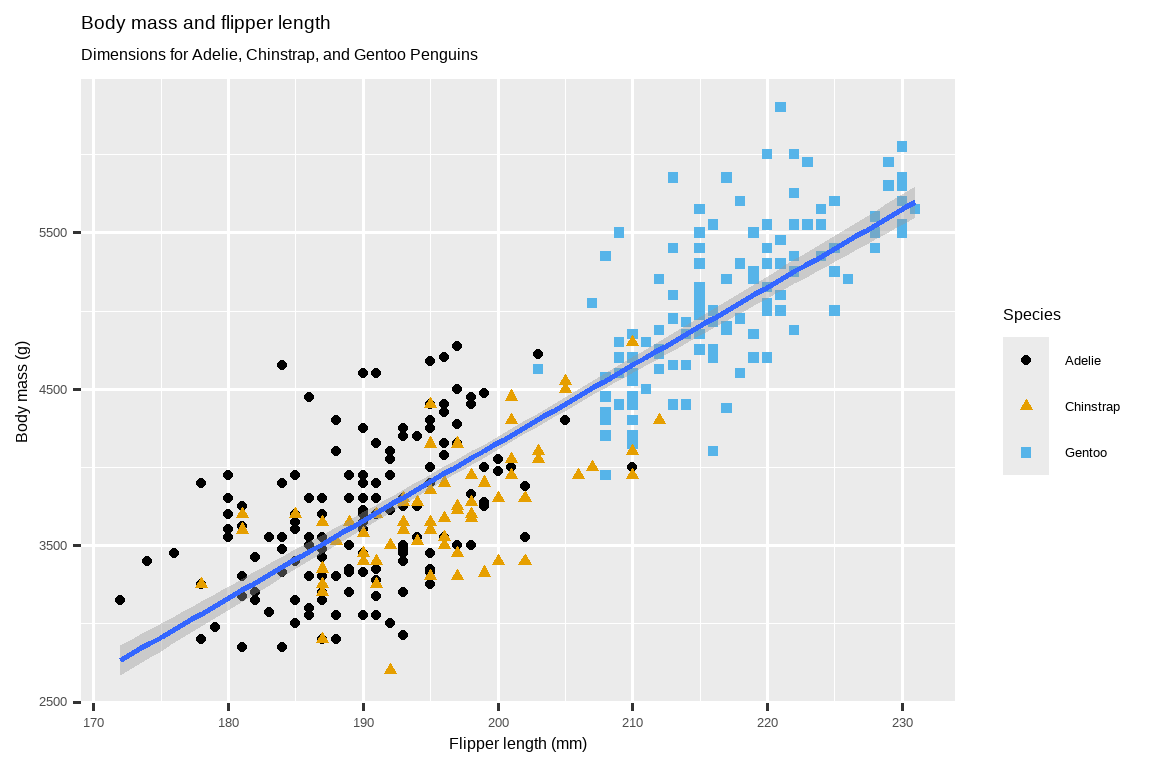
Our ultimate goal in this chapter is to recreate the following visualization displaying the relationship between flipper lengths and body masses of these penguins, taking into consideration the species of the penguin.
我们在本章的最终目标是重新创建以下可视化图表,该图表展示了这些企鹅的鳍状肢长度和体重之间的关系,同时考虑了企鹅的种类。
1.2.3 Creating a ggplot
Let’s recreate this plot step-by-step.
让我们一步步地重新创建这个图。
With ggplot2, you begin a plot with the function ggplot(), defining a plot object that you then add layers to. The first argument of ggplot() is the dataset to use in the graph and so ggplot(data = penguins) creates an empty graph that is primed to display the penguins data, but since we haven’t told it how to visualize it yet, for now it’s empty. This is not a very exciting plot, but you can think of it like an empty canvas you’ll paint the remaining layers of your plot onto.
使用 ggplot2 时,你通过 ggplot() 函数开始一个绘图,定义一个绘图对象,然后向其添加图层 (layers)。ggplot() 的第一个参数是要在图中使用的数据集,因此 ggplot(data = penguins) 会创建一个准备好显示 penguins 数据的空图,但由于我们还没有告诉它如何可视化这些数据,所以目前它还是空的。这虽然不是一个很激动人心的图,但你可以把它想象成一块空白的画布,你将在这上面绘制图的其余图层。
ggplot(data = penguins)
Next, we need to tell ggplot() how the information from our data will be visually represented. The mapping argument of the ggplot() function defines how variables in your dataset are mapped to visual properties (aesthetics) of your plot. The mapping argument is always defined in the aes() function, and the x and y arguments of aes() specify which variables to map to the x and y axes. For now, we will only map flipper length to the x aesthetic and body mass to the y aesthetic. ggplot2 looks for the mapped variables in the data argument, in this case, penguins.
接下来,我们需要告诉 ggplot() 如何将我们数据中的信息进行可视化表示。ggplot() 函数的 mapping 参数定义了你数据集中的变量如何映射到图的视觉属性(美学 (aesthetics))上。mapping 参数总是在 aes() 函数中定义,而 aes() 的 x 和 y 参数指定了将哪些变量映射到 x 轴和 y 轴。现在,我们只将鳍状肢长度映射到 x 美学,将体重映射到 y 美学。ggplot2 会在 data 参数(在这里是 penguins)中寻找被映射的变量。
The following plot shows the result of adding these mappings.
下面的图表展示了添加这些映射后的结果。
Our empty canvas now has more structure – it’s clear where flipper lengths will be displayed (on the x-axis) and where body masses will be displayed (on the y-axis). But the penguins themselves are not yet on the plot. This is because we have not yet articulated, in our code, how to represent the observations from our data frame on our plot.
我们空白的画布现在有了更多的结构——很清楚鳍状肢长度将显示在哪里(x 轴上),体重将显示在哪里(y 轴上)。但是企鹅本身还没有出现在图上。这是因为我们还没有在代码中明确说明如何将我们数据框中的观测值在图上表示出来。
To do so, we need to define a geom: the geometrical object that a plot uses to represent data. These geometric objects are made available in ggplot2 with functions that start with geom_. People often describe plots by the type of geom that the plot uses. For example, bar charts use bar geoms (geom_bar()), line charts use line geoms (geom_line()), boxplots use boxplot geoms (geom_boxplot()), scatterplots use point geoms (geom_point()), and so on.
为此,我们需要定义一个 几何对象 (geom):即图用来表示数据的几何对象。这些几何对象在 ggplot2 中通过以 geom_ 开头的函数提供。人们通常用图所使用的几何对象类型来描述图。例如,条形图使用条形几何对象 (geom_bar()),折线图使用线形几何对象 (geom_line()),箱线图使用箱线图几何对象 (geom_boxplot()),散点图使用点几何对象 (geom_point()) 等等。
The function geom_point() adds a layer of points to your plot, which creates a scatterplot. ggplot2 comes with many geom functions that each adds a different type of layer to a plot. You’ll learn a whole bunch of geoms throughout the book, particularly in Chapter 9.
函数 geom_point() 会在你的图上添加一个点图层,从而创建一个散点图。ggplot2 提供了许多几何函数,每个函数都会给图添加不同类型的图层。你将在本书中学习到许多几何对象,特别是在 Chapter 9 中。
ggplot(
  data = penguins,
  mapping = aes(x = flipper_length_mm, y = body_mass_g)
) +
geom_point()
#> Warning: Removed 2 rows containing missing values or values outside the scale range
#> (`geom_point()`).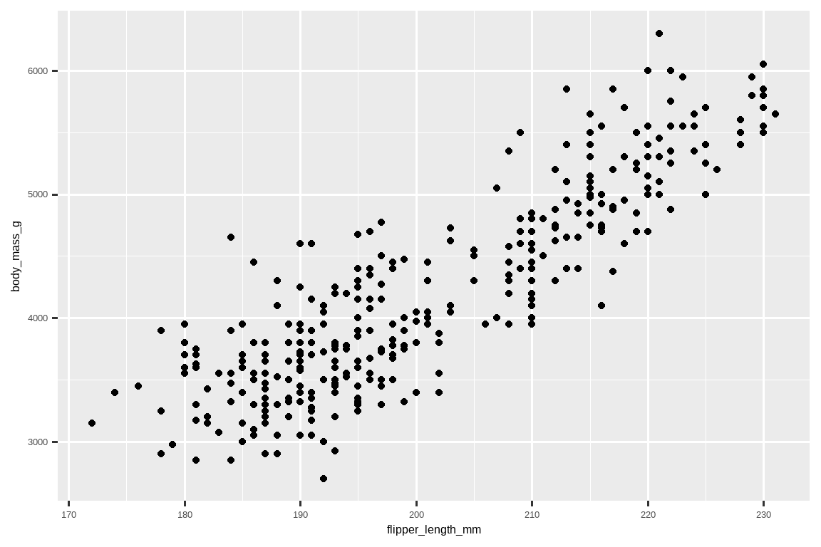
Now we have something that looks like what we might think of as a “scatterplot”. It doesn’t yet match our “ultimate goal” plot, but using this plot we can start answering the question that motivated our exploration: “What does the relationship between flipper length and body mass look like?” The relationship appears to be positive (as flipper length increases, so does body mass), fairly linear (the points are clustered around a line instead of a curve), and moderately strong (there isn’t too much scatter around such a line). Penguins with longer flippers are generally larger in terms of their body mass.
现在我们得到了一个看起来像是我们所认为的“散点图”的东西。它还不完全符合我们“最终目标”的图,但通过这张图,我们可以开始回答激发我们探索的问题:“鳍状肢长度和体重之间的关系是怎样的?” 这种关系看起来是正相关的(随着鳍状肢长度的增加,体重也增加),相当线性的(数据点聚集在一条直线周围而不是一条曲线),并且强度适中(围绕这条线的散点不多)。鳍状肢较长的企鹅通常体重也较重。
Before we add more layers to this plot, let’s pause for a moment and review the warning message we got:
在为这张图添加更多图层之前,让我们暂停一下,回顾一下我们收到的警告信息:
Removed 2 rows containing missing values (
geom_point()).
> 已移除 2 个包含缺失值的行 (geom_point()).
We’re seeing this message because there are two penguins in our dataset with missing body mass and/or flipper length values and ggplot2 has no way of representing them on the plot without both of these values. Like R, ggplot2 subscribes to the philosophy that missing values should never silently go missing. This type of warning is probably one of the most common types of warnings you will see when working with real data – missing values are a very common issue and you’ll learn more about them throughout the book, particularly in Chapter 18. For the remaining plots in this chapter we will suppress this warning so it’s not printed alongside every single plot we make.
我们看到这条消息是因为我们的数据集中有两只企鹅的体重和/或鳍状肢长度值缺失,而 ggplot2 在没有这两个值的情况下无法在图上表示它们。和 R 一样,ggplot2 也遵循这样的理念:缺失值不应该悄无声息地消失。这种类型的警告可能是你在处理真实数据时最常看到的警告之一——缺失值是一个非常普遍的问题,你将在本书中,特别是在 Chapter 18 中学到更多相关知识。对于本章中余下的图,我们将抑制此警告,这样它就不会在我们制作的每一张图旁边都打印出来。
1.2.4 Adding aesthetics and layers
Scatterplots are useful for displaying the relationship between two numerical variables, but it’s always a good idea to be skeptical of any apparent relationship between two variables and ask if there may be other variables that explain or change the nature of this apparent relationship. For example, does the relationship between flipper length and body mass differ by species? Let’s incorporate species into our plot and see if this reveals any additional insights into the apparent relationship between these variables.
散点图对于展示两个数值变量之间的关系很有用,但对两个变量之间的任何明显关系持怀疑态度总是一个好主意,并且应该探究是否还有其他变量可以解释或改变这种明显关系的性质。例如,鳍状肢长度和体重之间的关系是否因物种而异?让我们将物种纳入我们的图中,看看这是否能揭示关于这些变量之间明显关系的更多见解。
To achieve this, will we need to modify the aesthetic or the geom? If you guessed “in the aesthetic mapping, inside of aes()”, you’re already getting the hang of creating data visualizations with ggplot2! And if not, don’t worry. Throughout the book you will make many more ggplots and have many more opportunities to check your intuition as you make them.
为了实现这一点,我们需要修改美学还是几何对象?如果你猜的是“在美学映射中,即 aes() 内部”,那么你已经开始掌握用 ggplot2 创建数据可视化的窍门了!如果没猜对,也别担心。在本书中,你将制作更多的 ggplot 图,并在制作过程中有更多机会来检验你的直觉。
ggplot(
  data = penguins,
  mapping = aes(x = flipper_length_mm, y = body_mass_g, color = species)
) +
  geom_point()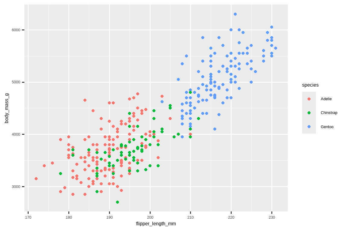
When a categorical variable is mapped to an aesthetic, ggplot2 will automatically assign a unique value of the aesthetic (here a unique color) to each unique level of the variable (each of the three species), a process known as scaling. ggplot2 will also add a legend that explains which values correspond to which levels.
当一个分类变量被映射到一个美学上时,ggplot2 会自动为该变量的每个唯一水平(这里是三个物种中的每一个)分配一个该美学的唯一值(这里是唯一的颜色),这个过程称为标度变换 (scaling)。ggplot2 还会添加一个图例,解释哪些值对应哪些水平。
Now let’s add one more layer: a smooth curve displaying the relationship between body mass and flipper length. Before you proceed, refer back to the code above, and think about how we can add this to our existing plot.
现在我们再加一个图层:一条平滑曲线,用于显示体重和鳍状肢长度之间的关系。在继续之前,请回顾上面的代码,并思考我们如何将这个图层添加到现有的图中。
Since this is a new geometric object representing our data, we will add a new geom as a layer on top of our point geom: geom_smooth(). And we will specify that we want to draw the line of best fit based on a linear model with method = "lm".
由于这是一个代表我们数据的新的几何对象,我们将在点几何对象之上添加一个新的几何对象图层:geom_smooth()。并且我们将指定我们希望基于一个线性模型(linear model)来绘制最佳拟合线,即设置 method = "lm"。
ggplot(
  data = penguins,
  mapping = aes(x = flipper_length_mm, y = body_mass_g, color = species)
) +
  geom_point() +
  geom_smooth(method = "lm")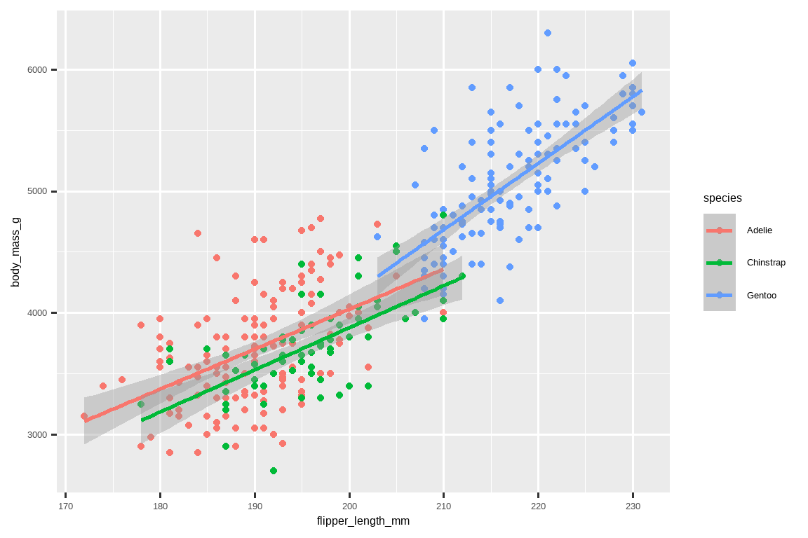
We have successfully added lines, but this plot doesn’t look like the plot from Section 1.2.2, which only has one line for the entire dataset as opposed to separate lines for each of the penguin species.
我们成功地添加了线,但这张图看起来不像 Section 1.2.2 中的那张图,那张图只有一条贯穿整个数据集的线,而不是为每种企鹅都画一条单独的线。
When aesthetic mappings are defined in ggplot(), at the global level, they’re passed down to each of the subsequent geom layers of the plot. However, each geom function in ggplot2 can also take a mapping argument, which allows for aesthetic mappings at the local level that are added to those inherited from the global level. Since we want points to be colored based on species but don’t want the lines to be separated out for them, we should specify color = species for geom_point() only.
当美学映射在 ggplot() 中定义时,即在全局层面,它们会被传递给图中后续的每个几何对象图层。然而,ggplot2 中的每个几何函数也可以接受一个 mapping 参数,这允许在局部层面进行美学映射,这些映射会添加到从全局层面继承的映射之上。因为我们希望点根据物种着色,但不希望线也因此分开,所以我们应该只为 geom_point() 指定 color = species。
ggplot(
  data = penguins,
  mapping = aes(x = flipper_length_mm, y = body_mass_g)
) +
  geom_point(mapping = aes(color = species)) +
  geom_smooth(method = "lm")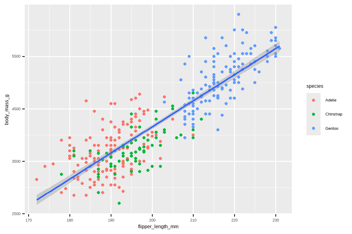
Voila! We have something that looks very much like our ultimate goal, though it’s not yet perfect. We still need to use different shapes for each species of penguins and improve labels.
瞧!我们得到了一个非常接近我们最终目标的图,尽管还不完美。我们还需要为每种企鹅使用不同的形状,并改进标签。
It’s generally not a good idea to represent information using only colors on a plot, as people perceive colors differently due to color blindness or other color vision differences. Therefore, in addition to color, we can also map species to the shape aesthetic.
通常来说,在图上仅用颜色来表示信息不是一个好主意,因为由于色盲或其他色觉差异,人们对颜色的感知是不同的。因此,除了颜色,我们还可以将 species 映射到 shape 美学上。
ggplot(
  data = penguins,
  mapping = aes(x = flipper_length_mm, y = body_mass_g)
) +
  geom_point(mapping = aes(color = species, shape = species)) +
  geom_smooth(method = "lm")
Note that the legend is automatically updated to reflect the different shapes of the points as well.
请注意,图例也会自动更新,以反映点的不同形状。
And finally, we can improve the labels of our plot using the labs() function in a new layer. Some of the arguments to labs() might be self explanatory: title adds a title and subtitle adds a subtitle to the plot. Other arguments match the aesthetic mappings, x is the x-axis label, y is the y-axis label, and color and shape define the label for the legend. In addition, we can improve the color palette to be colorblind safe with the scale_color_colorblind() function from the ggthemes package.
最后,我们可以通过在一个新图层中使用 labs() 函数来改进我们图的标签。labs() 的一些参数可能是不言自明的:title 为图添加一个标题,subtitle 添加一个副标题。其他参数与美学映射相对应,x 是 x 轴的标签,y 是 y 轴的标签,而 color 和 shape 定义了图例的标签。此外,我们可以使用 ggthemes 包中的 scale_color_colorblind() 函数来改进调色板,使其对色盲友好。
ggplot(
  data = penguins,
  mapping = aes(x = flipper_length_mm, y = body_mass_g)
) +
  geom_point(aes(color = species, shape = species)) +
  geom_smooth(method = "lm") +
  labs(
    title = "Body mass and flipper length",
    subtitle = "Dimensions for Adelie, Chinstrap, and Gentoo Penguins",
    x = "Flipper length (mm)", y = "Body mass (g)",
    color = "Species", shape = "Species"
  ) +
  scale_color_colorblind()
We finally have a plot that perfectly matches our “ultimate goal”!
我们终于得到了一个与我们的“最终目标”完全匹配的图!
1.2.5 Exercises
How many rows are in
penguins? How many columns?penguins数据框中有多少行?多少列?What does the
bill_depth_mmvariable in thepenguinsdata frame describe? Read the help for?penguinsto find out.penguins数据框中的bill_depth_mm变量描述了什么?阅读?penguins的帮助文档来找出答案。Make a scatterplot of
bill_depth_mmvs.bill_length_mm. That is, make a scatterplot withbill_depth_mmon the y-axis andbill_length_mmon the x-axis. Describe the relationship between these two variables.
制作一个bill_depth_mm对bill_length_mm的散点图。也就是说,制作一个以bill_depth_mm为 y 轴,bill_length_mm为 x 轴的散点图。描述这两个变量之间的关系。What happens if you make a scatterplot of
speciesvs.bill_depth_mm? What might be a better choice of geom?
如果你制作一个species对bill_depth_mm的散点图会发生什么?什么可能是更好的几何对象选择?-
Why does the following give an error and how would you fix it?
为什么下面的代码会报错?你将如何修复它?ggplot(data = penguins) + geom_point() What does the
na.rmargument do ingeom_point()? What is the default value of the argument? Create a scatterplot where you successfully use this argument set toTRUE.
geom_point()中的na.rm参数有什么作用?该参数的默认值是什么?创建一个散点图,在其中成功地将此参数设置为TRUE`。Add the following caption to the plot you made in the previous exercise: “Data come from the palmerpenguins package.” Hint: Take a look at the documentation for
labs().
在你上一个练习中制作的图上添加以下标题:“数据来自 palmerpenguins 包。” 提示:查看labs()的文档。-
Recreate the following visualization. What aesthetic should
bill_depth_mmbe mapped to? And should it be mapped at the global level or at the geom level?
重新创建以下可视化图。bill_depth_mm应该映射到哪个美学上?它应该在全局层面还是在几何对象层面进行映射?ggplot(data = penguins, mapping = aes(x = flipper_length_mm, y = body_mass_g)) + geom_point(aes(color = bill_depth_mm)) + geom_smooth() #> `geom_smooth()` using method = 'loess' and formula = 'y ~ x' #> Warning: Removed 2 rows containing non-finite outside the scale range #> (`stat_smooth()`). #> Warning: Removed 2 rows containing missing values or values outside the scale range #> (`geom_point()`).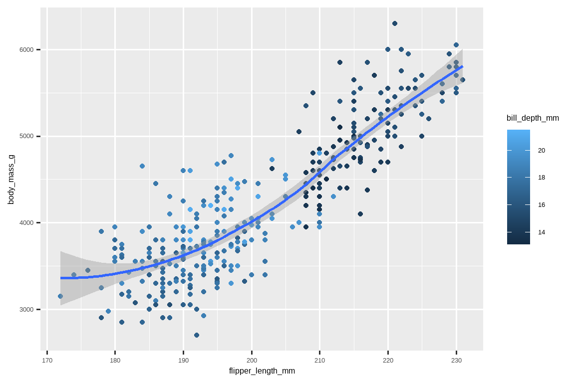
-
Run this code in your head and predict what the output will look like. Then, run the code in R and check your predictions.
在脑海中运行这段代码,并预测输出会是什么样子。然后,在 R 中运行代码并检查你的预测。ggplot( data = penguins, mapping = aes(x = flipper_length_mm, y = body_mass_g, color = island) ) + geom_point() + geom_smooth(se = FALSE) Will these two graphs look different? Why/why not? 这两张图看起来会有所不同吗?为什么/为什么不?
::: {.cell}

```{.r .cell-code}
ggplot(
  data = penguins,
  mapping = aes(x = flipper\_length\_mm, y = body\_mass\_g)
) +
  geom\_point() +
  geom\_smooth()

ggplot() +
  geom\_point(
    data = penguins,
    mapping = aes(x = flipper\_length\_mm, y = body\_mass\_g)
  ) +
  geom\_smooth(
    data = penguins,
    mapping = aes(x = flipper\_length\_mm, y = body\_mass\_g)
  )
```
:::
1.3 ggplot2 calls
As we move on from these introductory sections, we’ll transition to a more concise expression of ggplot2 code. So far we’ve been very explicit, which is helpful when you are learning:
随着我们从这些介绍性章节继续前进,我们将转向一种更简洁的 ggplot2 代码表达方式。到目前为止,我们一直非常明确,这在学习时很有帮助:
ggplot(
  data = penguins,
  mapping = aes(x = flipper_length_mm, y = body_mass_g)
) +
  geom_point()
Typically, the first one or two arguments to a function are so important that you should know them by heart. The first two arguments to ggplot() are data and mapping, in the remainder of the book, we won’t supply those names. That saves typing, and, by reducing the amount of extra text, makes it easier to see what’s different between plots. That’s a really important programming concern that we’ll come back to in Chapter 25.
通常,函数的前一两个参数非常重要,你应该熟记于心。ggplot() 的前两个参数是 data 和 mapping,在本书的其余部分,我们将不再提供这些名称。这样可以节省打字时间,并且通过减少额外的文本量,更容易看出图与图之间的区别。这是一个非常重要的编程考量,我们将在 Chapter 25 中再次讨论。
Rewriting the previous plot more concisely yields:
更简洁地重写之前的图会得到:
ggplot(penguins, aes(x = flipper_length_mm, y = body_mass_g)) +
  geom_point()
In the future, you’ll also learn about the pipe, |>, which will allow you to create that plot with:
将来,你还会学到管道符 |>,它将允许你用以下方式创建该图:
penguins |>
  ggplot(aes(x = flipper_length_mm, y = body_mass_g)) +
  geom_point()
1.4 Visualizing distributions
How you visualize the distribution of a variable depends on the type of variable: categorical or numerical.
如何可视化一个变量的分布,取决于该变量的类型:是分类变量还是数值变量。
1.4.1 A categorical variable
A variable is categorical if it can only take one of a small set of values. To examine the distribution of a categorical variable, you can use a bar chart. The height of the bars displays how many observations occurred with each x value.
如果一个变量只能取一小组值中的一个,那么它就是分类 (categorical) 变量。要检查分类变量的分布,你可以使用条形图。条形的高度显示了每个 x 值出现了多少次观测。
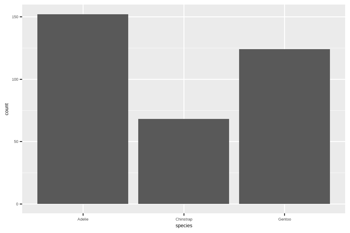
In bar plots of categorical variables with non-ordered levels, like the penguin species above, it’s often preferable to reorder the bars based on their frequencies. Doing so requires transforming the variable to a factor (how R handles categorical data) and then reordering the levels of that factor.
在处理具有无序水平的分类变量的条形图时,比如上面的企鹅 species,通常最好根据它们的频率对条形进行重新排序。这样做需要将变量转换为因子(R 处理分类数据的方式),然后重新排列该因子的水平。
ggplot(penguins, aes(x = fct_infreq(species))) +
  geom_bar()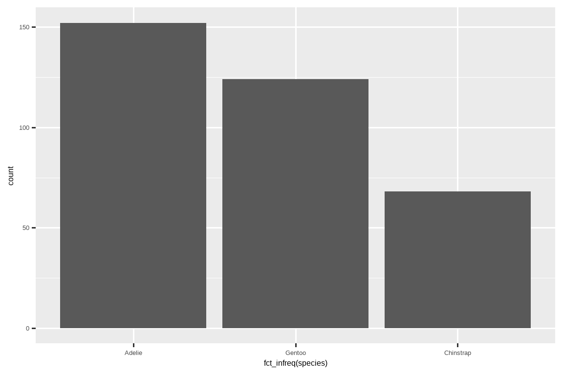
You will learn more about factors and functions for dealing with factors (like fct_infreq() shown above) in Chapter 16.
你将在 Chapter 16 中学习更多关于因子以及处理因子的函数(如上面展示的 fct_infreq())的知识。
1.4.2 A numerical variable
A variable is numerical (or quantitative) if it can take on a wide range of numerical values, and it is sensible to add, subtract, or take averages with those values. Numerical variables can be continuous or discrete.
如果一个变量可以取广泛的数值,并且对这些值进行加、减或求平均是有意义的,那么它就是数值 (numerical)(或定量)变量。数值变量可以是连续的或离散的。
One commonly used visualization for distributions of continuous variables is a histogram.
一种常用于可视化连续变量分布的图是直方图。
ggplot(penguins, aes(x = body_mass_g)) +
  geom_histogram(binwidth = 200)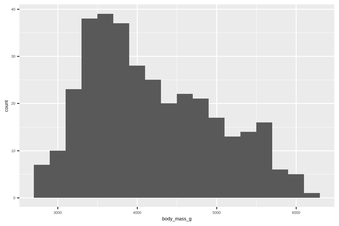
A histogram divides the x-axis into equally spaced bins and then uses the height of a bar to display the number of observations that fall in each bin. In the graph above, the tallest bar shows that 39 observations have a body_mass_g value between 3,500 and 3,700 grams, which are the left and right edges of the bar.
直方图将 x 轴划分为等宽的区间(bins),然后用条形的高度来显示落入每个区间的观测数量。在上图中,最高的条形显示有 39 个观测的 body_mass_g 值在 3,500 到 3,700 克之间,这分别是该条形的左右边界。
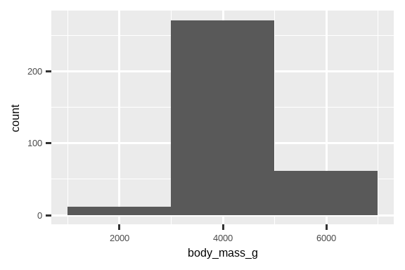
You can set the width of the intervals in a histogram with the binwidth argument, which is measured in the units of the x variable. You should always explore a variety of binwidths when working with histograms, as different binwidths can reveal different patterns. In the plots below a binwidth of 20 is too narrow, resulting in too many bars, making it difficult to determine the shape of the distribution. Similarly, a binwidth of 2,000 is too high, resulting in all data being binned into only three bars, and also making it difficult to determine the shape of the distribution. A binwidth of 200 provides a sensible balance.
你可以使用 binwidth 参数来设置直方图中区间的宽度,该宽度以 x 变量的单位来衡量。在使用直方图时,你应该总是尝试不同的区间宽度,因为不同的宽度可能会揭示出不同的模式。在下面的图中,20 的区间宽度太窄,导致条形过多,难以确定分布的形状。同样,2000 的区间宽度太高,导致所有数据只被分到三个条形中,也使得确定分布的形状变得困难。200 的区间宽度提供了一个合理的平衡。
ggplot(penguins, aes(x = body_mass_g)) +
  geom_histogram(binwidth = 20)
ggplot(penguins, aes(x = body_mass_g)) +
  geom_histogram(binwidth = 2000)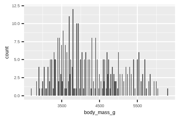
An alternative visualization for distributions of numerical variables is a density plot. A density plot is a smoothed-out version of a histogram and a practical alternative, particularly for continuous data that comes from an underlying smooth distribution. We won’t go into how geom_density() estimates the density (you can read more about that in the function documentation), but let’s explain how the density curve is drawn with an analogy. Imagine a histogram made out of wooden blocks. Then, imagine that you drop a cooked spaghetti string over it. The shape the spaghetti will take draped over blocks can be thought of as the shape of the density curve. It shows fewer details than a histogram but can make it easier to quickly glean the shape of the distribution, particularly with respect to modes and skewness.
数值变量分布的另一种可视化方法是密度图。密度图是直方图的平滑版本,是一种实用的替代方案,尤其适用于来自底层平滑分布的连续数据。我们不会深入探讨 geom_density() 如何估计密度(你可以在函数文档中了解更多信息),但让我们用一个类比来解释密度曲线是如何绘制的。想象一个由木块组成的直方图。然后,想象你把一根煮熟的意大利面条扔在它上面。意大利面条搭在木块上形成的形状可以被看作是密度曲线的形状。它比直方图显示的细节少,但可以更容易地快速了解分布的形状,特别是在众数和偏度方面。
ggplot(penguins, aes(x = body_mass_g)) +
  geom_density()
#> Warning: Removed 2 rows containing non-finite outside the scale range
#> (`stat_density()`).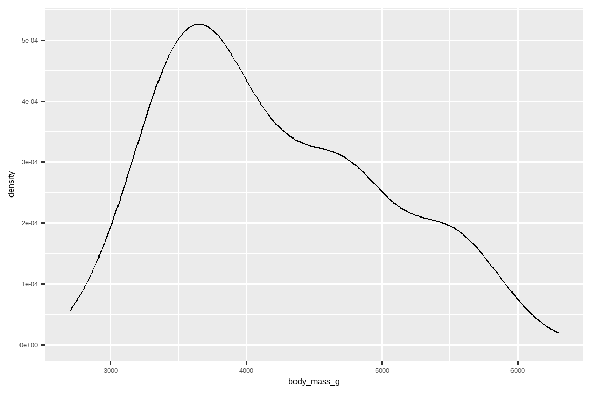
1.4.3 Exercises
Make a bar plot of
speciesofpenguins, where you assignspeciesto theyaesthetic. How is this plot different?
制作一个penguins中species的条形图,其中你将species赋给y美学。这个图有什么不同?-
How are the following two plots different? Which aesthetic,
colororfill, is more useful for changing the color of bars?
下面这两个图有什么不同?哪个美学,color还是fill,对于改变条形的颜色更有用?ggplot(penguins, aes(x = species)) + geom\_bar(color = "red") ggplot(penguins, aes(x = species)) + geom\_bar(fill = "red") What does the
binsargument ingeom_histogram()do?geom_histogram()中的bins参数有什么作用?Make a histogram of the
caratvariable in thediamondsdataset that is available when you load the tidyverse package. Experiment with different binwidths. What binwidth reveals the most interesting patterns?
制作一个diamonds数据集中carat变量的直方图,该数据集在加载 tidyverse 包时可用。尝试不同的区间宽度。哪个区间宽度揭示了最有趣的模式?
1.5 Visualizing relationships
To visualize a relationship we need to have at least two variables mapped to aesthetics of a plot. In the following sections you will learn about commonly used plots for visualizing relationships between two or more variables and the geoms used for creating them.
要可视化一个关系,我们需要将至少两个变量映射到图的美学上。在接下来的部分,你将学习到常用于可视化两个或多个变量之间关系的图,以及用于创建它们的几何对象。
1.5.1 A numerical and a categorical variable
To visualize the relationship between a numerical and a categorical variable we can use side-by-side box plots. A boxplot is a type of visual shorthand for measures of position (percentiles) that describe a distribution. It is also useful for identifying potential outliers. As shown in Figure 1.1, each boxplot consists of:
为了可视化数值变量和分类变量之间的关系,我们可以使用并排的箱线图。箱线图 (boxplot) 是一种描述分布位置度量(百分位数)的视觉简写。它对于识别潜在的异常值也很有用。如 Figure 1.1 所示,每个箱线图都由以下几部分组成:
- A box that indicates the range of the middle half of the data, a distance known as the interquartile range (IQR), stretching from the 25th percentile of the distribution to the 75th percentile. In the middle of the box is a line that displays the median, i.e. 50th percentile, of the distribution. These three lines give you a sense of the spread of the distribution and whether or not the distribution is symmetric about the median or skewed to one side.
- 一个箱体,表示数据中间一半的范围,这个距离被称为四分位距 (IQR),从分布的第 25 百分位数延伸到第 75 百分位数。箱体中间有一条线,显示分布的中位数,即第 50 百分位数。这三条线让你了解分布的离散程度以及分布是否关于中位数对称或偏向一侧。
- Visual points that display observations that fall more than 1.5 times the IQR from either edge of the box. These outlying points are unusual so are plotted individually.
- 显示离箱体任一边缘超过 1.5 倍 IQR 的观测值的视觉点。这些离群点是不寻常的,所以被单独绘制出来。
- A line (or whisker) that extends from each end of the box and goes to the farthest non-outlier point in the distribution.
- 从箱体两端延伸出的线(或须),一直延伸到分布中最远的非离群点。
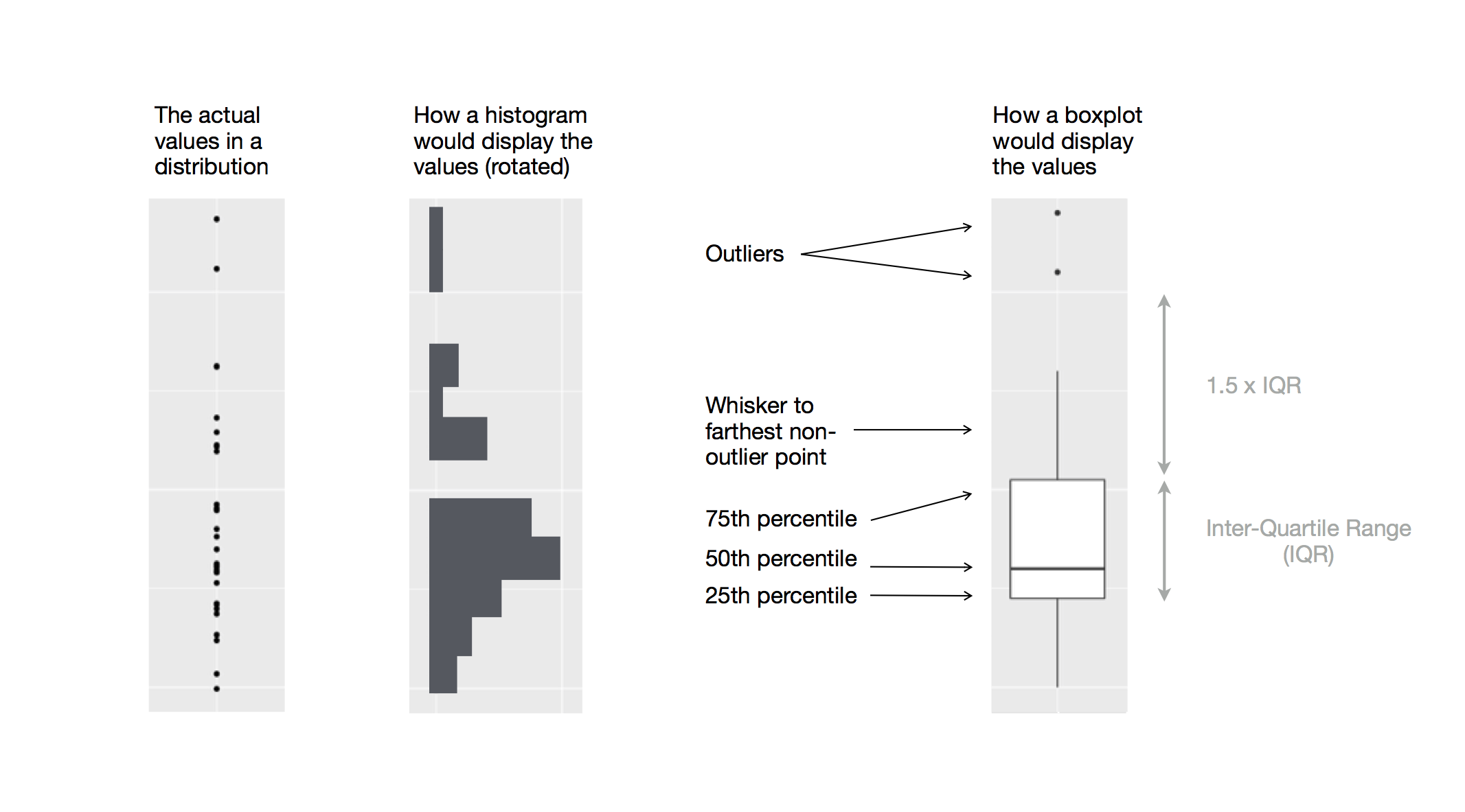
Let’s take a look at the distribution of body mass by species using geom_boxplot():
让我们使用 geom_boxplot() 来查看按物种分的体重分布:
ggplot(penguins, aes(x = species, y = body_mass_g)) +
  geom_boxplot()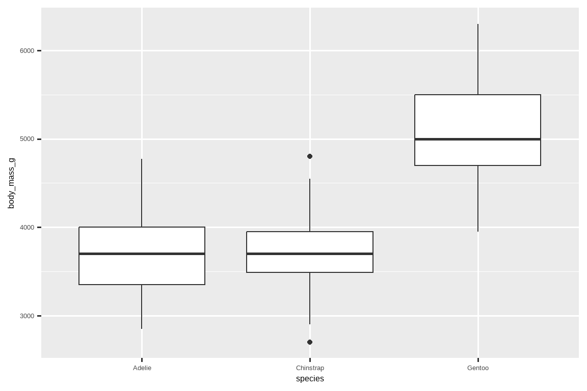
Alternatively, we can make density plots with geom_density().
或者,我们可以使用 geom_density() 制作密度图。
ggplot(penguins, aes(x = body_mass_g, color = species)) +
  geom_density(linewidth = 0.75)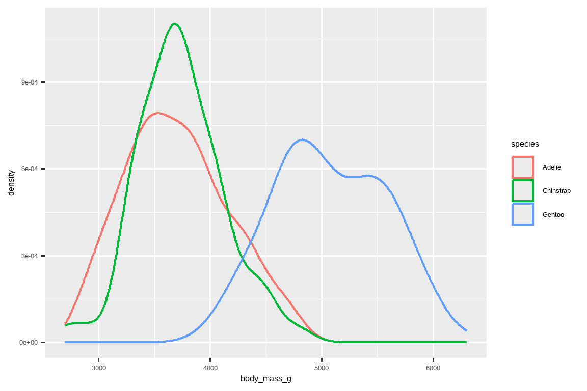
We’ve also customized the thickness of the lines using the linewidth argument in order to make them stand out a bit more against the background.
我们还使用了 linewidth 参数自定义了线条的粗细,以便它们在背景中更加突出。
Additionally, we can map species to both color and fill aesthetics and use the alpha aesthetic to add transparency to the filled density curves. This aesthetic takes values between 0 (completely transparent) and 1 (completely opaque). In the following plot it’s set to 0.5.
此外,我们可以将 species 同时映射到 color 和 fill 美学,并使用 alpha 美学为填充的密度曲线添加透明度。这个美学的值介于 0(完全透明)和 1(完全不透明)之间。在下面的图中,它被设置为 0.5。
ggplot(penguins, aes(x = body_mass_g, color = species, fill = species)) +
  geom_density(alpha = 0.5)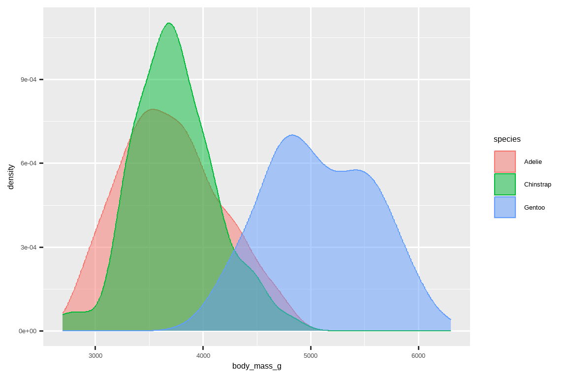
Note the terminology we have used here:
注意我们在这里使用的术语:
- We map variables to aesthetics if we want the visual attribute represented by that aesthetic to vary based on the values of that variable. - Otherwise, we set the value of an aesthetic.
- 如果我们希望由某个美学代表的视觉属性根据某个变量的值而变化,我们就将变量映射到该美学。
- 否则,我们就设置某个美学的值。
1.5.2 Two categorical variables
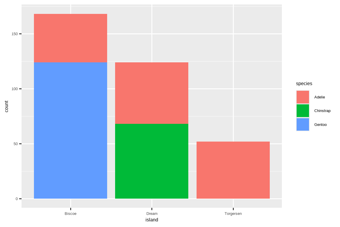
We can use stacked bar plots to visualize the relationship between two categorical variables. For example, the following two stacked bar plots both display the relationship between island and species, or specifically, visualizing the distribution of species within each island.
我们可以使用堆叠条形图来可视化两个分类变量之间的关系。例如,以下两个堆叠条形图都显示了 island 和 species 之间的关系,或者具体来说,可视化了每个岛屿内 species 的分布。
The first plot shows the frequencies of each species of penguins on each island. The plot of frequencies shows that there are equal numbers of Adelies on each island. But we don’t have a good sense of the percentage balance within each island.
第一张图显示了每个岛屿上每种企鹅的频率。频率图显示,每个岛屿上的阿德利企鹅数量相等。但我们无法很好地了解每个岛屿内部的百分比平衡。
The second plot, a relative frequency plot created by setting position = "fill" in the geom, is more useful for comparing species distributions across islands since it’s not affected by the unequal numbers of penguins across the islands. Using this plot we can see that Gentoo penguins all live on Biscoe island and make up roughly 75% of the penguins on that island, Chinstrap all live on Dream island and make up roughly 50% of the penguins on that island, and Adelie live on all three islands and make up all of the penguins on Torgersen.
第二张图是一个相对频率图,通过在几何对象中设置 position = "fill" 创建,它在比较不同岛屿间的物种分布时更有用,因为它不受各岛屿企鹅数量不等的影响。通过这张图我们可以看到,金图企鹅都生活在比斯科岛,约占该岛企鹅总数的 75%;帽带企鹅都生活在梦幻岛,约占该岛企鹅总数的 50%;而阿德利企鹅生活在所有三个岛屿上,并且占了托尔森岛上所有企鹅。
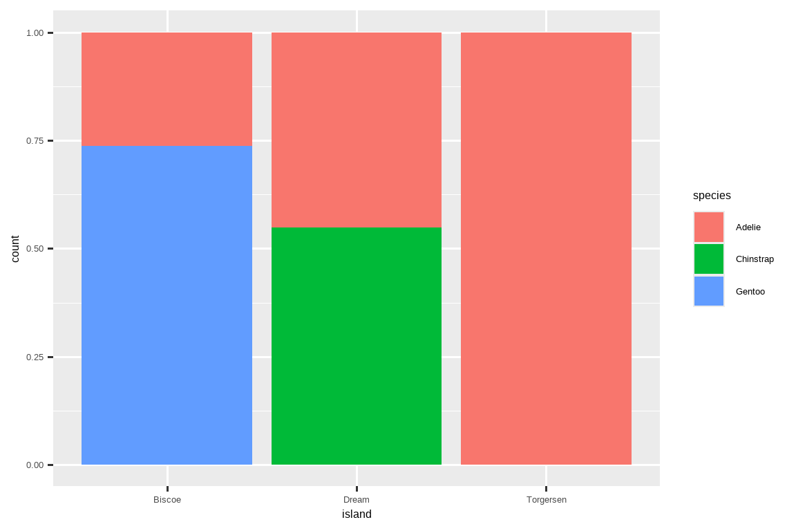
In creating these bar charts, we map the variable that will be separated into bars to the x aesthetic, and the variable that will change the colors inside the bars to the fill aesthetic.
在创建这些条形图时,我们将要被分成条形的变量映射到 x 美学,将要改变条形内部颜色的变量映射到 fill 美学。
1.5.3 Two numerical variables
So far you’ve learned about scatterplots (created with geom_point()) and smooth curves (created with geom_smooth()) for visualizing the relationship between two numerical variables. A scatterplot is probably the most commonly used plot for visualizing the relationship between two numerical variables.
到目前为止,你已经学习了用于可视化两个数值变量之间关系的散点图(用 geom_point() 创建)和平滑曲线(用 geom_smooth() 创建)。散点图可能是可视化两个数值变量之间关系最常用的图。
ggplot(penguins, aes(x = flipper_length_mm, y = body_mass_g)) +
  geom_point()
1.5.4 Three or more variables
As we saw in Section 1.2.4, we can incorporate more variables into a plot by mapping them to additional aesthetics. For example, in the following scatterplot the colors of points represent species and the shapes of points represent islands.
正如我们在 Section 1.2.4 中看到的,我们可以通过将更多变量映射到其他美学上,将它们融入到图中。例如,在下面的散点图中,点的颜色代表物种,点的形状代表岛屿。
ggplot(penguins, aes(x = flipper_length_mm, y = body_mass_g)) +
  geom_point(aes(color = species, shape = island))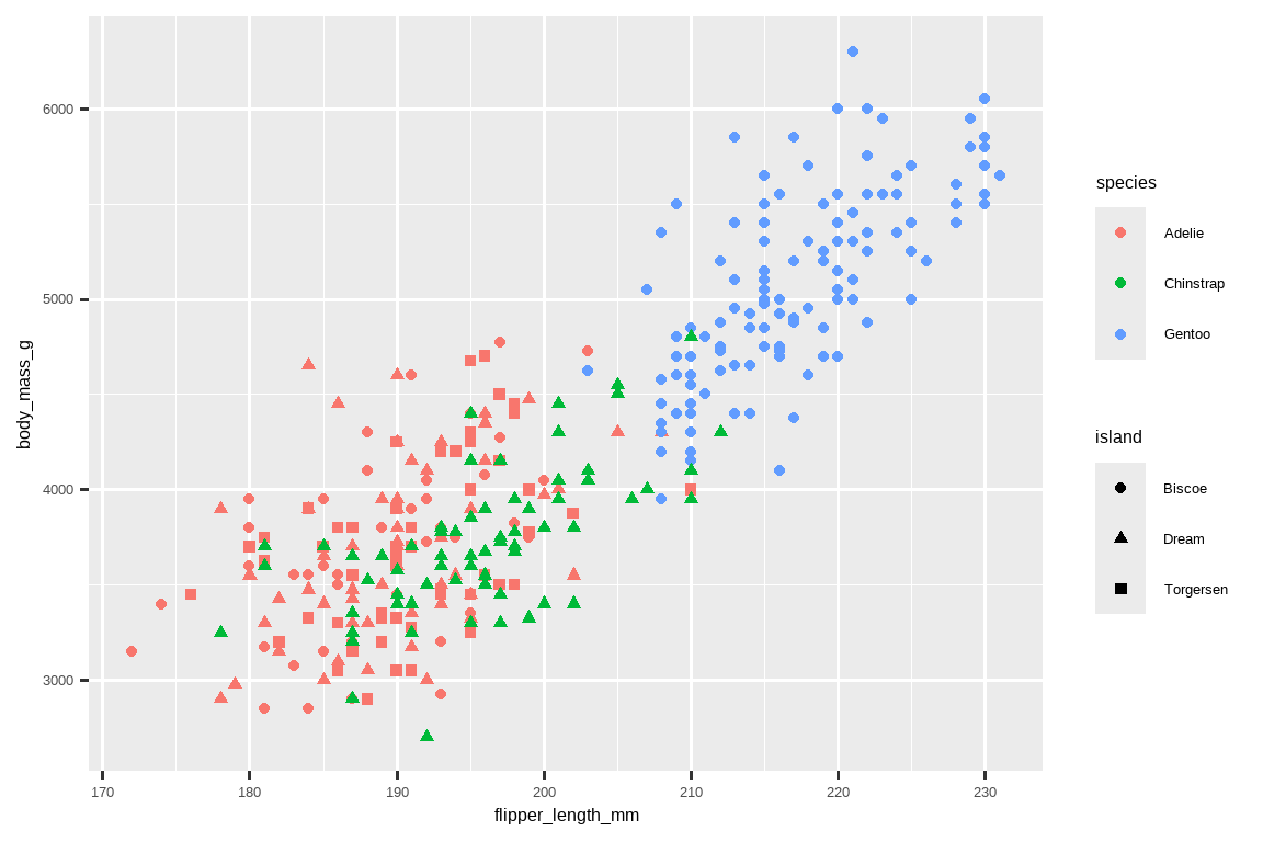
However adding too many aesthetic mappings to a plot makes it cluttered and difficult to make sense of. Another way, which is particularly useful for categorical variables, is to split your plot into facets, subplots that each display one subset of the data.
然而,向图中添加太多的美学映射会使其变得杂乱无章,难以理解。另一种方法,特别是对分类变量很有用,就是将你的图分割成分面 (facets),即每个子图显示数据的一个子集。
To facet your plot by a single variable, use facet_wrap(). The first argument of facet_wrap() is a formula3, which you create with ~ followed by a variable name. The variable that you pass to facet_wrap() should be categorical.
要按单个变量对图进行分面,请使用 facet_wrap()。facet_wrap() 的第一个参数是一个公式3,你通过 ~ 后跟一个变量名来创建它。传递给 facet_wrap() 的变量应该是分类变量。
ggplot(penguins, aes(x = flipper_length_mm, y = body_mass_g)) +
  geom_point(aes(color = species, shape = species)) +
  facet_wrap(~island)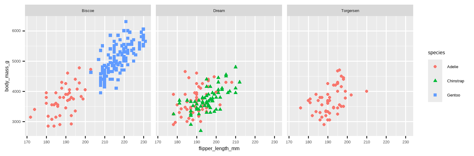
You will learn about many other geoms for visualizing distributions of variables and relationships between them in Chapter 9.
你将在 Chapter 9 中学习到许多其他用于可视化变量分布和它们之间关系的几何对象。
1.5.5 Exercises
The
mpgdata frame that is bundled with the ggplot2 package contains 234 observations collected by the US Environmental Protection Agency on 38 car models. Which variables inmpgare categorical? Which variables are numerical? (Hint: Type?mpgto read the documentation for the dataset.) How can you see this information when you runmpg?
ggplot2 软件包中包含的mpg数据框 (data frame) 含有 234 条观测数据,这些数据由美国环境保护署收集,涵盖了 38 种车型。mpg中的哪些变量是分类 (categorical) 变量? 哪些变量是数值 (numerical) 变量? (提示:输入?mpg来阅读该数据集的文档。) 当你运行mpg时,如何看到这些信息?Make a scatterplot of
hwyvs.displusing thempgdata frame. Next, map a third, numerical variable tocolor, thensize, then bothcolorandsize, thenshape. How do these aesthetics behave differently for categorical vs. numerical variables?
使用mpg数据框 (data frame) 创建一个hwy与displ的散点图 (scatterplot)。 接下来,将第三个数值 (numerical) 变量映射 (map) 到color,然后是size,然后是color和size,最后是shape。 对于分类 (categorical) 变量和数值 (numerical) 变量,这些图形属性 (aesthetics) 的行为有何不同?In the scatterplot of
hwyvs.displ, what happens if you map a third variable tolinewidth?
在hwy与displ的散点图 (scatterplot) 中,如果将第三个变量映射 (map) 到linewidth会发生什么?What happens if you map the same variable to multiple aesthetics?
如果将同一个变量映射 (map) 到多个图形属性 (aesthetics) 会发生什么?Make a scatterplot of
bill_depth_mmvs.bill_length_mmand color the points byspecies. What does adding coloring by species reveal about the relationship between these two variables? What about faceting byspecies?
创建一个bill_depth_mm与bill_length_mm的散点图 (scatterplot),并按species为点着色。 按物种 (species) 着色揭示了这两个变量之间关系的哪些信息? 按species分面 (faceting) 呢?-
Why does the following yield two separate legends? How would you fix it to combine the two legends?
为什么以下代码会产生两个独立的图例 (legends)? 你将如何修改它以合并这两个图例 (legends)?ggplot( data = penguins, mapping = aes( x = bill_length_mm, y = bill_depth_mm, color = species, shape = species ) ) + geom_point() + labs(color = "Species") -
Create the two following stacked bar plots. Which question can you answer with the first one? Which question can you answer with the second one?
创建以下两个堆叠条形图 (stacked bar plots)。 你可以用第一个图回答什么问题? 你可以用第二个图回答什么问题?
1.6 Saving your plots
Once you’ve made a plot, you might want to get it out of R by saving it as an image that you can use elsewhere. That’s the job of ggsave(), which will save the plot most recently created to disk:
一旦你制作了图,你可能希望将其从 R 中导出,保存为可在其他地方使用的图像。这是 ggsave() 的工作,它会将最近创建的图保存到磁盘:
ggplot(penguins, aes(x = flipper_length_mm, y = body_mass_g)) +
  geom_point()
ggsave(filename = "penguin-plot.png")
This will save your plot to your working directory, a concept you’ll learn more about in Chapter 6.
这会将你的图保存到你的工作目录,关于这个概念你将在 Chapter 6 中学到更多。
If you don’t specify the width and height they will be taken from the dimensions of the current plotting device. For reproducible code, you’ll want to specify them. You can learn more about ggsave() in the documentation.
如果你不指定 width 和 height,它们将取自当前绘图设备的尺寸。为了代码的可复现性,你会希望指定它们。你可以在文档中了解更多关于 ggsave() 的信息。
Generally, however, we recommend that you assemble your final reports using Quarto, a reproducible authoring system that allows you to interleave your code and your prose and automatically include your plots in your write-ups. You will learn more about Quarto in Chapter 28.
然而,通常我们建议你使用 Quarto 来组织你的最终报告,这是一个可复现的创作系统,它允许你将代码和文字交织在一起,并自动将你的图包含在你的报告中。你将在 Chapter 28 中学习更多关于 Quarto 的信息。
1.6.1 Exercises
-
Run the following lines of code. Which of the two plots is saved as
mpg-plot.png? Why?
运行以下代码行。哪张图被保存为mpg-plot.png?为什么? What do you need to change in the code above to save the plot as a PDF instead of a PNG? How could you find out what types of image files would work in
ggsave()?
你需要如何更改上面的代码,才能将图保存为 PDF 而不是 PNG?你如何找出ggsave()支持哪些类型的图像文件?
1.7 Common problems
As you start to run R code, you’re likely to run into problems. Don’t worry — it happens to everyone. We have all been writing R code for years, but every day we still write code that doesn’t work on the first try!
当你开始运行 R 代码时,你很可能会遇到问题。别担心——这发生在每个人身上。我们都写了多年的 R 代码,但每天我们仍然会写出第一次尝试就不能工作的代码!
Start by carefully comparing the code that you’re running to the code in the book. R is extremely picky, and a misplaced character can make all the difference. Make sure that every ( is matched with a ) and every " is paired with another ". Sometimes you’ll run the code and nothing happens. Check the left-hand of your console: if it’s a +, it means that R doesn’t think you’ve typed a complete expression and it’s waiting for you to finish it. In this case, it’s usually easy to start from scratch again by pressing ESCAPE to abort processing the current command.
首先,仔细比较你正在运行的代码和书中的代码。R 非常挑剔,一个放错位置的字符都可能导致天壤之别。确保每个 ( 都与一个 ) 匹配,每个 " 都与另一个 " 配对。有时你运行代码后什么也没发生。检查你的控制台左侧:如果它是一个 +,这意味着 R 认为你还没有输入一个完整的表达式,正在等待你完成它。在这种情况下,通常很容易通过按 ESCAPE 键中止当前命令的处理,然后从头开始。
One common problem when creating ggplot2 graphics is to put the + in the wrong place: it has to come at the end of the line, not the start. In other words, make sure you haven’t accidentally written code like this:
在创建 ggplot2 图形时,一个常见的问题是把 + 放在了错误的位置:它必须放在行的末尾,而不是开头。换句话说,确保你没有意外地写出像下面这样的代码:
ggplot(data = mpg)
+ geom_point(mapping = aes(x = displ, y = hwy))
If you’re still stuck, try the help. You can get help about any R function by running ?function_name in the console, or highlighting the function name and pressing F1 in RStudio. Don’t worry if the help doesn’t seem that helpful - instead skip down to the examples and look for code that matches what you’re trying to do.
如果你仍然卡住了,试试帮助。你可以通过在控制台运行 ?function_name 来获取任何 R 函数的帮助,或者在 RStudio 中高亮函数名并按 F1。如果帮助看起来不那么有用,别担心——直接跳到示例部分,寻找与你正在尝试做的事情相匹配的代码。
If that doesn’t help, carefully read the error message. Sometimes the answer will be buried there! But when you’re new to R, even if the answer is in the error message, you might not yet know how to understand it. Another great tool is Google: try googling the error message, as it’s likely someone else has had the same problem, and has gotten help online.
如果那也帮不了你,仔细阅读错误信息。有时答案就藏在那里!但是当你刚接触 R 时,即使答案就在错误信息中,你可能还不知道如何理解它。另一个很棒的工具是谷歌:尝试用谷歌搜索错误信息,因为很可能其他人也遇到过同样的问题,并且在网上得到了帮助。
1.8 Summary
In this chapter, you’ve learned the basics of data visualization with ggplot2. We started with the basic idea that underpins ggplot2: a visualization is a mapping from variables in your data to aesthetic properties like position, color, size and shape. You then learned about increasing the complexity and improving the presentation of your plots layer-by-layer. You also learned about commonly used plots for visualizing the distribution of a single variable as well as for visualizing relationships between two or more variables, by leveraging additional aesthetic mappings and/or splitting your plot into small multiples using faceting.
在本章中,你学习了使用 ggplot2 进行数据可视化的基础知识。我们从支撑 ggplot2 的基本思想开始:可视化是将数据中的变量映射到诸如位置、颜色、大小和形状等美学属性的过程。然后你学习了如何逐层增加图的复杂性并改善其呈现效果。你还学习了常用于可视化单个变量分布以及可视化两个或多个变量之间关系的图,这是通过利用额外的美学映射和/或使用分面将图分割成小倍数图来实现的。
We’ll use visualizations again and again throughout this book, introducing new techniques as we need them as well as do a deeper dive into creating visualizations with ggplot2 in Chapter 9 through Chapter 11.
在本书中,我们将反复使用可视化,在需要时引入新技术,并在 Chapter 9 到 Chapter 11 中更深入地探讨使用 ggplot2 创建可视化。
With the basics of visualization under your belt, in the next chapter we’re going to switch gears a little and give you some practical workflow advice. We intersperse workflow advice with data science tools throughout this part of the book because it’ll help you stay organized as you write increasing amounts of R code.
掌握了可视化的基础知识后,在下一章中,我们将稍微转换一下思路,给你一些实用的工作流程建议。在本书的这一部分,我们将工作流程建议与数据科学工具穿插在一起,因为这将在你编写越来越多的 R 代码时帮助你保持条理清晰。
You can eliminate that message and force conflict resolution to happen on demand by using the conflicted package, which becomes more important as you load more packages. You can learn more about conflicted at https://conflicted.r-lib.org.↩︎
Horst AM, Hill AP, Gorman KB (2020). palmerpenguins: Palmer Archipelago (Antarctica) penguin data. R package version 0.1.0. https://allisonhorst.github.io/palmerpenguins/. doi: 10.5281/zenodo.3960218.↩︎
Here “formula” is the name of the thing created by
~, not a synonym for “equation”.↩︎