Show/Hide Code
library(ggridges)
library(tidyverse)

ggplot(diamonds, aes(x = price, y = cut, fill = cut)) +
  geom_density_ridges(alpha = 0.5) +
  theme_ridges() + # 适合ridge图的主题
  theme(legend.position = "none")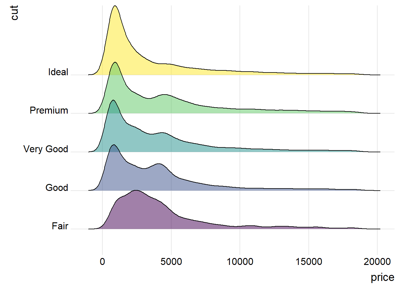
主要借助强大且美观的ggridges包来绘制山脊图。山脊图可以更好地展示多个分布的情况。
山脊图(ridgeline chart)本质上是一组密度图(density plots),建议先学习密度图的绘制方法。
library(ggridges)
library(tidyverse)
ggplot(diamonds, aes(x = price, y = cut, fill = cut)) +
geom_density_ridges(alpha = 0.5) +
theme_ridges() + # 适合ridge图的主题
theme(legend.position = "none")
ggplot(diamonds, aes(x = price, y = cut, fill = cut)) +
  geom_density_ridges(alpha = 0.5, stat="binline") + # 直方图参数
  theme_ridges() + # 适合ridge图的主题
  theme(legend.position = "none")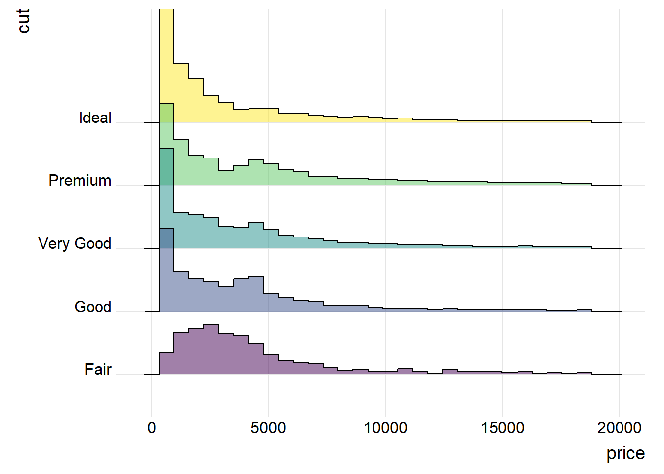
# 加载 ggridges 包,用于创建山峦图 (Ridgeline Plot)
library(ggridges)
# 加载 ggplot2 包,这是 R 中用于数据可视化的核心包
library(ggplot2)
# 加载 viridis 包,提供对色盲友好的美观调色板
library(viridis)
# 加载 hrbrthemes 包,提供一套简洁、专业外观的 ggplot2 主题
library(hrbrthemes)

ggplot(lincoln_weather, aes(x = `Mean Temperature [F]`, y = `Month`, fill = ..x..)) +

  # 添加一个“渐变密度山峦图”几何对象层
  # - geom_density_ridges_gradient() 是 ggridges 包的核心函数
  # - `fill = ..x..` 的美学映射在这里生效,使得每个山峦的填充色根据其 x 轴数值(温度)进行渐变
  geom_density_ridges_gradient(
    # scale = 3: 控制山峦之间重叠的程度。数值越大,重叠越多,图形越紧凑
    scale = 3,
    # rel_min_height = 0.01: 裁剪每个密度曲线的尾部,移除高度低于最大高度1%的部分,使图形更整洁
    rel_min_height = 0.01
  ) +

  # 使用 viridis 调色板来应用填充色
  scale_fill_viridis(
    # name = "Temp. [F]": 设置颜色图例的标题(尽管后面图例被隐藏了)
    name = "Temp. [F]",
    # option = "C": 选择 viridis 调色板中的 "C" 方案 (也称为 "plasma")
    option = "C"
  ) +

  # 设置图表的标签
  labs(title = 'Temperatures in Lincoln NE in 2016') + # 设置主标题

  theme_ipsum() +

  # 对主题进行微调
  theme(
    # legend.position="none": 隐藏图例。因为颜色已经直观地反映在x轴上,所以图例不是必需的
    legend.position="none",
    # panel.spacing: 调整不同面板(即每个月份的图)之间的垂直间距,使其更紧凑
    panel.spacing = unit(0.1, "lines"),
    # strip.text.x: 调整分面标题在X轴方向的文本属性。
    strip.text.y = element_text(size = 8)
  )
Quarto渲染效果不好,用R直接渲染会好看一点。
# 加载所需的R包
library(tidyverse)    # 数据整理和可视化的核心包集合,包括 ggplot2, dplyr, readr 等
library(ggtext)       # 增强ggplot2的文本渲染能力,支持Markdown和HTML
library(ggdist)       # 提供高级的分布可视化图层,如 stat_halfeye
library(glue)         # 方便地将变量嵌入到字符串中
library(patchwork)    # 用于组合和排列多个ggplot图表

# 读取数据文件
# 注意:请确保以下CSV文件存在于您的工作目录下的 "data" 文件夹中
rent = read_csv("data/rent.csv") # 包含原始租金信息的CSV文件
rent_title_words = read_csv("data/rent_title_words.csv") # 包含从标题中提取的词语和对应租金的数据
df_plot = read_csv("data/df_plot.csv") # 专门为绘图准备的聚合数据

# --- 数据预处理 ---

# 按平均价格降序排列数据框
df_plot <- df_plot |> arrange(desc(mean_price))
# 将 'word' 列转换为因子类型,并指定其顺序(levels),确保在图表中的显示顺序与排列后的一致
df_plot$word <- factor(df_plot$word, levels = unique(df_plot$word))

# 计算一些将在图表中使用的全局统计量
mean_price <- mean(rent$price, na.rm = TRUE)      # 所有房源的平均租金
median_price <- median(rent$price, na.rm = TRUE)  # 所有房源的租金中位数
n_rental_posts <- nrow(subset(rent, !is.na(title))) # 有效(标题不为空)的出租帖子总数

# --- 图表美学设置 ---

# 定义图表的背景颜色
bg_color <- "grey97"

# 使用 glue 包创建一个动态的副标题字符串
plot_subtitle = glue("Adjectives used to describe houses and apartments in San Francisco Bay Area
Craigslist rental post titles, and their relationship with rent prices. Data is from
{scales::number(n_rental_posts, big.mark = ',')} Craigslist rental posts between 2000 and 2018.
The 15 most frequent adjectives are shown.
")


# --- 创建主图表 (p) ---

p <- df_plot |>
  ggplot(aes(word, price)) +  # 初始化ggplot对象,设置x轴为单词,y轴为价格
  # 添加半眼图层(雨云图的核心部分),展示数据分布
  stat_halfeye(fill_type = "segments", alpha = 0.3) +
  # 添加置信区间图层,默认显示50%, 80%, 95%的区间
  stat_interval() +
  # 添加一个点来表示每个单词对应的租金中位数
  stat_summary(geom = "point", fun = median) +
  # 在图表特定位置添加文本,作为平均卧室数的列标题
  annotate("text", x = 16, y = 0, label = "(Avg. Bedrooms)",
           size = 3, hjust = 0.5) +
  # 为每个单词计算并显示平均卧室数
  stat_summary(
    aes(y = beds), # 使用 'beds' 列的数据
    geom = "text", # 以文本形式显示
    fun.data = function(x) { # 自定义一个函数来计算均值并格式化输出
      data.frame(
        y = 0, # 将文本放置在y=0的位置
        label = sprintf("(%s)", scales::number(mean(ifelse(x > 0, x, NA), na.rm = TRUE), accuracy = 0.1))
      )
    },
    size = 2.5
  ) +
  # 添加一条水平虚线,代表所有房源的租金中位数
  geom_hline(yintercept = median_price, col = "grey30", lty = "dashed") +
  # 为中位数线添加文本标签
  annotate("text", x = 16, y = median_price + 50, label = "Median Rent",
           size = 3, hjust = 0) +
  # 将x轴的标签(单词)转换为大写
  scale_x_discrete(labels = toupper) +
  # 设置y轴(价格)的刻度标记
  scale_y_continuous(breaks = seq(2500, 20000, 2500)) +
  # 手动设置颜色方案,这里假设 MetBrewer 包已安装
  scale_color_manual(values = MetBrewer::met.brewer("VanGogh3")) +
  # 翻转坐标轴,使条形图水平显示,并设置y轴(翻转后为价格轴)的范围,clip="off"允许绘图超出面板区域
  coord_flip(ylim = c(0, 10000), clip = "off") +
  # 移除默认的颜色图例
  guides(col = "none") +
  # 设置图表的标题、副标题、说明文字和坐标轴标签
  labs(
    title = toupper("Are 'nice' and 'clean' apartments really cheaper?"),
    subtitle = plot_subtitle,
    caption = "Y-axis capped at $10,000.<br>
     Data source: Pennington, Kate (2018).
     Bay Area Craigslist Rental Housing Posts, 2000-2018.<br>
     From github.com/katepennington/historic_bay_area_craigslist_housing_posts/blob/master/clean_2000_2018.csv.zip.
     <br>
     Visualization: Ansgar Wolsing",
    x = NULL, # 移除x轴标签
    y = "Rent (USD)"
  ) +
  # 使用一个简洁的主题
  theme_minimal() +
  # 对主题进行深度定制
  theme(
    plot.background = element_rect(color = NA, fill = bg_color), # 设置图表背景
    panel.grid = element_blank(), # 移除所有网格线
    panel.grid.major.x = element_line(linewidth = 0.1, color = "grey75"), # 添加主x轴网格线(翻转后是水平线)
    plot.title = element_text(),
    plot.title.position = "plot", # 标题位置与整个图对齐
    plot.subtitle = element_textbox_simple( # 使用ggtext设置副标题,支持自动换行
      margin = margin(t = 4, b = 16), size = 10),
    plot.caption = element_textbox_simple( # 使用ggtext设置说明文字
      margin = margin(t = 12), size = 7
    ),
    plot.caption.position = "plot", # 说明文字位置与整个图对齐
    axis.text.y = element_text(hjust = 0, margin = margin(r = -10)),
    plot.margin = margin(4, 4, 4, 4) # 设置图表外边距
  )

# --- 创建自定义图例 (p_legend) ---

# 为图例创建一个小的数据框,只使用 "beautiful" 这个词的数据作为示例
df_for_legend <- rent_title_words |>
  filter(word == "beautiful")

# 创建一个独立的ggplot对象作为图例
p_legend <- df_for_legend |>
  ggplot(aes(word, price)) +
  # 同样添加半眼图、区间图和中位数点,作为图例的示例图形
  stat_halfeye(fill_type = "segments", alpha = 0.3) +
  stat_interval() +
  stat_summary(geom = "point", fun = median) +
  # 添加富文本注释,解释图表的各个部分
  annotate(
    "richtext",
    x = c(0.8, 0.8, 0.8, 1.4, 1.8),
    y = c(1000, 5000, 3000, 2400, 4000),
    label = c("50% of prices<br>fall in this range", "95% of prices",
              "80% of prices", "Median", "Distribution<br>of prices"),
    fill = NA, label.size = 0, size = 2, vjust = 1,
  ) +
  # 添加曲线箭头,将文本注释指向图形的相应部分
  geom_curve(
    data = data.frame(
      x = c(0.7, 0.80, 0.80, 1.225, 1.8),
      xend = c(0.95, 0.95, 0.95, 1.075, 1.8),
      y = c(1800, 5000, 3000, 2300, 3800),
      yend = c(1800, 5000, 3000, 2100, 2500)),
    aes(x = x, xend = xend, y = y, yend = yend),
    stat = "unique", curvature = 0.2, linewidth = 0.2, color = "grey12",
    arrow = arrow(angle = 20, length = unit(1, "mm"))
  ) +
  # 设置与主图一致的颜色方案
  scale_color_manual(values = MetBrewer::met.brewer("VanGogh3")) +
  # 翻转坐标轴,并精心调整坐标轴范围以适应图例内容
  coord_flip(xlim = c(0.75, 1.3), ylim = c(0, 6000), expand = TRUE) +
  # 移除图例
  guides(color = "none") +
  # 添加图例的标题
  labs(title = "Legend") +
  # 使用空白主题,移除所有坐标轴、背景等元素
  theme_void() +
  # 对图例进行主题微调
  theme(plot.title = element_text(size = 9, hjust = 0.075),
        plot.background = element_rect(color = "grey30", linewidth = 0.2, fill = bg_color)) # 为图例添加边框和背景色

# --- 组合图表 ---

# 使用 patchwork 包的 inset_element() 函数,将自定义图例 (p_legend) 嵌入到主图表 (p) 的指定位置
# l, r, t, b 分别代表左、右、上、下的边界,数值是相对于主图绘图区域的比例
p + inset_element(p_legend, l = 0.6, r = 1.0,  t = 0.99, b = 0.7, clip = FALSE)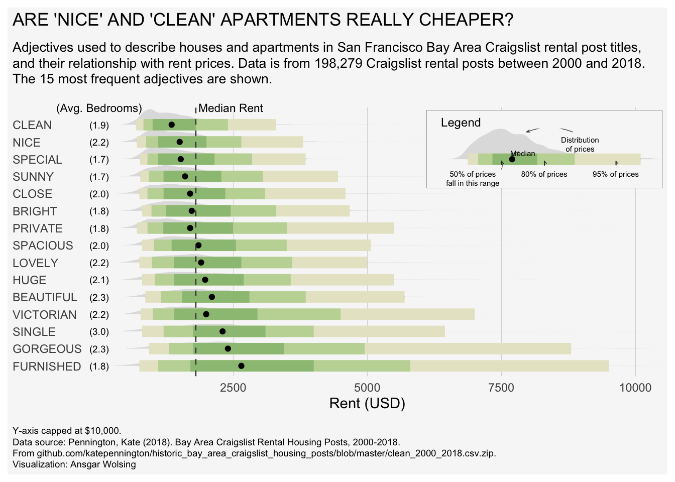
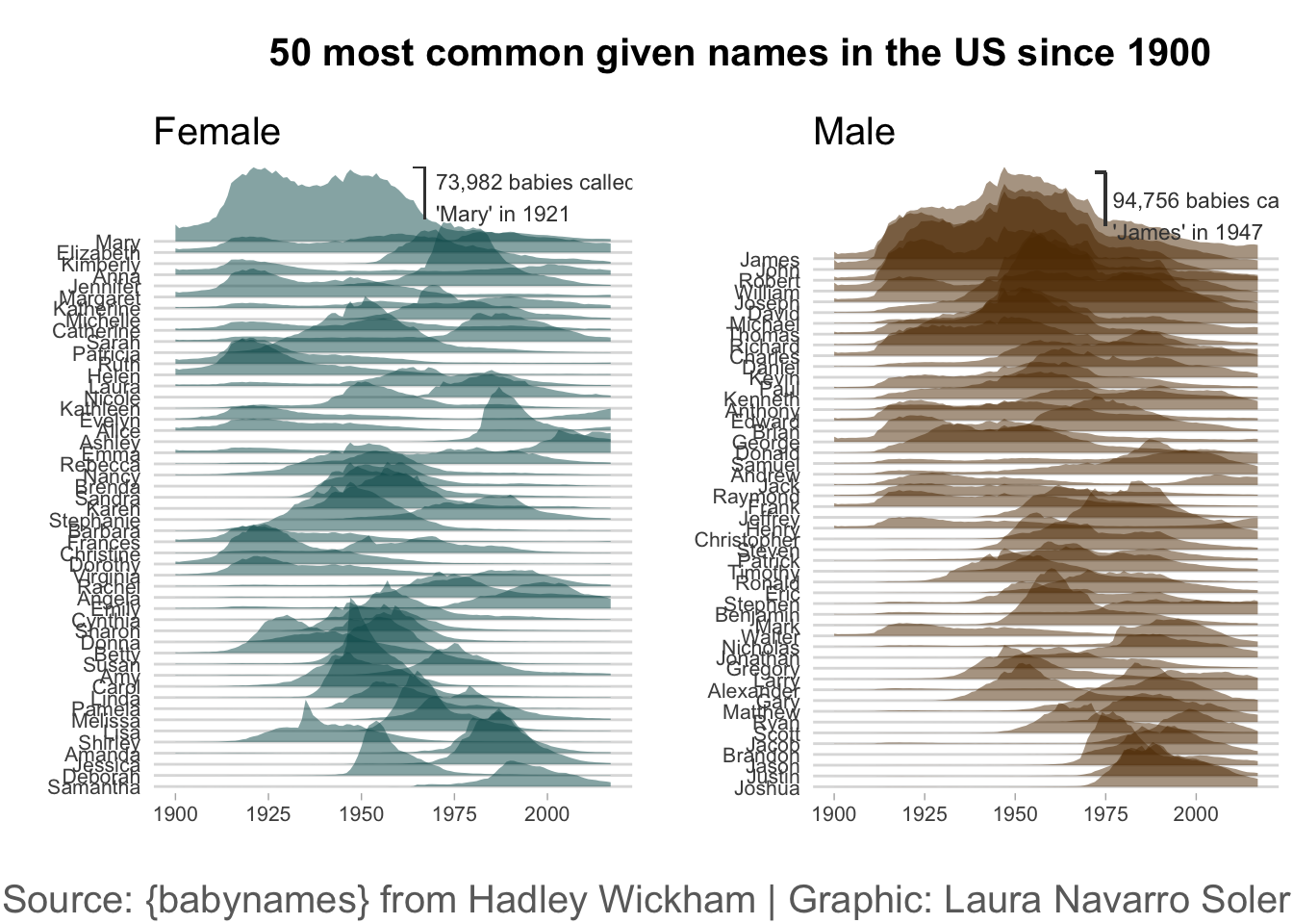
# 步骤 1: 加载所需的库
# ------------------------------------------------
# 注意:所有与自定义字体相关的库 (extrafont, showtext) 均已移除。
library(tidyverse)    # 用于数据处理 (dplyr) 和绘图 (ggplot2) 的核心包集合
library(ggridges)     # 用于创建山脊图 (geom_ridgeline)
library(cowplot)      # 用于组合多个 ggplot 图表


# 步骤 2: 数据加载和准备
# ------------------------------------------------

# 加载 babynames 数据集,它包含了美国自1880年以来的婴儿姓名数据
babynames <- babynames::babynames

# 筛选出历史上总出生数最多的 50 个女性名字
top_female <- babynames |>
  filter(sex == "F") |>                  # 1. 筛选性别为女性的数据
  group_by(name) |>                      # 2. 按名字进行分组
  summarise(total = sum(n)) |>           # 3. 计算每个名字在所有年份的总出生数
  slice_max(total, n = 50) |>            # 4. 提取总数排名前50的名字
  mutate(
    name = forcats::fct_reorder(name, -total) # 5. 将名字转换为因子,并根据总数降序排列
  ) |>
  pull(name)                             # 6. 提取出排好序的名字向量,作为后续排序的基准

# 筛选出历史上总出生数最多的 50 个男性名字 (逻辑同上)
top_male <- babynames |>
  filter(sex == "M") |>
  group_by(name) |>
  summarise(total = sum(n)) |>
  slice_max(total, n = 50) |>
  mutate(
    name = forcats::fct_reorder(name, -total)
  ) |>
  pull(name)

# 准备用于绘制山脊图的女性名字数据
female_names <- babynames |>
  filter(
    sex == "F",
    name %in% top_female  # 1. 只保留属于前50热门列表中的名字
  ) |>
  # 2. 将name列转换为因子,并指定其顺序与top_female一致,确保Y轴按总排名显示
  mutate(name = factor(name, levels = levels(top_female))) |>
  group_by(year, name) |>   # 3. 按年份和名字分组
  summarise(n = sum(n))     # 4. 聚合数据

# 准备用于绘制山脊图的男性名字数据 (逻辑同上)
male_names <- babynames |>
  filter(
    sex == "M",
    name %in% top_male
  ) |>
  mutate(name = factor(name, levels = levels(top_male))) |>
  group_by(year, name) |>
  summarise(n = sum(n))


# 步骤 3: 创建独立的图表
# ------------------------------------------------

########### 女性名字山脊图 (plot1) ###########
plot1 <- ggplot(female_names, aes(x = year, y = fct_reorder(name, n), height = n / 50000, group = name)) +
  geom_ridgeline(
    alpha = 0.5, scale = 4.5, linewidth = 0,
    fill = "#05595B", color = "white"
  ) +
  xlim(1900, NA) +
  labs(title = "Female", y = "", x = "") +
  theme_light() + # 应用一个明亮的主题
  theme(
    # 注意:所有 'family' 参数已被移除,将使用系统默认字体
    plot.title = element_text(hjust = 0, size = 15),
    axis.ticks.y = element_blank(),
    axis.text = element_text(size = 8),
    panel.grid.major.x = element_blank(),
    panel.grid.minor.x = element_blank(),
    panel.grid.major.y = element_line(linewidth = 0.5),
    panel.border = element_blank()
  ) +
  geom_segment(aes(x = 1967, xend = 1967, y = 56.7, yend = 52), color = "#404040") +
  geom_segment(aes(x = 1967, xend = 1964, y = 56.7, yend = 56.7), color = "#404040") +
  annotate(
    geom = "text", x = 1970, y = 54, label = "73,982 babies called\n'Mary' in 1921", hjust = "left",
    size = 3, color = "#404040" # 'family' 参数已移除
  )

######### 男性名字山脊图 (plot2) #########
plot2 <- ggplot(male_names, aes(x = year, y = fct_reorder(name, n), height = n / 50000, group = name)) +
  geom_ridgeline(
    alpha = 0.5, scale = 4.5, linewidth = 0,
    fill = "#603601", color = "white"
  ) +
  xlim(1900, NA) +
  labs(title = "Male", y = "", x = "") +
  theme_light() +
  theme(
    # 注意:所有 'family' 参数已被移除
    plot.title = element_text(hjust = 0, size = 15),
    axis.ticks.y = element_blank(),
    axis.text = element_text(size = 8),
    panel.grid.major.x = element_blank(),
    panel.grid.minor.x = element_blank(),
    panel.grid.major.y = element_line(linewidth = 0.5),
    panel.border = element_blank(),
    panel.background = element_rect(fill = "white"),
    plot.background = element_rect(fill = "white")
  ) +
  geom_segment(aes(x = 1975, xend = 1975, y = 58, yend = 53.1), color = "#404040") +
  geom_segment(aes(x = 1975, xend = 1972, y = 58, yend = 58), color = "#404040") +
  annotate(
    geom = "text", x = 1977, y = 54, label = "94,756 babies called\n'James' in 1947", hjust = "left",
    size = 3, color = "#404040" # 'family' 参数已移除
  )


# 步骤 4: 组合图表并添加标题和说明
# ------------------------------------------------

# 使用 cowplot 创建一个独立的总标题
title_theme <- ggdraw() +
  draw_label("50 most common given names in the US since 1900",
    fontface = "bold",
    size = 15,
    hjust = 0.4 # 'fontfamily' 参数已移除
  )

# 使用 cowplot 创建一个独立的图表说明/来源信息
caption <- ggdraw() +
  draw_label("Source: {babynames} from Hadley Wickham | Graphic: Laura Navarro Soler",
    size = 15,
    hjust = 0.5,
    color = "#6B6B6B" # 'fontfamily' 参数已移除
  )

# 将两个山脊图水平并排组合
gridofplots <- plot_grid(plot1, plot2, nrow = 1)

# 将标题、组合图、图表说明垂直堆叠成最终的成品图
plot_grid(title_theme,
  gridofplots,
  caption,
  ncol = 1, # 最终所有组件排成一列
  rel_heights = c(0.2, 1.5, 0.1) # 分别指定标题、图、说明的相对高度
)