Show/Hide Code
library(tidyverse)

data = data.frame(value = rnorm(1000))

ggplot(data, aes(x = value)) +
  geom_histogram()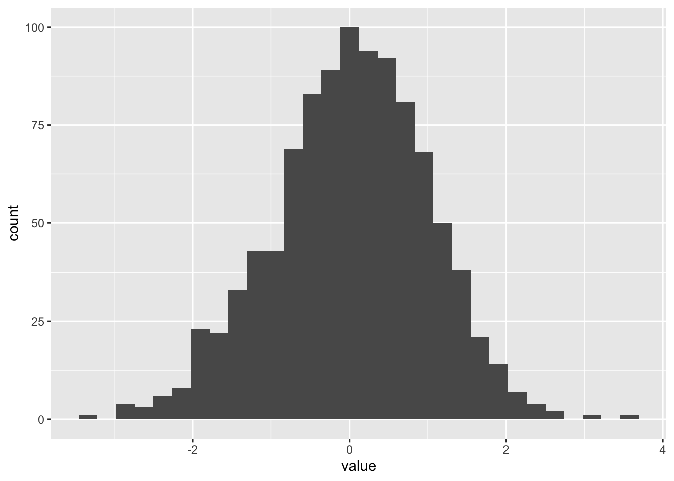
非常简单的数据可视化形式,可以用base R::hist()或ggplot2::geom_histogram()来实现。
library(tidyverse)
data = data.frame(value = rnorm(1000))
ggplot(data, aes(x = value)) +
geom_histogram()
library(hrbrthemes)

ggplot(data, aes(x=value)) +
  geom_histogram(binwidth=0.1, fill="#69b3a2", color="#e9ecef", alpha=0.9) +
  theme_ipsum()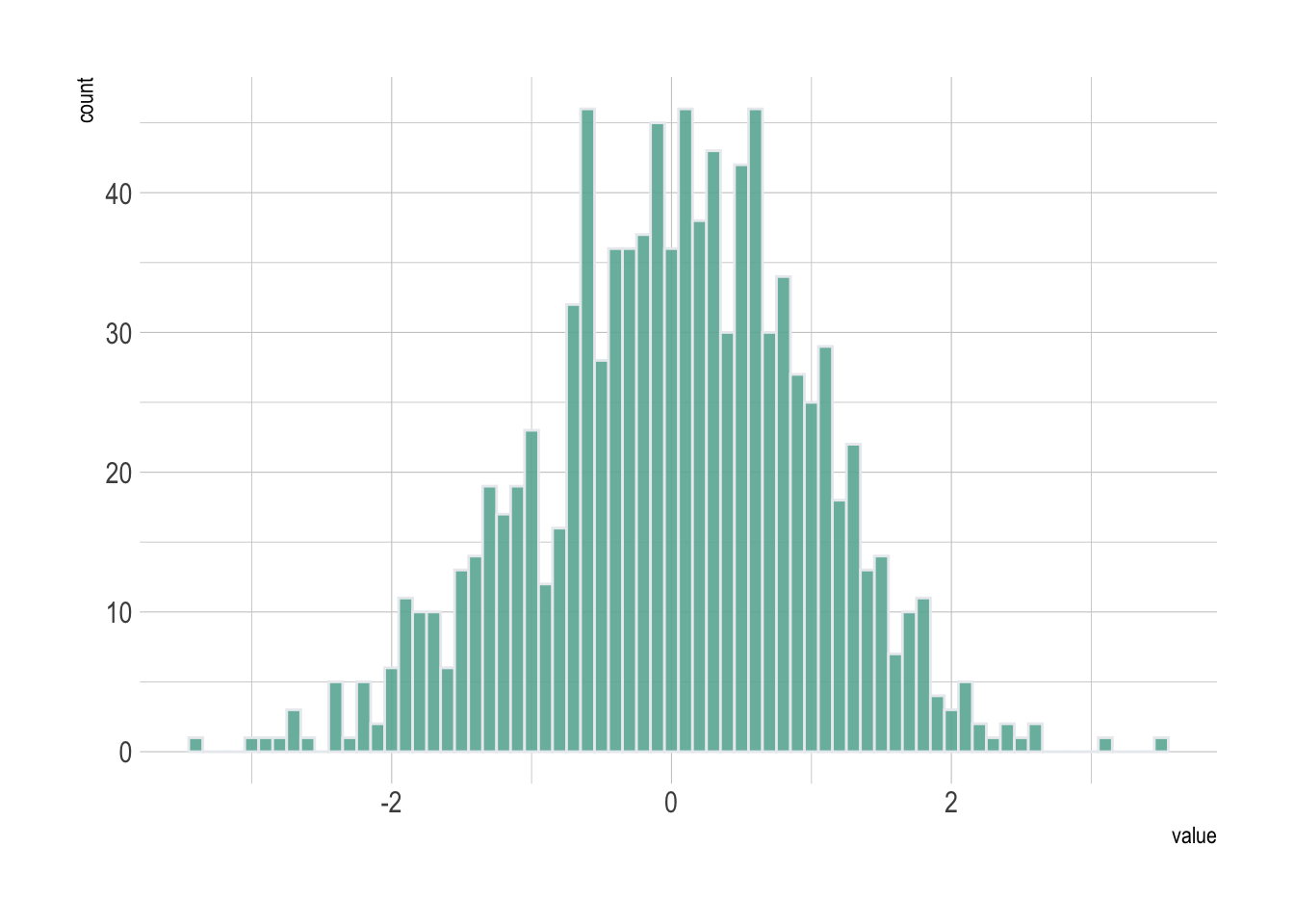
还有用于比较两个变量分布(从0开始)的镜像直方图。
直方图的默认y = -..count..,因此可以通过设置y = -..count..来实现镜像效果。
data <- data.frame(
  var1 = rnorm(100),
  var2 = rnorm(100, mean = 2)
)

ggplot(data, aes(x = x)) +
  # 上方图
  geom_histogram(aes(x = var1, y = ..count..), fill = "#69b3a2") +
  geom_label(aes(x = 4.5, y = 6, label = "variable1"), color = "#69b3a2") +
  # 下方图,主要是通过y = -..count..来实现镜像
  geom_histogram(aes(x = var2, y = -..count..), fill = "#404080") +
geom_label(aes(x = 4.5, y = -4, label = "variable2"), color = "#404080") 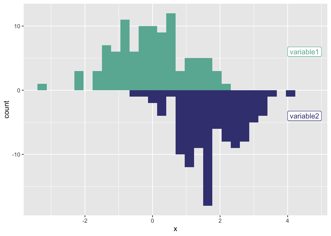
密度曲线图默认y = ..density..,因此可以通过设置y = -..density..来实现镜像效果。
下图,左侧是直方图(y改为密度),右侧是密度曲线图。
library(patchwork)

p1 <- ggplot(data, aes(x = x)) +
  # 上方图
  geom_histogram(aes(x = var1, y = ..density..), fill = "#69b3a2") +
  geom_label(aes(x = 3.5, y = 0.2, label = "variable1"), color = "#69b3a2") +
  # 下方图
  geom_histogram(aes(x = var2, y = -..density..), fill = "#404080") +
  geom_label(aes(x = 3.5, y = -0.2, label = "variable2"), color = "#404080")

p2 <- ggplot(data, aes(x = x)) +
  # 上方图
  geom_density(aes(x = var1, y = ..density..), fill = "#69b3a2") +
  geom_label(aes(x = 3.5, y = 0.2, label = "variable1"), color = "#69b3a2") +
  # 下方图
  geom_density(aes(x = var2, y = -..density..), fill = "#404080") +
  geom_label(aes(x = 3.5, y = -0.2, label = "variable2"), color = "#404080")

p1 + p2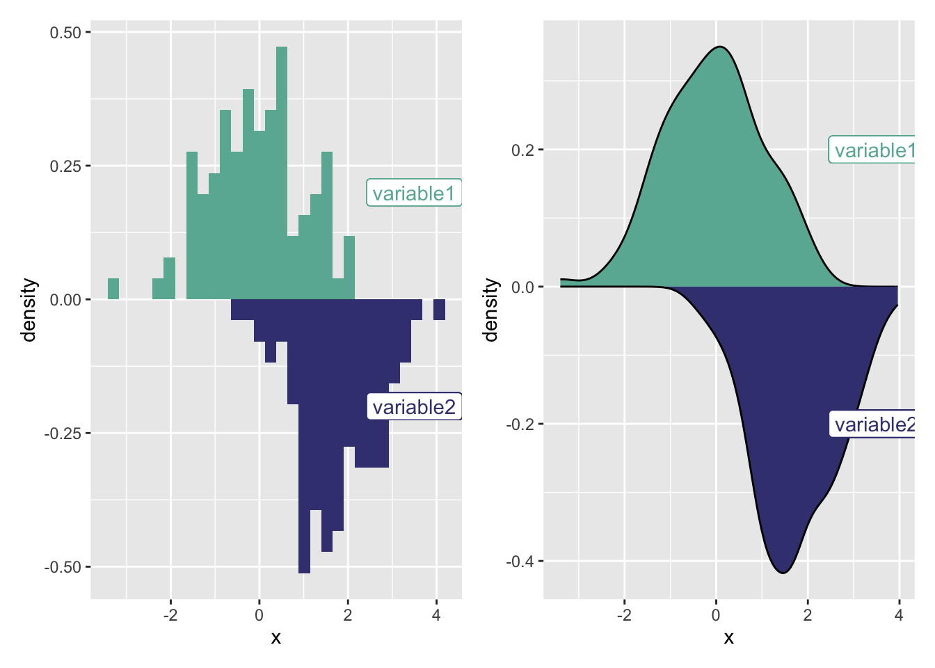
data <- data.frame(
  type = c(rep("variable 1", 1000), rep("variable 2", 1000)),
  value = c(rnorm(1000), rnorm(1000, mean = 4))
)

ggplot(data, aes(x = value, fill = type)) +
  geom_histogram(color = "#e9ecef", alpha = 0.6, position = 'identity') +
  scale_fill_manual(values = c("#69b3a2", "#404080")) # 使用自定义颜色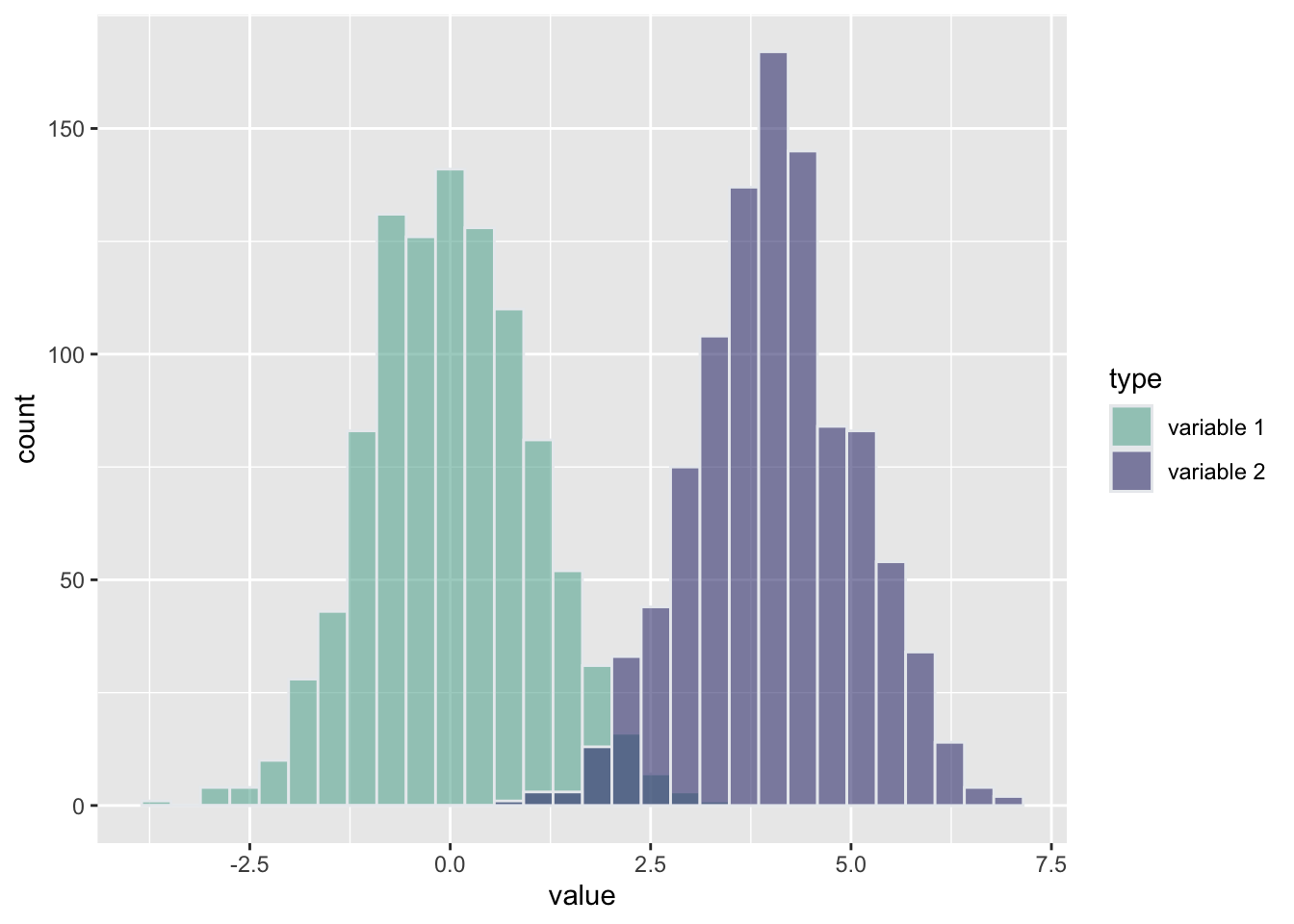
ggplot(iris, aes(x = `Sepal.Length`, fill = `Sepal.Length`)) +
  geom_histogram() +
  facet_wrap(~ Species, scale = "free_x")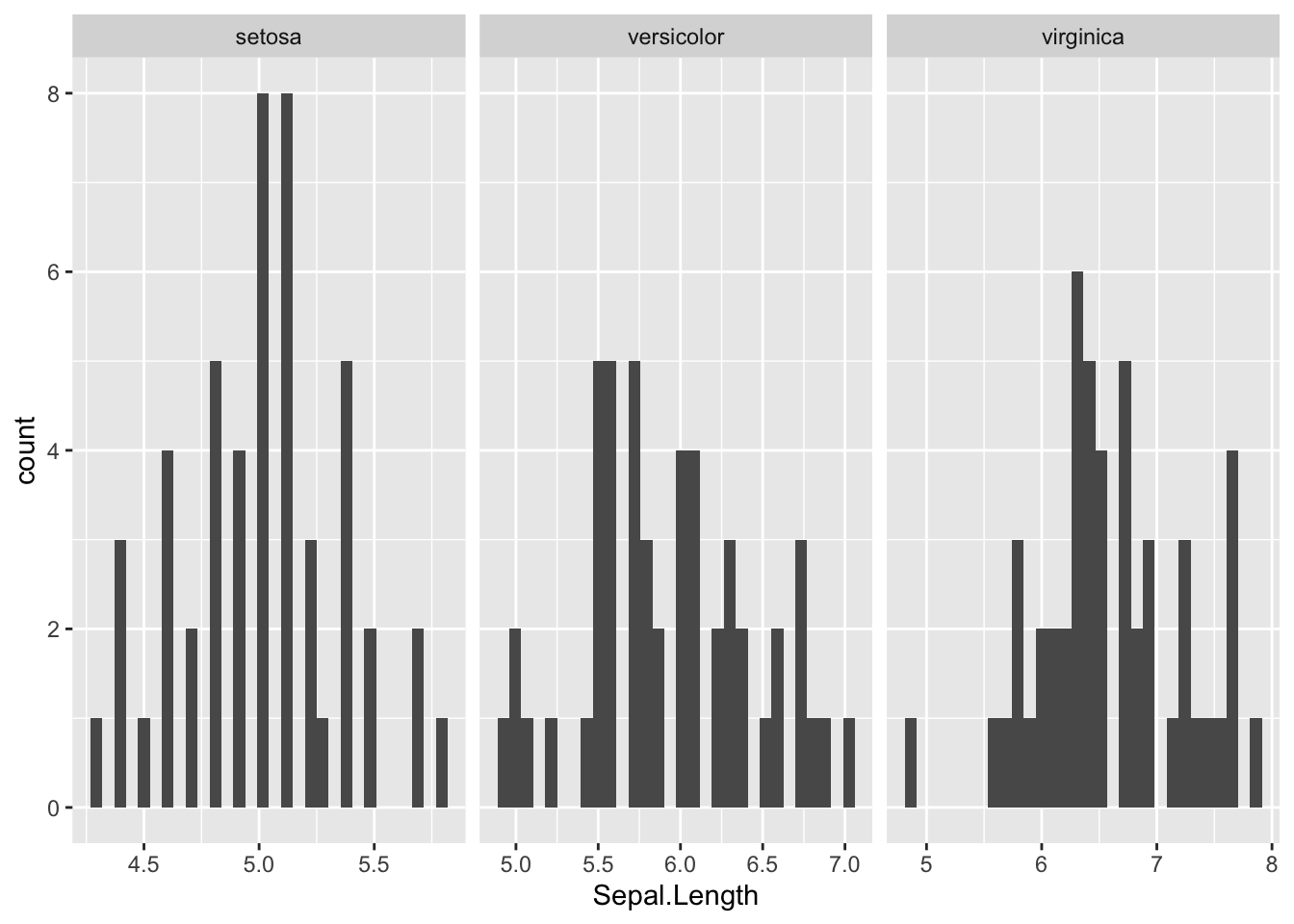
查看 r-graph-gallery的例子。