# Boxplot {#sec-boxplot}
## 箱线图陷阱 {#sec-boxplot-trap}
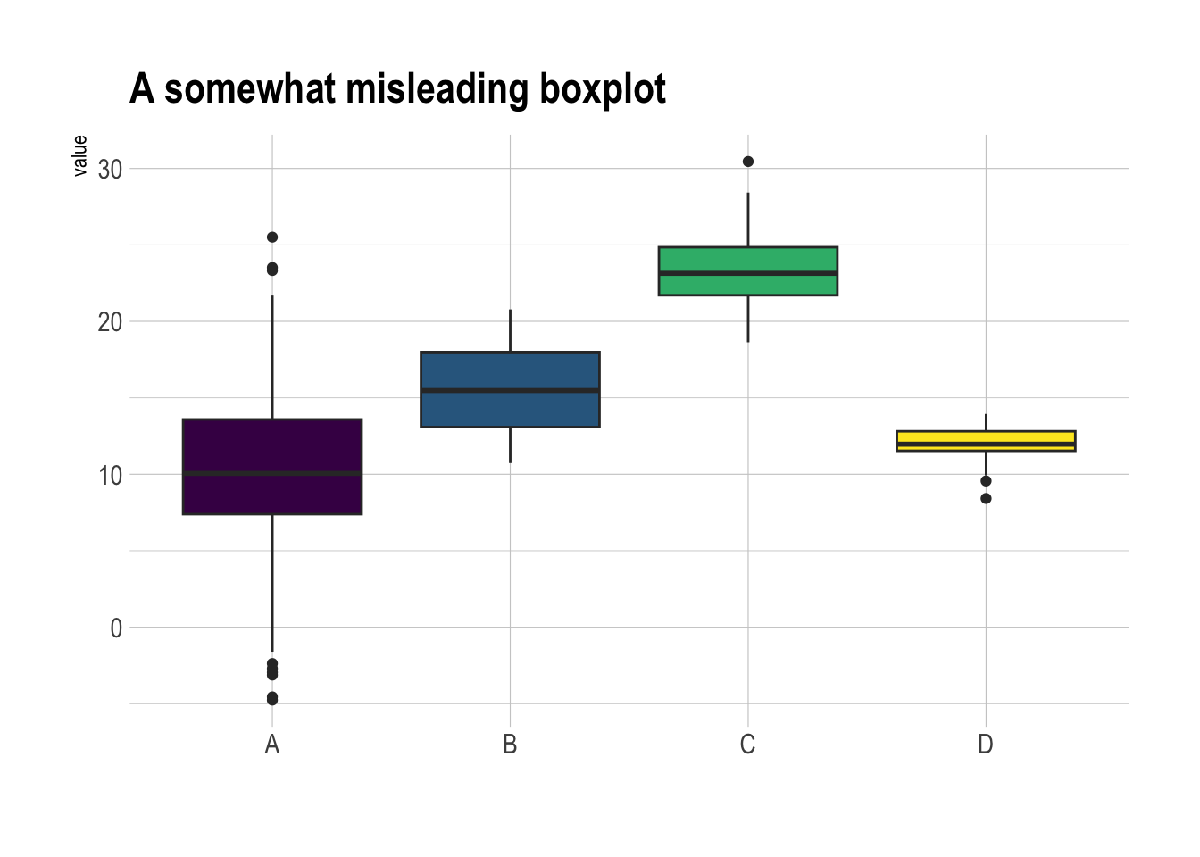
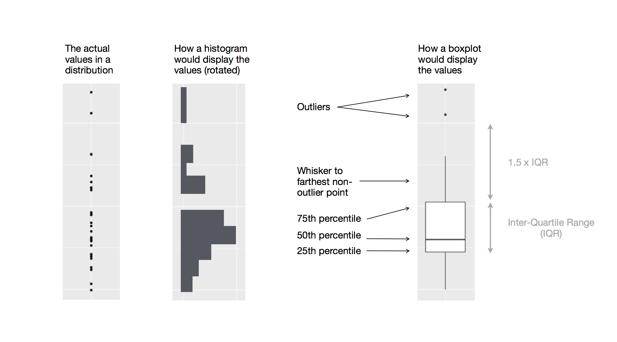
箱线图又叫盒须图,展示数据的中位数(median)、上下四分位数(Quartiles)、四分位距(IQR)、须线(Whiskers)和异常值(outlier)。
这是说明箱线图构成的示意图:
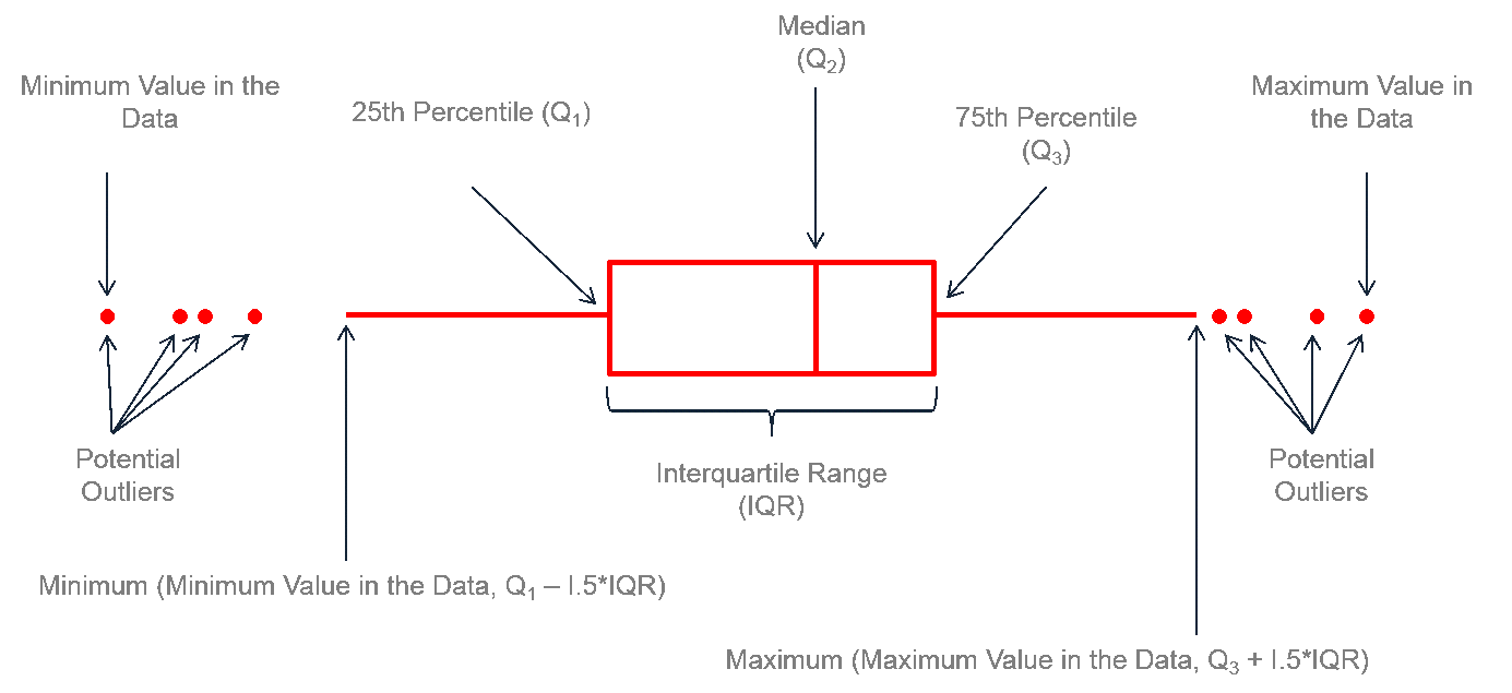
但是,这种信息的总结也有个大问题——**无法显示数据的分布情况**。例如:正态分布可能看起来与双峰分布完全相同。因此,考虑用小提琴图或脊线图。
```{r}
library(tidyverse)
library(hrbrthemes) # hrbrthemes 提供了更适合排版的主题
library(viridis) # viridis 提供了好看的色盲友好型颜色

# 创建数据集
data1 <- data.frame(
  name = c(
    rep("A", 500),
    rep("B", 250),
    rep("B", 250),
    rep("C", 20),
    rep('D', 100)
  ),
  value = c(
    rnorm(500, 10, 5),
    rnorm(250, 13, 1),
    rnorm(250, 18, 1),
    rnorm(20, 25, 4),
    rnorm(100, 12, 1)
  )
)

data1 |>
  ggplot(aes(x = name, y = value, fill = name)) +
  geom_boxplot() +
  scale_fill_viridis(discrete = TRUE) + # 好看的色盲友好型颜色,离散变量
  theme_ipsum() +
  theme(legend.position = "none") +
  labs(x = "") +
  ggtitle("A somewhat misleading boxplot")
```
## 改进
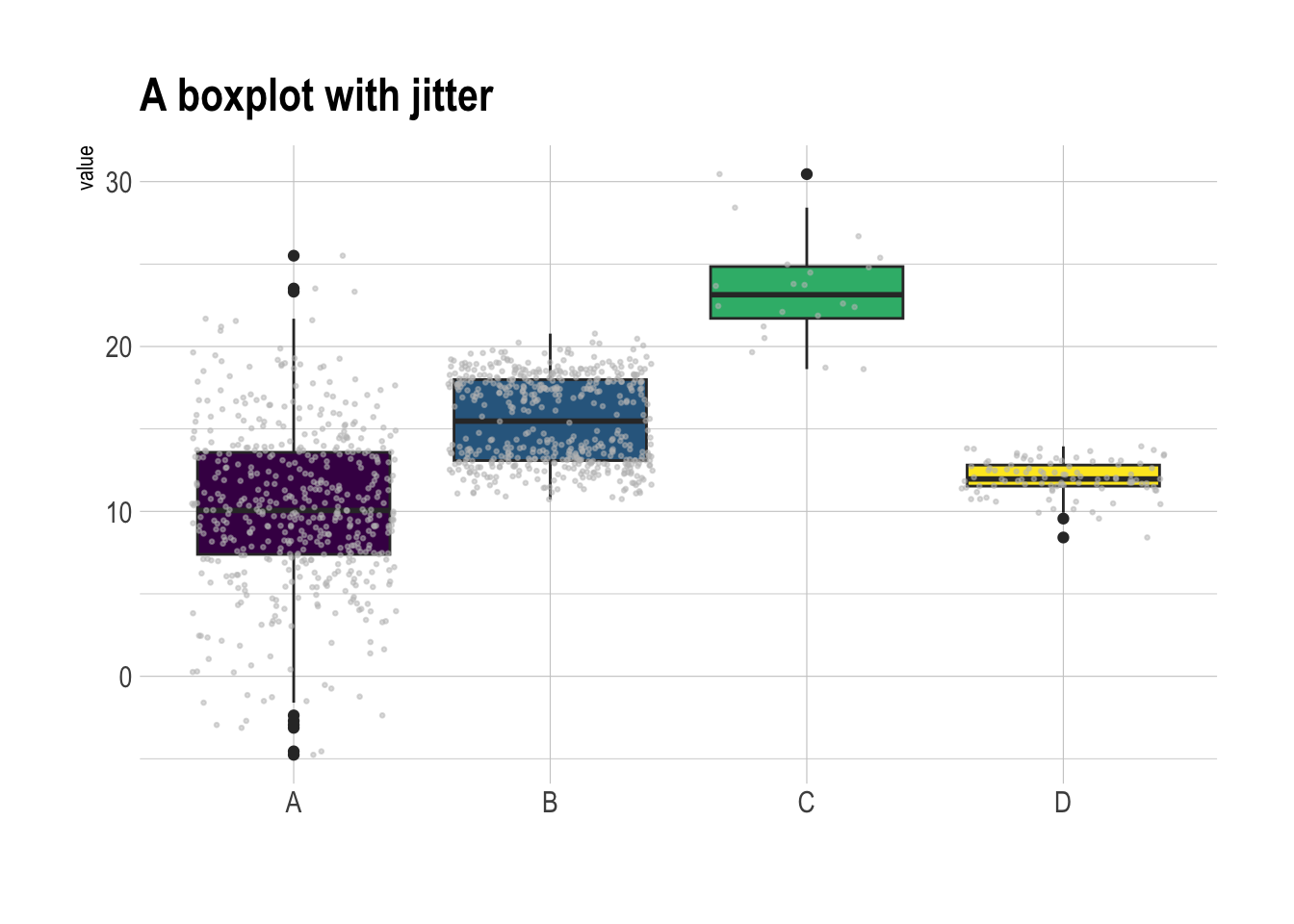
### 添加抖动(Jitter)
适合数据量不太大的情况
```{r}
#| fig-cap: 添加抖动(jitter)的箱线图
data1 |>
  ggplot( aes(x=name, y=value, fill=name)) +
    geom_boxplot() +
    scale_fill_viridis(discrete = TRUE) +  # 好看的色盲友好型颜色,离散变量
    geom_jitter(color="grey", size=0.5, alpha=0.5) +
    theme_ipsum() +
    theme(legend.position="none") +
    labs(x = "") +
    ggtitle("A boxplot with jitter")
```
发现:
- 组 C 样本量小。在得出组 C 的值高于其他组的结论之前,要考虑样本量.
- 组 B 呈现出双峰分布(y = 18 和 y = 13),但是箱线图中看起来和组 A 并无区别.
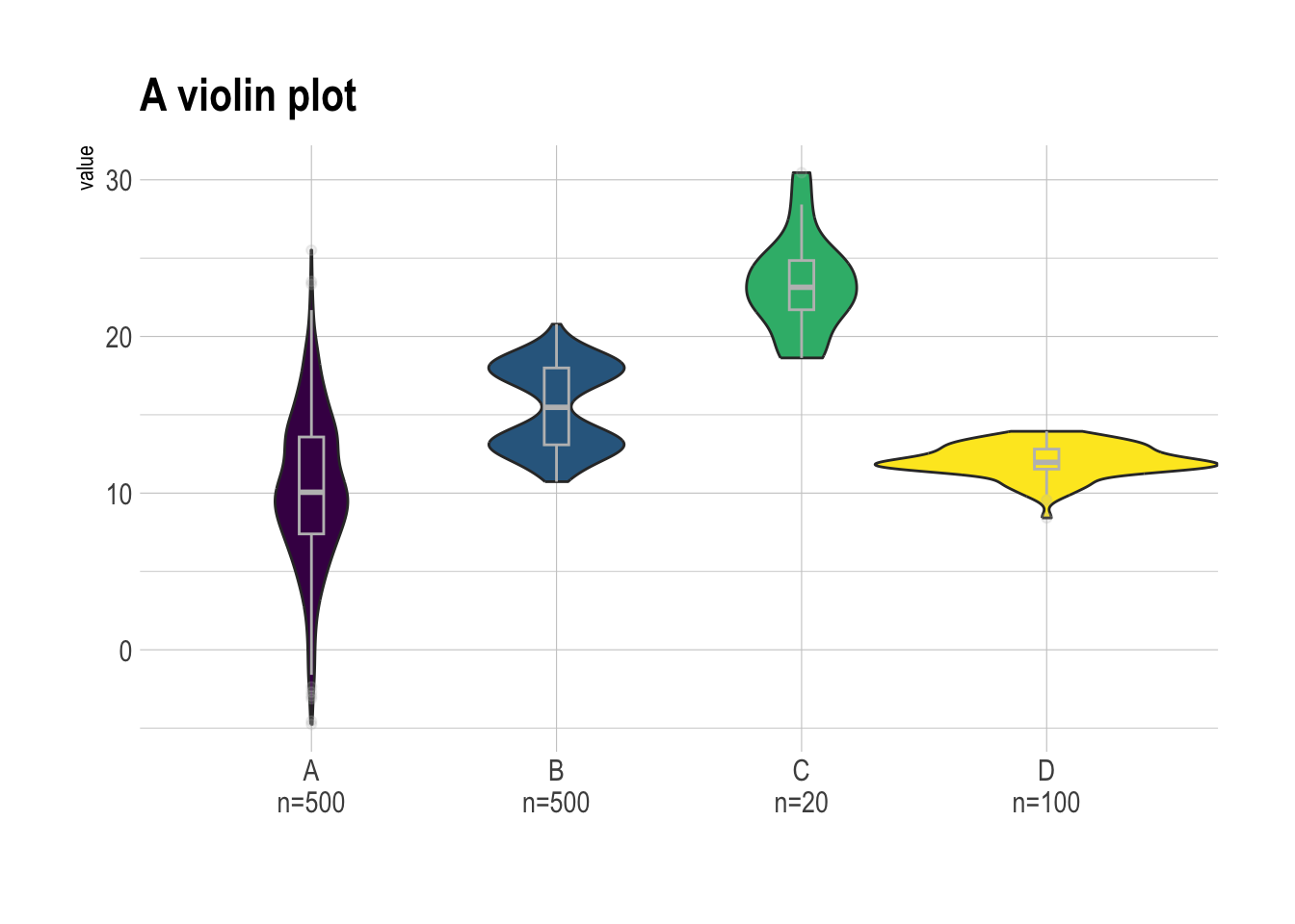
### 小提琴图(Violin)
```{r}
# 显示样本量
sample_size = data1 |> group_by(name) |> summarize(num = n())

data1  |>
  left_join(sample_size) |>
  mutate(myaxis = paste0(name, "\n", "n=", num)) |>
  ggplot(aes(x = myaxis, y = value, fill = name)) +
  geom_violin(width = 1.4) +
  geom_boxplot(width = 0.1, color = "grey", alpha = 0.2) +
  scale_fill_viridis(discrete = TRUE) +
  theme_ipsum() +
  theme(legend.position = "none") +
  labs(x = "") +
  ggtitle("A violin plot")
```
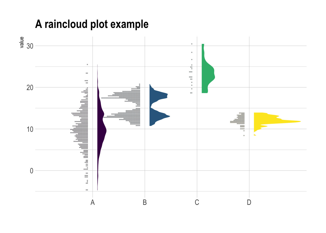
### 云雨图(Raincloud)
看了就知道,云(半小提琴)+雨(散点)的组合。
```{r}
library(ggdist) # ggdist 提供了半小提琴图和云雨图
library(hrbrthemes) # hrbrthemes 提供了更适合排版的主题
library(viridis) # viridis 提供了好看的色盲友好型颜色

data1 |>
    ggplot(aes(x = factor(name), y = value, fill = factor(name))) +

    # 添加半小提琴图(显示分布)
    stat_halfeye(
        adjust = 0.5,
        justification = -0.1,
        .width = 0,
        point_colour = NA
    ) +

    # 添加散点(显示原始数据点)
    stat_dots(
        side = "left",
        justification = 1.1,
        binwidth = 0.25
    ) +

    # 设置色盲友好型配色
    scale_fill_viridis(discrete = TRUE) +
    theme_ipsum() +
    theme(legend.position = "none") +
    labs(x = "") +
    ggtitle("A raincloud plot example")
```
把**头顺时针旋转90度**(或交换R代码X轴和Y轴),就更像云雨了
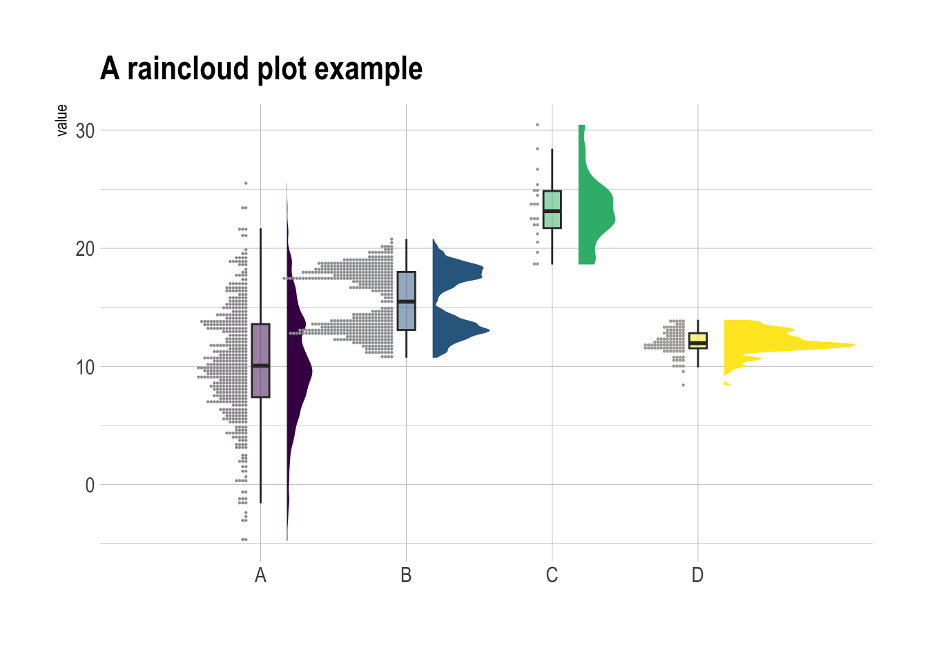
甚至还可以再加上箱线图
```{r}
library(ggdist) # ggdist 提供了半小提琴图和云雨图
library(hrbrthemes) # hrbrthemes 提供了更适合排版的主题
library(viridis) # viridis 提供了好看的色盲友好型颜色

data1 |>
    ggplot(aes(x = factor(name), y = value, fill = factor(name))) +

    # 添加半小提琴图(显示分布)
    stat_halfeye(
        adjust = 0.5,
        justification = -0.2,
        .width = 0,
        point_colour = NA
    ) +

    # 添加箱线图
    geom_boxplot(
        width = 0.12,
        outlier.color = NA,
        alpha = 0.5
    ) +

    # 添加散点(显示原始数据点)
    stat_dots(
        side = "left",
        justification = 1.1,
        binwidth = 0.25
    ) +

    # 设置色盲友好型配色
    scale_fill_viridis(discrete = TRUE) +
    theme_ipsum() +
    theme(legend.position = "none") +
    labs(x = "") +
    ggtitle("A raincloud plot example")
```
## ggplot2
主要是`geom_boxplot()`函数.
### 基础
```{r}
#| fig-cap: 最基础的箱线图
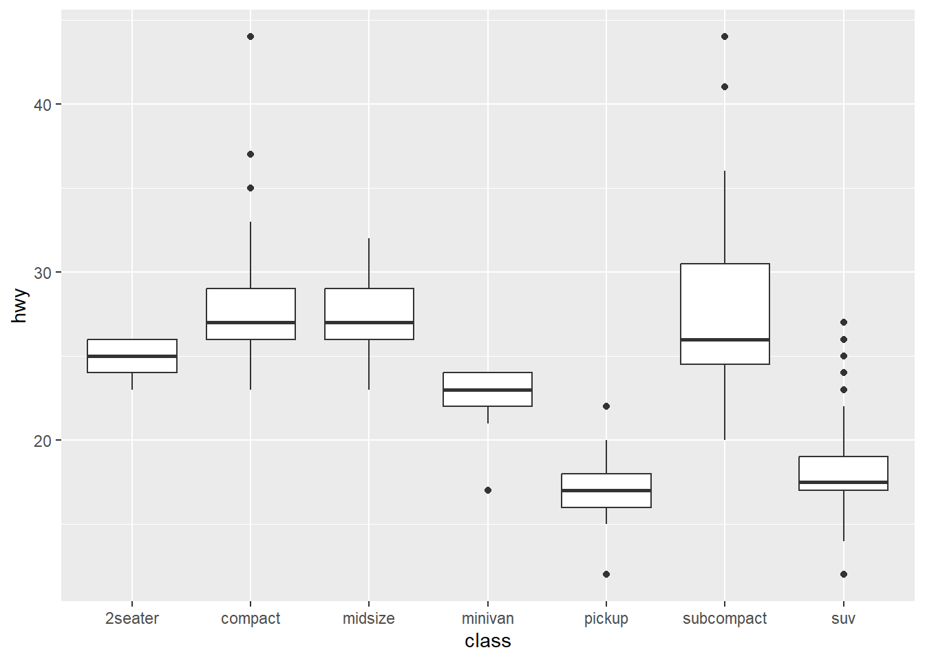
ggplot(mpg, aes(x = class, y = hwy)) +
    geom_boxplot()
```
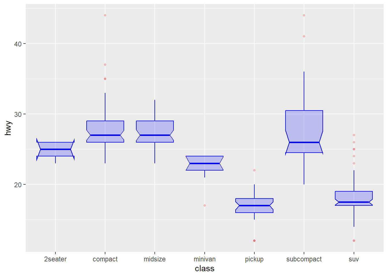
```{r}
#| fig-cap: 有细腰的箱线图
ggplot(mpg, aes(x=class, y=hwy)) +
  geom_boxplot(
    color="blue",         # 箱线图边框颜色为蓝色
    fill="blue",          # 箱体填充颜色为蓝色
    alpha=0.2,            # 箱体透明度为0.2,便于观察重叠部分

    notch=TRUE,           # 显示缺口,用于比较中位数是否有显著差异
    notchwidth = 0.8,     # 缺口的宽度

    outlier.colour="red", # 异常值点的边框颜色为红色
    outlier.fill="red",   # 异常值点的填充颜色为红色
    outlier.size=1        # 异常值点的大小为3
  )
```
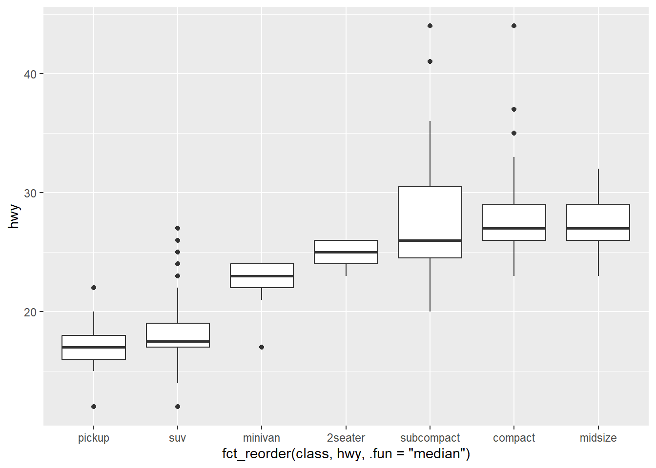
### 排序
```{r}
#| fig-cap: 用均值排序箱线图
mpg |>
  # fct_reorder() 函数排序
  ggplot( aes(x=fct_reorder(class, hwy, .fun='median'), y=hwy)) +
    geom_boxplot()
```
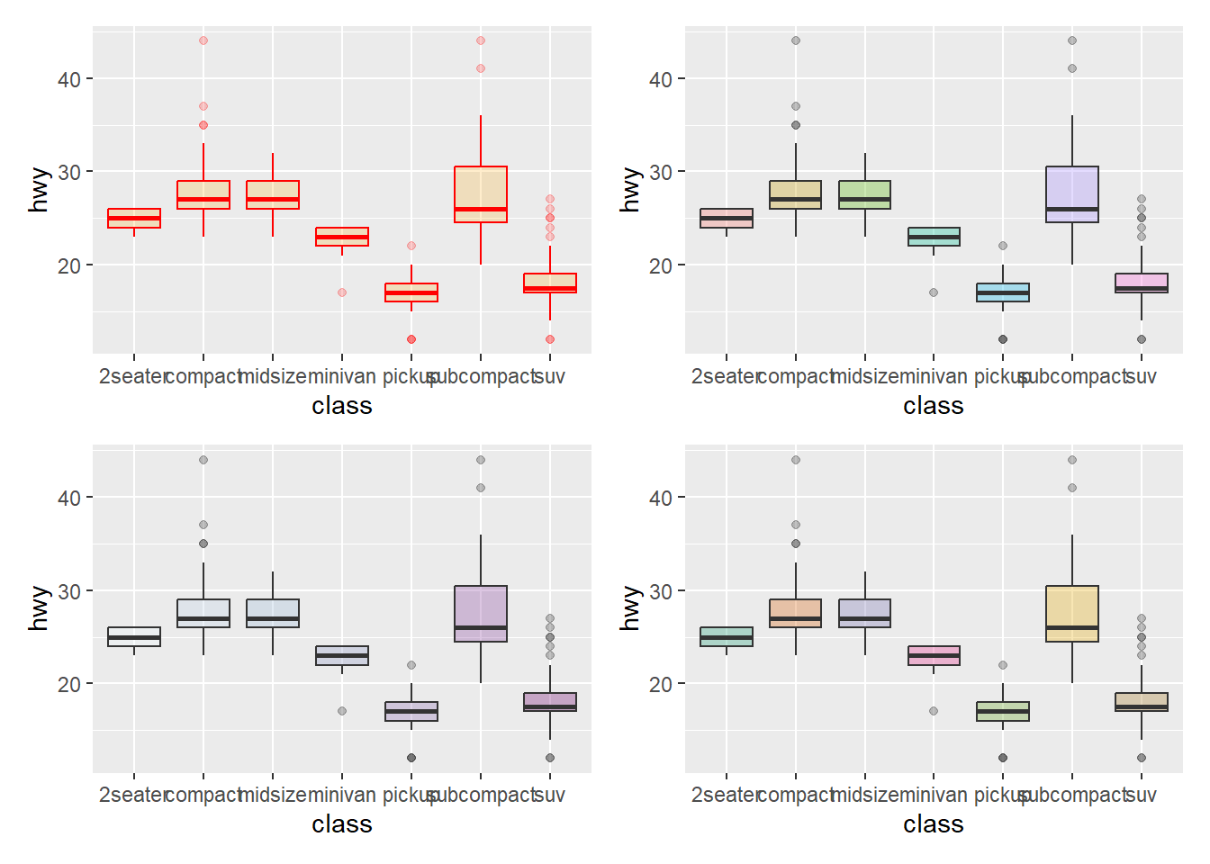
### 定制外观
```{r}
#| fig-cap: 改变颜色
library(patchwork)

p1 <- ggplot(mpg, aes(x=class, y=hwy)) +
    geom_boxplot(color="red", fill="orange", alpha=0.2)

p2 <- ggplot(mpg, aes(x=class, y=hwy, fill=class)) +
    geom_boxplot(alpha=0.3) +
    theme(legend.position="none")

p3 <- ggplot(mpg, aes(x=class, y=hwy, fill=class)) +
    geom_boxplot(alpha=0.3) +
    theme(legend.position="none") +
    scale_fill_brewer(palette="BuPu") # 调色板

p4 <- ggplot(mpg, aes(x=class, y=hwy, fill=class)) +
    geom_boxplot(alpha=0.3) +
    theme(legend.position="none") +
    scale_fill_brewer(palette="Dark2") # 调色板

p1 + p2 + p3 + p4
```
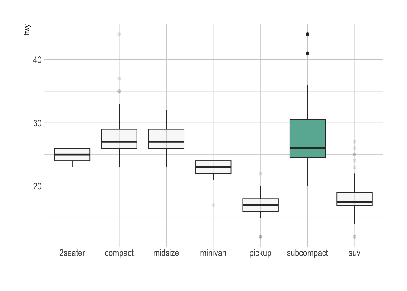
```{r}
#| fig-cap: 高亮某个组
library(hrbrthemes)

mpg |>
  # 添加一列 'type',用于标记是否高亮某个组
  mutate(type = ifelse(class == "subcompact", "Highlighted", "Normal")) |>

  ggplot(aes(x = class, y = hwy, fill = type, alpha = type)) +
    geom_boxplot() +
    scale_fill_manual(values = c("#69b3a2", "grey")) + # 手动设置填充色,高亮组为绿色,其余为灰色
    scale_alpha_manual(values = c(1, 0.1)) + # 手动设置透明度,高亮组为不透明,其余为半透明
    theme_ipsum() + # 使用 hrbrthemes 包的排版主题
    theme(legend.position = "none") + # 不显示图例
    xlab("") # 去除 x 轴标签
```
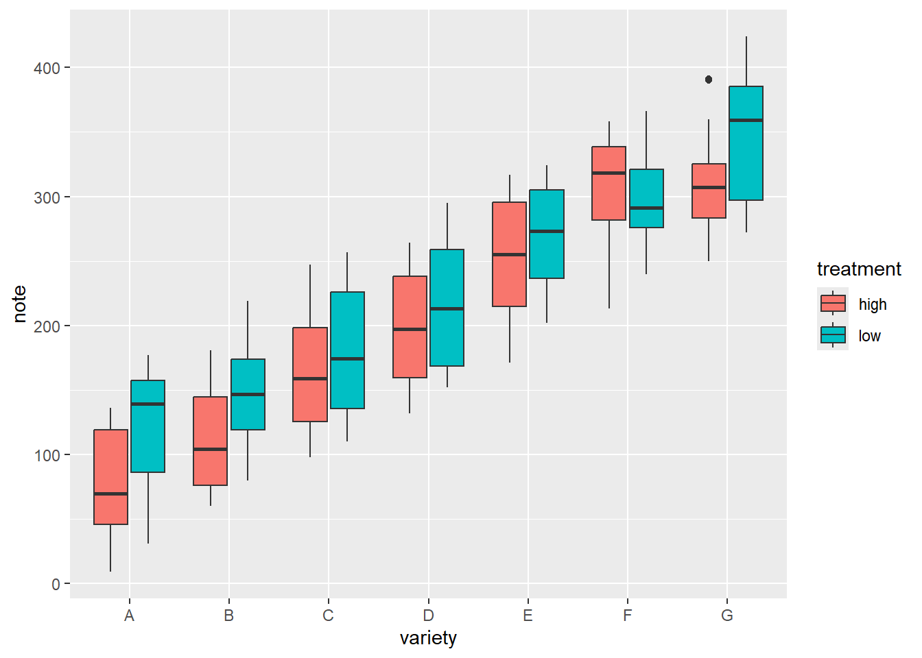
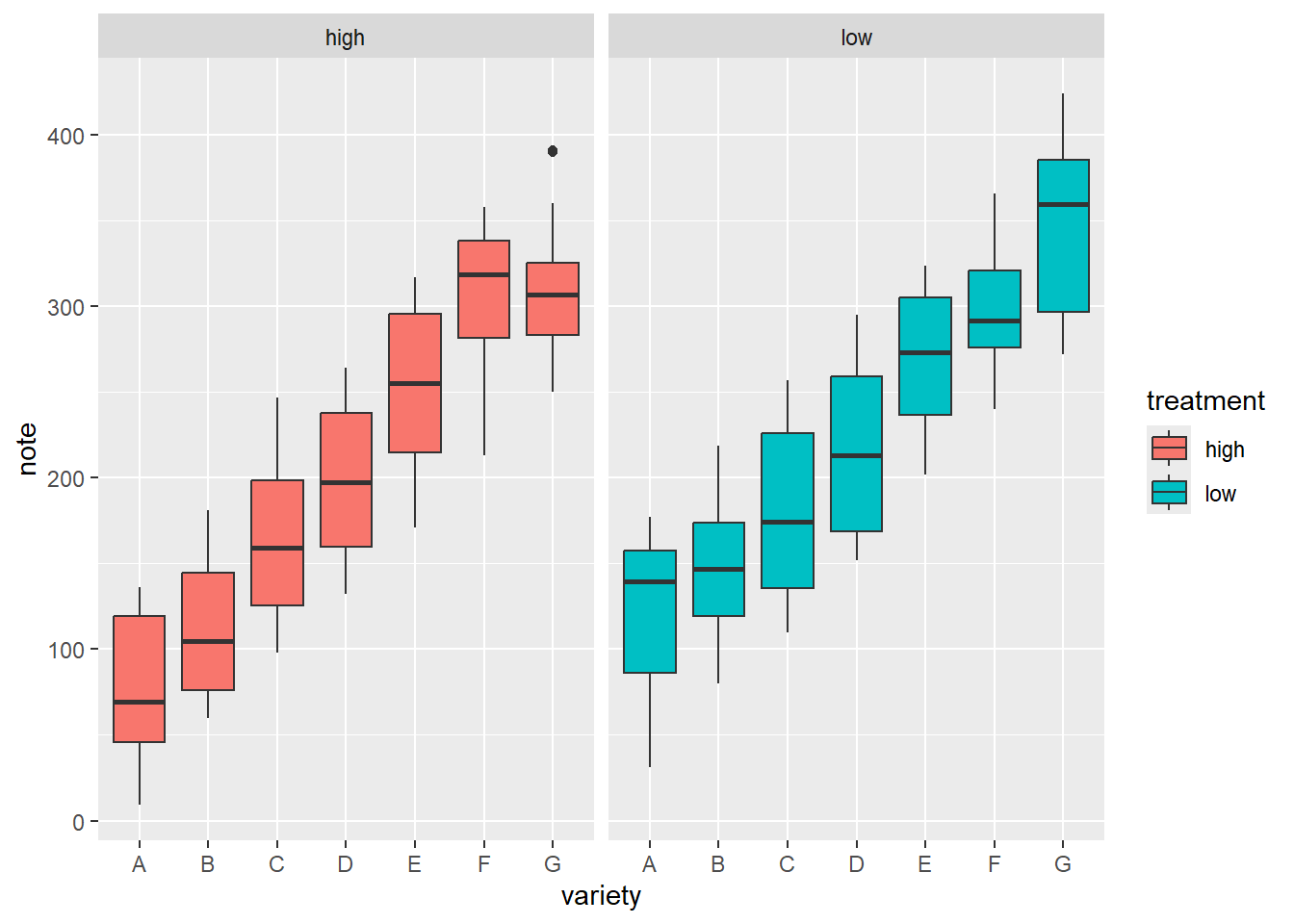
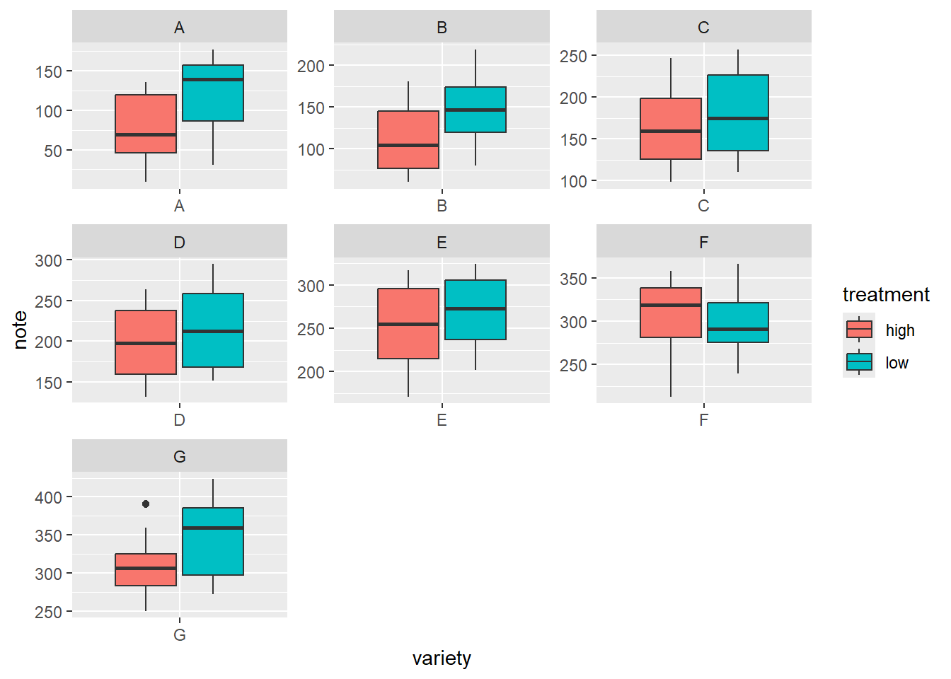
### 分组/分面
```{r}
library(patchwork)
#| fig-cap: 分组箱线图与分面箱线图
# 构造数据
variety = rep(LETTERS[1:7], each = 40) # 7种品种,每种40个观测
treatment = rep(c("high", "low"), each = 20) # 处理分为high和low,每组20个观测
note = seq(1:280) + sample(1:150, 280, replace = TRUE) # 生成note变量,添加一定随机性
data2 = data.frame(variety, treatment, note) # 组合成数据框

# 分组箱线图
ggplot(data2, aes(x = variety, y = note, fill = treatment)) +
  geom_boxplot()
# 少分面箱线图
ggplot(data2, aes(x=variety, y=note, fill=treatment)) +
    geom_boxplot() +
    facet_wrap(~treatment)
# 多分面箱线图
ggplot(data2, aes(x=variety, y=note, fill=treatment)) +
    geom_boxplot() +
    facet_wrap(~variety, scale="free") # 自由y轴
```
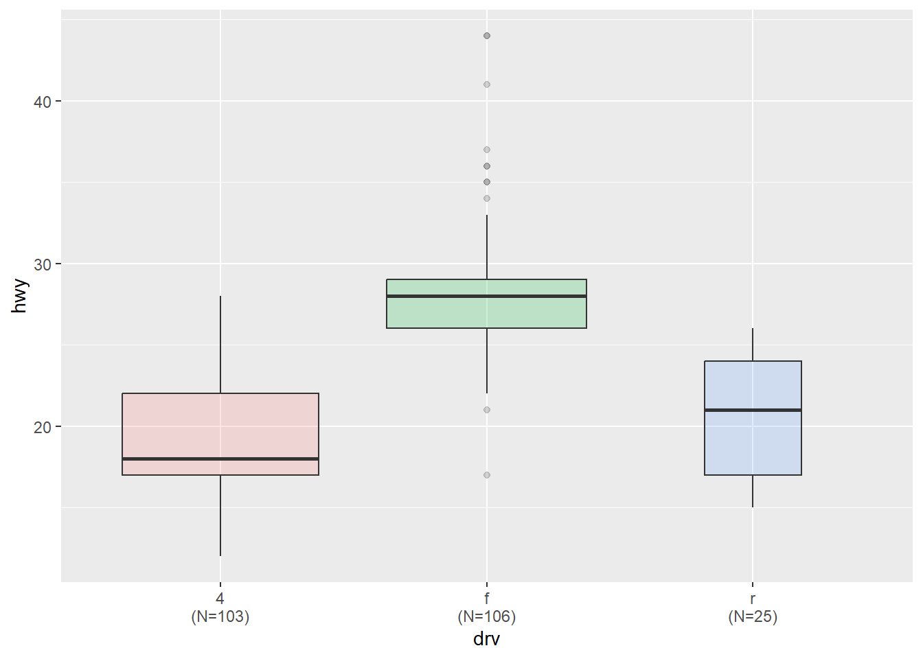
### 不等宽
让箱线图的宽度与样本量成正比
```{r}
#| fig-cap: 不等宽箱线图(宽带是样本量)
# 转换为因子类型
mpg$drv <- as.factor(mpg$drv)
# 创建x轴标签,包含每个drv水平的名称及其对应的样本量
n_xlab <- str_glue("{levels(mpg$drv)}\n(N={table(mpg$drv)})")

ggplot(mpg, aes(x = drv, y = hwy, fill = drv)) +
    geom_boxplot(varwidth = TRUE, alpha = 0.2) + # varwidth = TRUE 不等宽
    scale_x_discrete(labels = n_xlab) +
    theme(legend.position = "none")
```
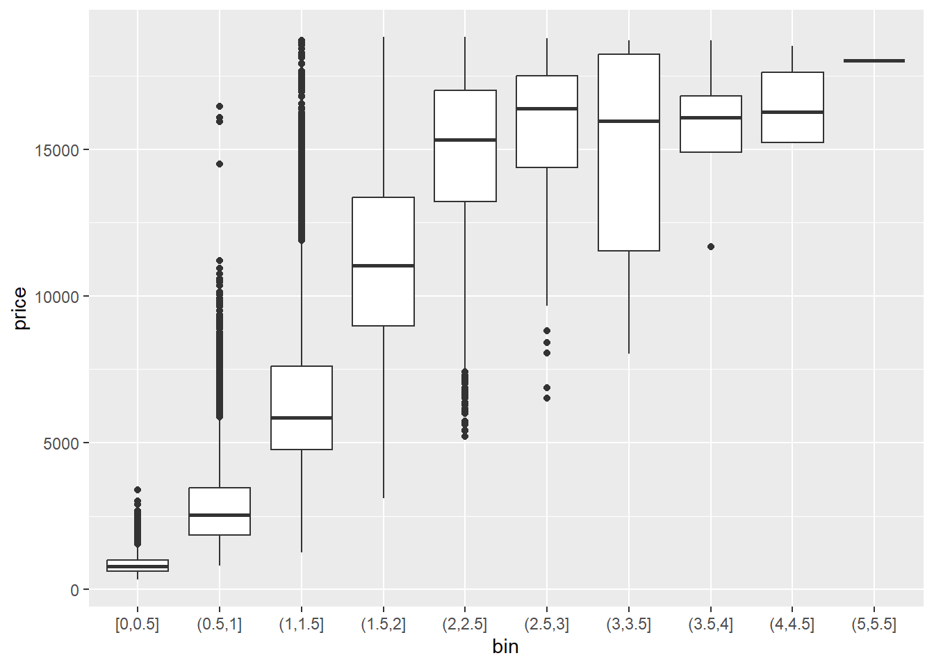
### 连续变量
把连续变量分箱后再绘制箱线图。
```{r}
#| fig-cap: 连续变量箱线图
diamonds |>
  mutate(bin = cut_width(carat, width = 0.5, boundary = 0)) |>
  ggplot(aes(x = bin, y = price)) +
  geom_boxplot()
```
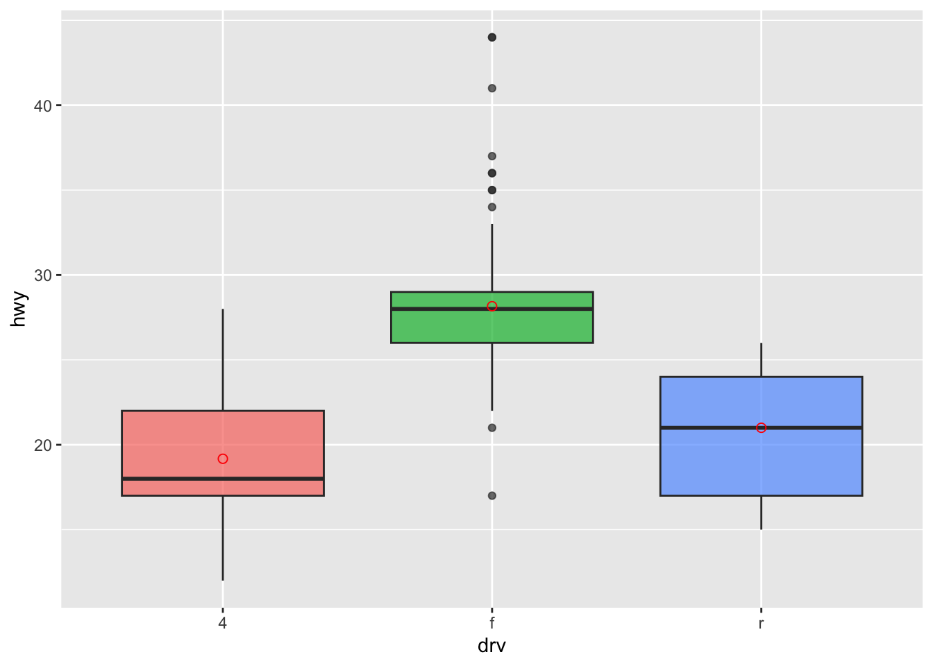
### 添加均值点
```{r}
#| fig-cap: 添加均值点
ggplot(mpg, aes(x=drv, y=hwy, fill=drv)) +
    geom_boxplot(alpha=0.7) +
    stat_summary(fun=mean, geom="point", shape=1, size=2, color = 'red') +
    theme(legend.position="none")
```
### 带数据点
```{r}
#| fig-cap: 带抖动的箱线图
# data1 是之前创建的数据集
data1 |>
  ggplot( aes(x=name, y=value, fill=name)) +
    geom_boxplot() +
    scale_fill_viridis(discrete = TRUE) +  # 好看的色盲友好型颜色,离散变量
    geom_jitter(color="grey", size=0.5, alpha=0.5) +
    theme_ipsum() + # 更适合排版的主题
    theme(legend.position="none") +
    labs(x = "") +
    ggtitle("A boxplot with jitter")
```
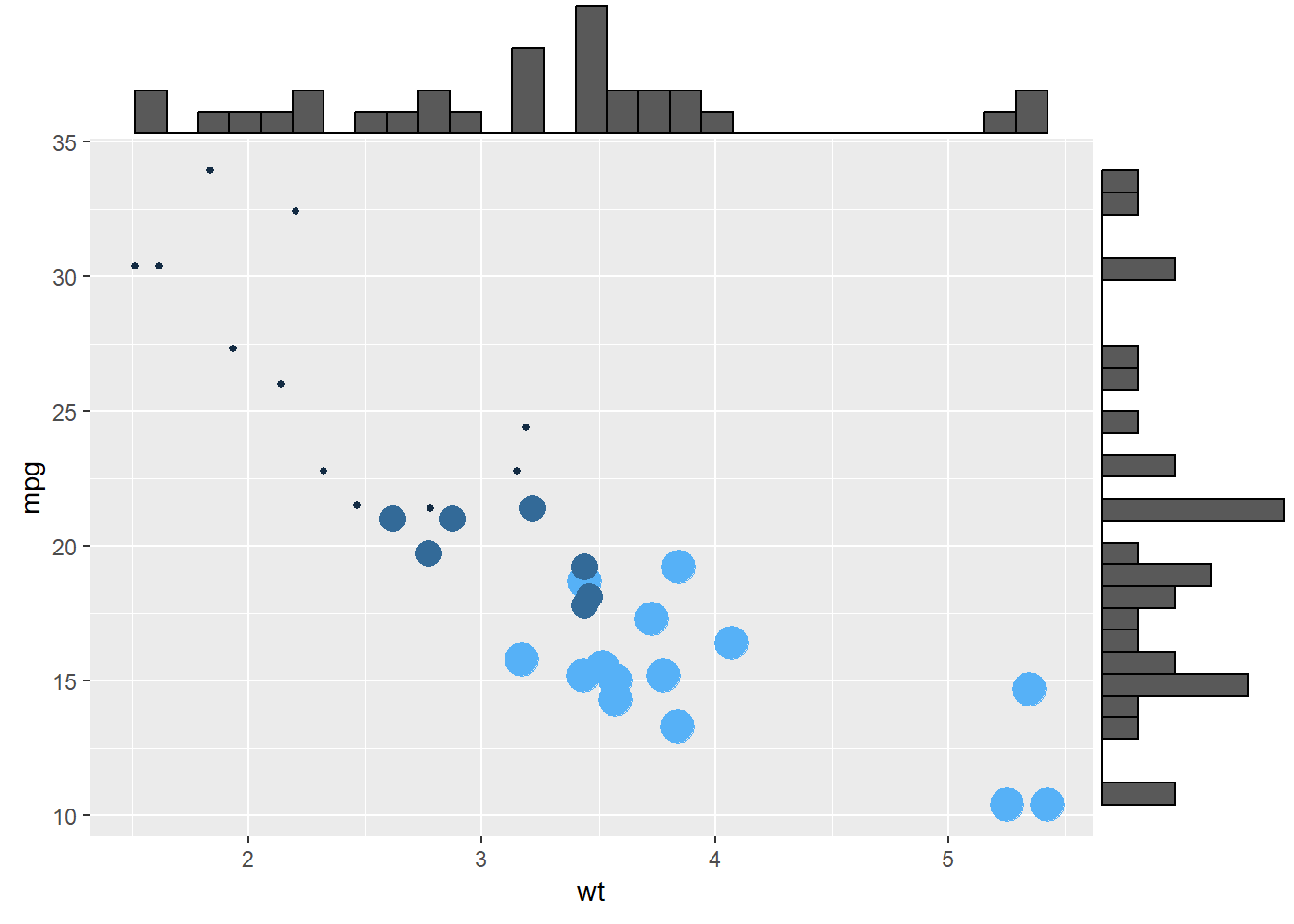
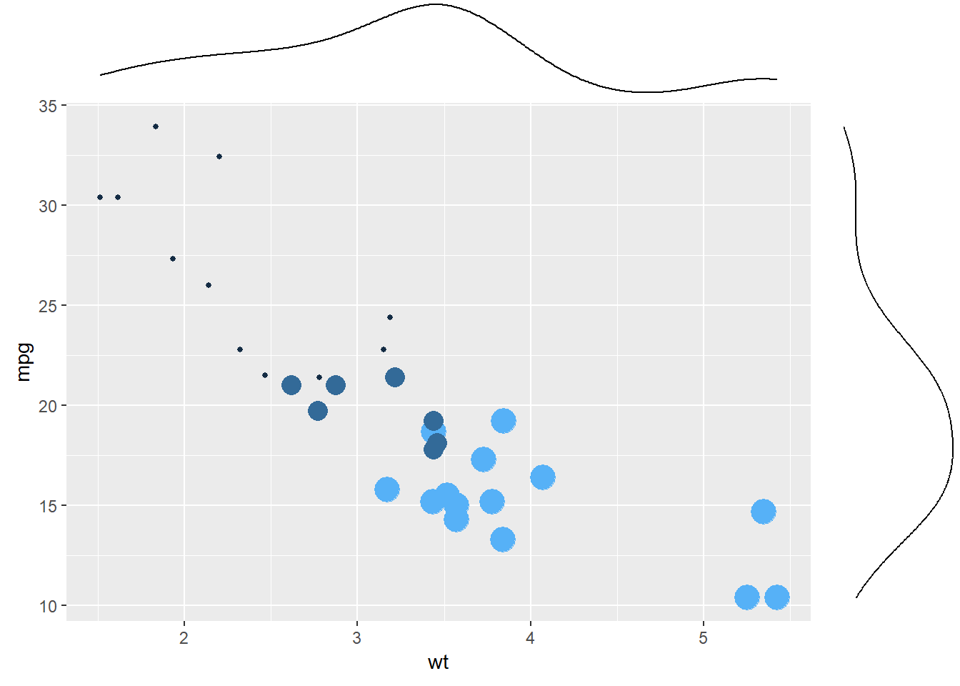
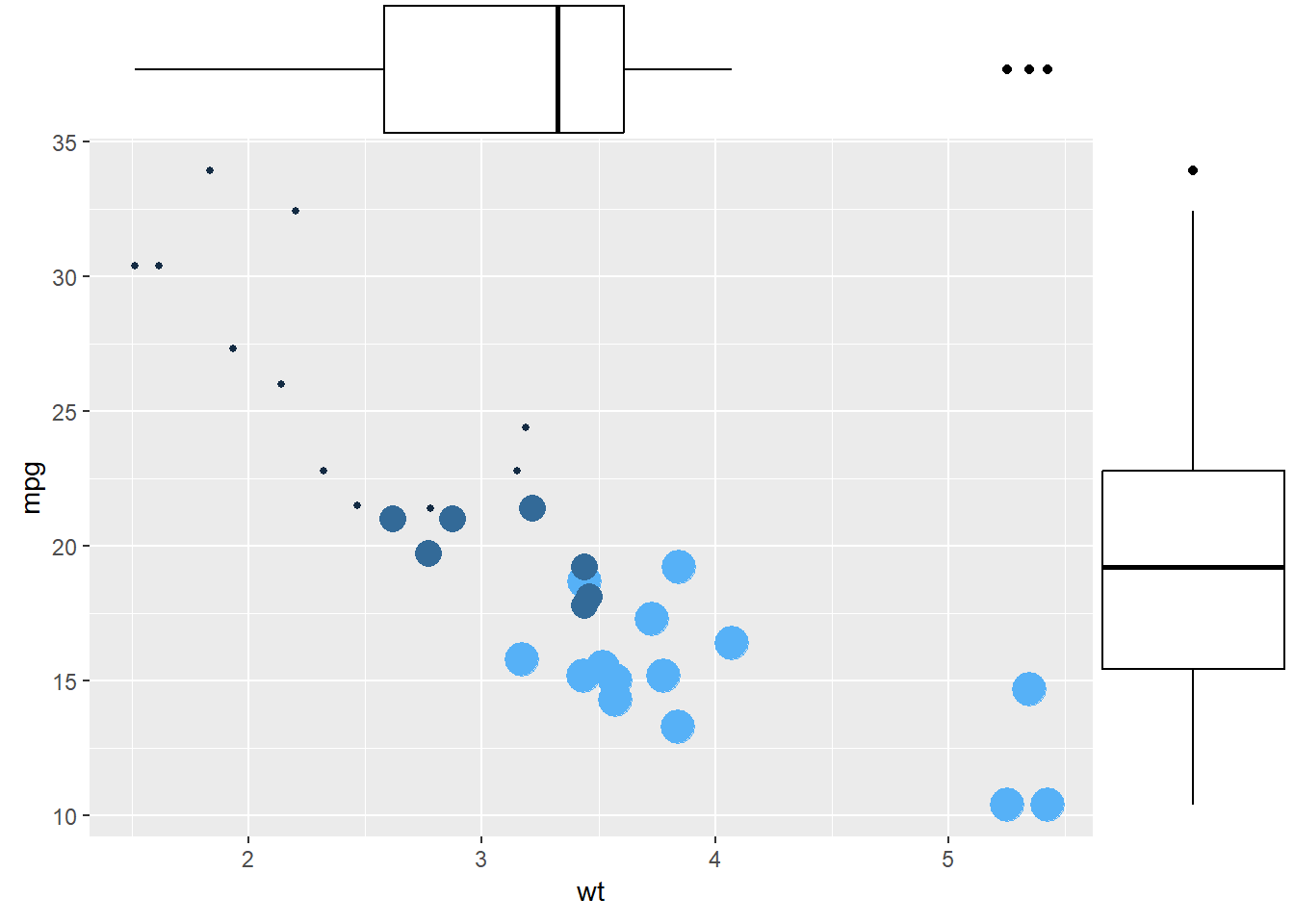
### 散点图外边套箱线图 {#sec-ggMarginal}
可以library(ggExtra)来实现更复杂(花哨)的图形,在ggplot2散点图的基础上再叠加箱线图、密度曲线等。
```{r}
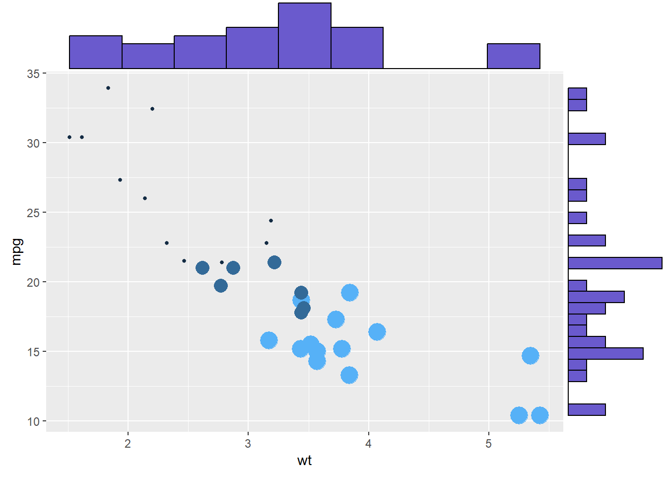
#| fig-cap: ggMarginal散点图叠加直方图
library(ggExtra)
# 创建ggplot散点图
p <- ggplot(mtcars, aes(x = wt, y = mpg, color = cyl, size = cyl)) +
  geom_point() +
  theme(legend.position = "none")

ggMarginal(p, type = "histogram")
```
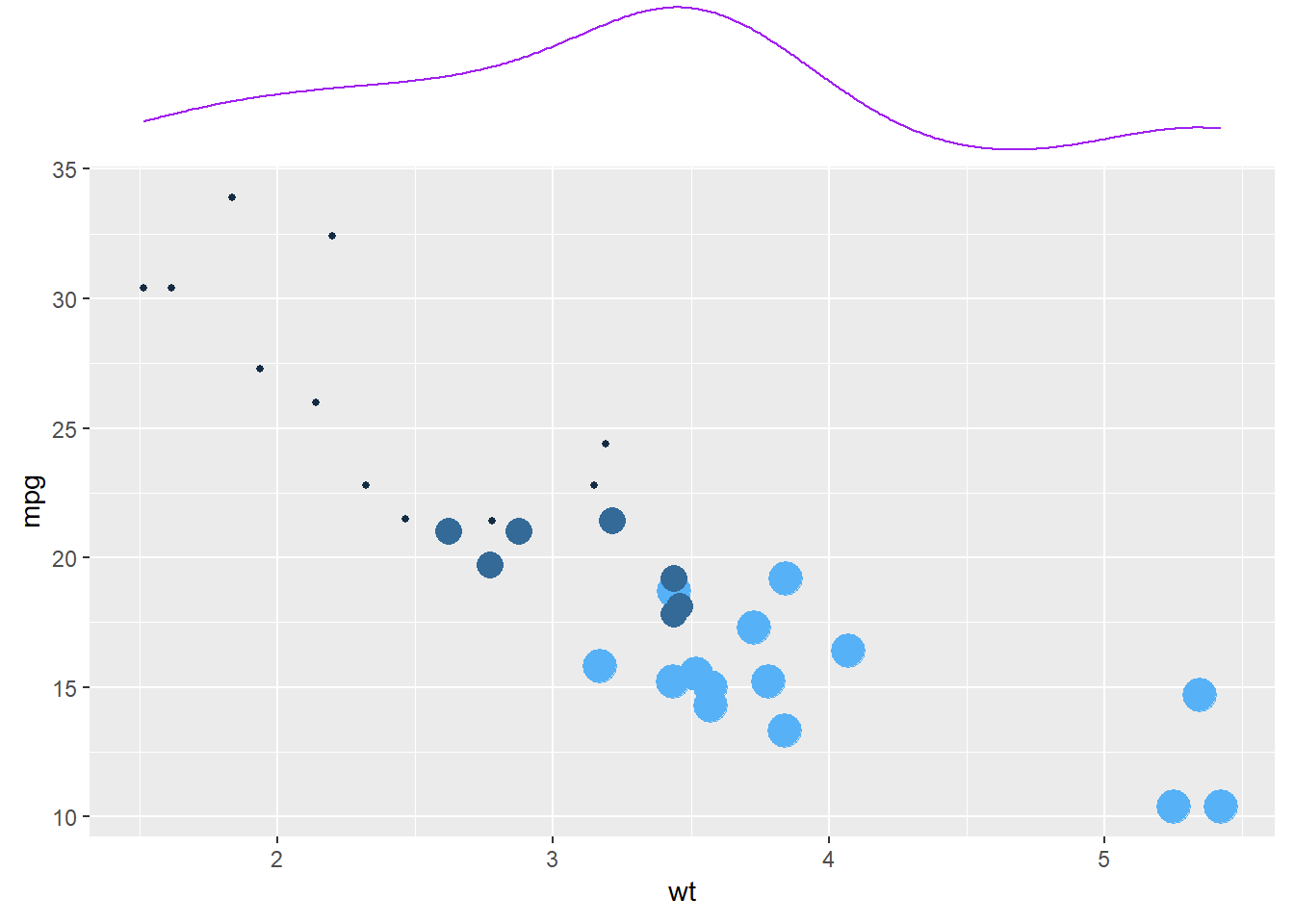
```{r}
#| fig-cap: ggMarginal散点图叠加密度图
ggMarginal(p, type = "density")
```
```{r}
#| fig-cap: ggMarginal散点图叠加箱线图
ggMarginal(p, type = "boxplot")
```
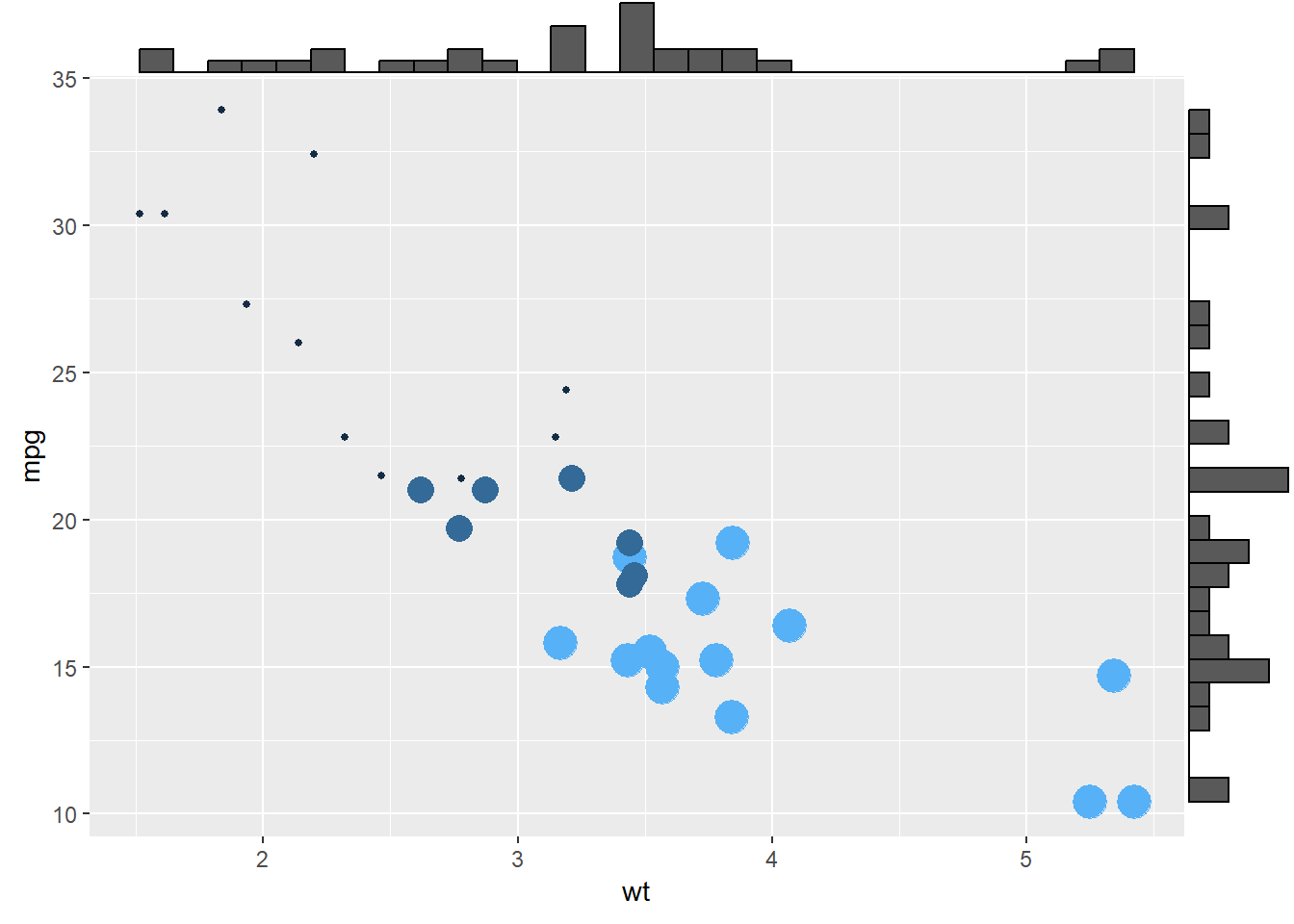
还可以定制化样式:
```{r}
#| fig-cap: ggMarginal定制化样式-尺寸大小
# 设置边际直方图的尺寸大小为10
ggMarginal(p, type = "histogram", size = 10)
```
```{r}
#| fig-cap: ggMarginal定制化样式-颜色和分箱
# 设置边际直方图的填充颜色为slateblue,x轴直方图分箱数为10
ggMarginal(p, type = "histogram", fill = "slateblue", xparams = list(bins = 10))
```
```{r}
#| fig-cap: ggMarginal定制化样式-颜色和尺寸
# 只在x轴添加边际图,边际图颜色为紫色,尺寸为4
ggMarginal(p, margins = 'x', color = "purple", size = 4)
```
## Base R
主要是通过`boxplot()`函数.
但是 base R 多看一秒都是浪费时间,直接ggplot2吧.
如果实在想学,可以看 [r-graph-gallery](https://r-graph-gallery.com/boxplot.html) 的文档。
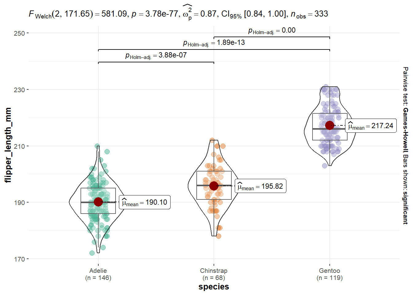
## Pearl {#sec-ggstatsplot}
```{r}
#| fig-cap: 带有统计的小提琴箱线图
palmerpenguins::penguins |>
  drop_na() |>
  ggstatsplot::ggbetweenstats(x = species, y = flipper_length_mm, 1)
```
在 [ggstatsplot](https://r-graph-gallery.com/web-violinplot-with-ggstatsplot.html) 可以看到进一步美化。
或者
在 [tidyplots](https://tidyplots.org/use-cases/) 有另一种风格的统计箱线图。